This lesson gives you the background information you need to use the Swing components, and then describes every Swing component. It assumes that you have successfully compiled and run a program that uses Swing components, and that you are familiar with basic Swing concepts.
As we mentioned before, Swing provides three generally useful top-level container classes: JFrame, JDialog, and JApplet. When using these classes, you should keep these facts in mind:
- To appear onscreen, every GUI component must be part of a containment hierarchy. A containment hierarchy is a tree of components that has a top-level container as its root. We'll show you one in a bit.
- Each GUI component can be contained only once. If a component is already in a container and you try to add it to another container, the component will be removed from the first container and then added to the second.
- Each top-level container has a content pane that, generally speaking, contains (directly or indirectly) the visible components in that top-level container's GUI
- You can optionally add a menu bar to a top-level container. The menu bar is by convention positioned within the top-level container, but outside the content pane. Some look and feels, such as the Mac OS look and feel, give you the option of placing the menu bar in another place more appropriate for the look and feel, such as at the top of the screen.
Here's a picture of a frame created by an application. The frame contains a green menu bar (with no menus) and, in the frame's content pane, a large blank, yellow label.


With the exception of top-level containers, all Swing components whose names begin with "J" descend from the JComponent class. For example, JPanel, JScrollPane, JButton, and JTable all inherit from JComponent. However, JFrame and JDialog don't because they implement top-level containers.
The JComponent class extends the Container class, which itself extends Component. The Component class includes everything from providing layout hints to supporting painting and events. The Container class has support for adding components to the container and laying them out. This section's API tables summarize the most often used methods of Component and Container, as well as of JComponent.
JComponent Features
The JComponent class provides the following functionality to its descendants:
◉ Tool tips
◉ Painting and borders
◉ Application-wide pluggable look and feel
◉ Custom properties
◉ Support for layout
◉ Support for accessibility
◉ Support for drag and drop
◉ Double buffering
◉ Key bindings
Tool tips
By specifying a string with the setToolTipText method, you can provide help to users of a component. When the cursor pauses over the component, the specified string is displayed in a small window that appears near the component.
Painting and borders
The setBorder method allows you to specify the border that a component displays around its edges. To paint the inside of a component, override the paintComponent method.
Application-wide pluggable look and feel
Behind the scenes, each JComponent object has a corresponding ComponentUI object that performs all the drawing, event handling, size determination, and so on for that JComponent. Exactly which ComponentUI object is used depends on the current look and feel, which you can set using the UIManager.setLookAndFeel method.
Custom properties
You can associate one or more properties (name/object pairs) with any JComponent. For example, a layout manager might use properties to associate a constraints object with each JComponent it manages. You put and get properties using the putClientProperty and getClientProperty methods.
Support for layout
Although the Component class provides layout hint methods such as getPreferredSize and getAlignmentX, it doesn't provide any way to set these layout hints, short of creating a subclass and overriding the methods. To give you another way to set layout hints, the JComponent class adds setter methods — setMinimumSize, setMaximumSize, setAlignmentX, and setAlignmentY.
Support for accessibility
The JComponent class provides API and basic functionality to help assistive technologies such as screen readers get information from Swing components.
Support for drag and drop
The JComponent class provides API to set a component's transfer handler, which is the basis for Swing's drag and drop support.
Double buffering
Double buffering smooths on-screen painting.
Key bindings
This feature makes components react when the user presses a key on the keyboard. For example, in many look and feels when a button has the focus, typing the Space key is equivalent to a mouse click on the button. The look and feel automatically sets up the bindings between pressing and releasing the Space key and the resulting effects on the button.
This section provides background information you might need when using Swing text components. If you intend to use an unstyled text component — a text field, password field, formatted text field, or text area — go to its how-to page and return here only if necessary.
Swing text components display text and optionally allow the user to edit the text. Programs need text components for tasks ranging from the straightforward (enter a word and press Enter) to the complex (display and edit styled text with embedded images in an Asian language).
Swing provides six text components, along with supporting classes and interfaces that meet even the most complex text requirements. In spite of their different uses and capabilities, all Swing text components inherit from the same superclass, JTextComponent, which provides a highly-configurable and powerful foundation for text manipulation.
The following figure shows the JTextComponent hierarchy.


3. Try entering valid and invalid dates into the formatted text field. Note that when you press Enter the label beneath the fields is updated only if the date is valid.
4. Select and edit text in the text area and the text pane. Use keyboard bindings, Ctrl-X, Ctrl-C, and Ctrl-V, to cut, copy, and paste text, respectively.
5. Try to edit the text in the editor pane, which has been made uneditable with a call to setEditable.
6. Look in the text pane to find an example of an embedded component and an embedded icon.
The TextSamplerDemo example uses the text components in very basic ways. The following table tells you more about what you can do with each kind of text component.
5. Using HTML in Swing Components
6. Using Models
7. Using Borders
8. Using Icons
9. Solving Common Component Problems
1. Using Top-Level Containers
As we mentioned before, Swing provides three generally useful top-level container classes: JFrame, JDialog, and JApplet. When using these classes, you should keep these facts in mind:
- To appear onscreen, every GUI component must be part of a containment hierarchy. A containment hierarchy is a tree of components that has a top-level container as its root. We'll show you one in a bit.
- Each GUI component can be contained only once. If a component is already in a container and you try to add it to another container, the component will be removed from the first container and then added to the second.
- Each top-level container has a content pane that, generally speaking, contains (directly or indirectly) the visible components in that top-level container's GUI
- You can optionally add a menu bar to a top-level container. The menu bar is by convention positioned within the top-level container, but outside the content pane. Some look and feels, such as the Mac OS look and feel, give you the option of placing the menu bar in another place more appropriate for the look and feel, such as at the top of the screen.
Here's a picture of a frame created by an application. The frame contains a green menu bar (with no menus) and, in the frame's content pane, a large blank, yellow label.
You can find the entire source for this example in TopLevelDemo.java. Although the example uses a JFrame in a standalone application, the same concepts apply to JApplets and JDialogs.
Here's the containment hierarchy for this example's GUI:
As the ellipses imply, we left some details out of this diagram. We reveal the missing details a bit later. Here are the topics this section discusses:
- Top-Level Containers and Containment Hierarchies
- Adding Components to the Content Pane
- Adding a Menu Bar
- The Root Pane (a.k.a. The Missing Details)
Top-Level Containers and Containment Hierarchies
Each program that uses Swing components has at least one top-level container. This top-level container is the root of a containment hierarchy — the hierarchy that contains all of the Swing components that appear inside the top-level container.
As a rule, a standalone application with a Swing-based GUI has at least one containment hierarchy with a JFrame as its root. For example, if an application has one main window and two dialogs, then the application has three containment hierarchies, and thus three top-level containers. One containment hierarchy has a JFrame as its root, and each of the other two has a JDialog object as its root.
A Swing-based applet has at least one containment hierarchy, exactly one of which is rooted by a JApplet object. For example, an applet that brings up a dialog has two containment hierarchies. The components in the browser window are in a containment hierarchy rooted by a JApplet object. The dialog has a containment hierarchy rooted by a JDialog object.
Adding Components to the Content Pane
Here's the code that the preceding example uses to get a frame's content pane and add the yellow label to it:
frame.getContentPane().add(yellowLabel, BorderLayout.CENTER);
As the code shows, you find the content pane of a top-level container by calling the getContentPane method. The default content pane is a simple intermediate container that inherits from JComponent, and that uses a BorderLayout as its layout manager.
It's easy to customize the content pane — setting the layout manager or adding a border, for example. However, there is one tiny gotcha. The getContentPane method returns a Container object, not a JComponent object. This means that if you want to take advantage of the content pane's JComponent features, you need to either typecast the return value or create your own component to be the content pane. Our examples generally take the second approach, since it's a little cleaner. Another approach we sometimes take is to simply add a customized component to the content pane, covering the content pane completely.
Note that the default layout manager for JPanel is FlowLayout; you'll probably want to change it.
To make a component the content pane, use the top-level container's setContentPane method. For example:
//Create a panel and add components to it.
JPanel contentPane = new JPanel(new BorderLayout());
contentPane.setBorder(someBorder);
contentPane.add(someComponent, BorderLayout.CENTER);
contentPane.add(anotherComponent, BorderLayout.PAGE_END);
topLevelContainer.setContentPane(contentPane);
Note:
As a convenience, the add method and its variants, remove and setLayout have been overridden to forward to the contentPane as necessary. This means you can write
frame.add(child);
and the child will be added to the contentPane.
Note that only these three methods do this. This means that getLayout() will not return the layout set with setLayout().
Adding a Menu Bar
In theory, all top-level containers can hold a menu bar. In practice, however, menu bars usually appear only in frames and applets. To add a menu bar to a top-level container, create a JMenuBar object, populate it with menus, and then call setJMenuBar. The TopLevelDemo adds a menu bar to its frame with this code:
frame.setJMenuBar(greenMenuBar);
The Root Pane
Each top-level container relies on a reclusive intermediate container called the root pane. The root pane manages the content pane and the menu bar, along with a couple of other containers. You generally don't need to know about root panes to use Swing components. However, if you ever need to intercept mouse clicks or paint over multiple components, you should get acquainted with root panes.
Here's a list of the components that a root pane provides to a frame (and to every other top-level container):
We've already told you about the content pane and the optional menu bar. The two other components that a root pane adds are a layered pane and a glass pane. The layered pane contains the menu bar and content pane, and enables Z-ordering of other components. The glass pane is often used to intercept input events occuring over the top-level container, and can also be used to paint over multiple components.
2. The JComponent Class
With the exception of top-level containers, all Swing components whose names begin with "J" descend from the JComponent class. For example, JPanel, JScrollPane, JButton, and JTable all inherit from JComponent. However, JFrame and JDialog don't because they implement top-level containers.
The JComponent class extends the Container class, which itself extends Component. The Component class includes everything from providing layout hints to supporting painting and events. The Container class has support for adding components to the container and laying them out. This section's API tables summarize the most often used methods of Component and Container, as well as of JComponent.
JComponent Features
The JComponent class provides the following functionality to its descendants:
◉ Tool tips
◉ Painting and borders
◉ Application-wide pluggable look and feel
◉ Custom properties
◉ Support for layout
◉ Support for accessibility
◉ Support for drag and drop
◉ Double buffering
◉ Key bindings
Tool tips
By specifying a string with the setToolTipText method, you can provide help to users of a component. When the cursor pauses over the component, the specified string is displayed in a small window that appears near the component.
Painting and borders
The setBorder method allows you to specify the border that a component displays around its edges. To paint the inside of a component, override the paintComponent method.
Application-wide pluggable look and feel
Behind the scenes, each JComponent object has a corresponding ComponentUI object that performs all the drawing, event handling, size determination, and so on for that JComponent. Exactly which ComponentUI object is used depends on the current look and feel, which you can set using the UIManager.setLookAndFeel method.
Custom properties
You can associate one or more properties (name/object pairs) with any JComponent. For example, a layout manager might use properties to associate a constraints object with each JComponent it manages. You put and get properties using the putClientProperty and getClientProperty methods.
Support for layout
Although the Component class provides layout hint methods such as getPreferredSize and getAlignmentX, it doesn't provide any way to set these layout hints, short of creating a subclass and overriding the methods. To give you another way to set layout hints, the JComponent class adds setter methods — setMinimumSize, setMaximumSize, setAlignmentX, and setAlignmentY.
Support for accessibility
The JComponent class provides API and basic functionality to help assistive technologies such as screen readers get information from Swing components.
Support for drag and drop
The JComponent class provides API to set a component's transfer handler, which is the basis for Swing's drag and drop support.
Double buffering
Double buffering smooths on-screen painting.
Key bindings
This feature makes components react when the user presses a key on the keyboard. For example, in many look and feels when a button has the focus, typing the Space key is equivalent to a mouse click on the button. The look and feel automatically sets up the bindings between pressing and releasing the Space key and the resulting effects on the button.
3. Using Text Components
This section provides background information you might need when using Swing text components. If you intend to use an unstyled text component — a text field, password field, formatted text field, or text area — go to its how-to page and return here only if necessary.
Swing text components display text and optionally allow the user to edit the text. Programs need text components for tasks ranging from the straightforward (enter a word and press Enter) to the complex (display and edit styled text with embedded images in an Asian language).
Swing provides six text components, along with supporting classes and interfaces that meet even the most complex text requirements. In spite of their different uses and capabilities, all Swing text components inherit from the same superclass, JTextComponent, which provides a highly-configurable and powerful foundation for text manipulation.
The following figure shows the JTextComponent hierarchy.
The following picture shows an application called TextSamplerDemo that uses each Swing text component.
Try this:
1. Click the Launch button to run TextSamplerDemo using Java™ Web Start (download JDK 7 or later).
2. Type some text in the text field and press Enter. Do the same in the password field. The label beneath the fields is updated when you press Enter.3. Try entering valid and invalid dates into the formatted text field. Note that when you press Enter the label beneath the fields is updated only if the date is valid.
4. Select and edit text in the text area and the text pane. Use keyboard bindings, Ctrl-X, Ctrl-C, and Ctrl-V, to cut, copy, and paste text, respectively.
5. Try to edit the text in the editor pane, which has been made uneditable with a call to setEditable.
6. Look in the text pane to find an example of an embedded component and an embedded icon.
The TextSamplerDemo example uses the text components in very basic ways. The following table tells you more about what you can do with each kind of text component.
| Group | Description | Swing Classes |
| Text Controls | Also known simply as text fields, text controls can display only one line of editable text. Like buttons, they generate action events. Use them to get a small amount of textual information from the user and perform an action after the text entry is complete. | JTextField and its subclasses JPasswordField and JFormattedTextField |
| Plain Text Areas | JTextArea can display multiple lines of editable text. Although a text area can display text in any font, all of the text is in the same font. Use a text area to allow the user to enter the unformatted text of any length or to display unformatted help information. | JTextArea |
| Styled Text Areas | A styled text component can display editable text using more than one font. Some styled text components allow embedded images and even embedded components. Styled text components are powerful and multi-faceted components suitable for high-end needs, and offer more avenues for customization than the other text components. Because they are so powerful and flexible, styled text components typically require more initial programming to set up and use. One exception is that editor panes can be easily loaded with formatted text from a URL, which makes them useful for displaying uneditable help information. |
JEditorPane and its subclass JTextPane |
This Tutorial provides information about the foundation laid by the JTextComponent class and tells you how to accomplish some common text-related tasks.
Text Component Features
The JTextComponent class is the foundation for Swing text components. This class provides the following customizable features for all of its descendants:
◉ A model, known as a document, that manages the component's content.
◉ A view, which displays the component on screen.
◉ A controller, known as an editor kit, that reads and writes text and implements editing capabilities with actions.
◉ Support for infinite undo and redo.
◉ A pluggable caret and support for caret change listeners and navigation filters.
See the example called TextComponentDemo to explore these capabilities. Although the TextComponentDemo example contains a customized instance of JTextPane, the capabilities discussed in this section are inherited by all JTextComponent subclasses.

The upper text component is the customized text pane. The lower text component is an instance of JTextArea, which serves as a log that reports all changes made to the contents of the text pane. The status line at the bottom of the window reports either the location of the selection or the position of the caret, depending on whether text is selected.
Try this:
1. Click the Launch button to run TextComponentDemo using Java™ Web Start (download JDK 7 or later). Alternatively, to compile and run the example yourself, consult the example index.
2. Use the mouse to select text and place the cursor in the text pane. Information about the selection and cursor is displayed at the bottom of the window.
3. Enter text by typing on the keyboard. You can move the caret around using the arrow keys on the keyboard or the four emacs key bindings: Ctrl-B (backward one character), Ctrl-F (forward one character), Ctrl-N (down one line), and Ctrl-P (up one line).
4. Open the Edit menu, and use its menu items to edit text in the text pane. Make a selection in the text area at the bottom of the window. Because the text area is not editable, only some of the Edit menu's commands, like copy-to-clipboard, work. It is important to note though, that the menu operates on both text components.
5. Use the items in the Style menu to apply different styles to the text in the text pane.
Using the TextComponentDemo example as a reference point, this section covers the following topics:
Associating Text Actions With Menus and Buttons
All Swing text components support standard editing commands such as cut, copy, paste, and insert characters. Each editing command is represented and implemented by an Action object. Actions allow you to associate a command with a GUI component, such as a menu item or button, and therefore build a GUI around a text component.
You can invoke the getActions method on any text component to receive an array containing all actions supported by this component. It is also possible to load the array of actions into a HashMap so your program can retrieve an action by name. Here is the code from the TextComponentDemo example that takes the actions from the text pane and loads them into a HashMap.
private HashMap<Object, Action> createActionTable(JTextComponent textComponent) {
HashMap<Object, Action> actions = new HashMap<Object, Action>();
Action[] actionsArray = textComponent.getActions();
for (int i = 0; i < actionsArray.length; i++) {
Action a = actionsArray[i];
actions.put(a.getValue(Action.NAME), a);
}
return actions;
}
Here is the method for retrieving an action by its name from the hash map:
private Action getActionByName(String name) {
return actions.get(name);
}
You can use both methods verbatim in your programs.
The following code shows how the cut menu item is created and associated with the action of removing text from the text component.
protected JMenu createEditMenu() {
JMenu menu = new JMenu("Edit");
...
menu.add(getActionByName(DefaultEditorKit.cutAction));
...
This code gets the action by name using the handy method shown previously. It then adds the action to the menu. That is all you need to do. The menu and the action take care of everything else. Note that the name of the action comes from DefaultEditorKit. This kit provides actions for basic text editing and is the superclass for all the editor kits provided by Swing. So its capabilities are available to all text components unless thay are overridden by a customization.
For efficiency, text components share actions. The Action object returned by getActionByName(DefaultEditorKit.cutAction) is shared by the uneditable JTextArea at the bottom of the window. This sharing characteristic has two important ramifications:
◉ Generally, you should not modify Action objects you get from editor kits. If you do, the changes affect all text components in your program.
◉ Action objects can operate on other text components in the program, sometimes more than you intended. In this example, even though it is not editable, the JTextArea shares actions with the JTextPane. (Select some text in the text area, then choose the cut-to-clipboard menu item. You will hear a beep because the text area is not editable.) If you do not want to share, instantiate the Action object yourself. DefaultEditorKit defines a number of useful Action subclasses.
Here is the code that creates the Style menu and puts the Bold menu item in it:
protected JMenu createStyleMenu() {
JMenu menu = new JMenu("Style");
Action action = new StyledEditorKit.BoldAction();
action.putValue(Action.NAME, "Bold");
menu.add(action);
...
The StyledEditorKit provides Action subclasses to implement editing commands for styled text. You will note that instead of getting the action from the editor kit, this code creates an instance of the BoldAction class. Thus, this action is not shared with any other text component, and changing its name will not affect any other text component.
Associating Text Actions With Key Strokes
In addition to associating an action with a GUI component, you can also associate an action with a key stroke by using a text component's input map.
The text pane in the TextComponentDemo example supports four key bindings not provided by default.
◉ Ctrl-B to move the caret backward one character
◉ Ctrl-F to move the caret forward one character
◉ Ctrl-N to move the caret down one line
◉ Ctrl-P to move the caret up one line
The following code adds the Ctrl-B key binding to the text pane. The code for adding the other three bindings listed above is similar.
InputMap inputMap = textPane.getInputMap();
KeyStroke key = KeyStroke.getKeyStroke(KeyEvent.VK_B,
Event.CTRL_MASK);
inputMap.put(key, DefaultEditorKit.backwardAction);
First, the code obtains the text component's input map. Next, it finds a KeyStroke object representing the Ctrl-B key sequence. Finally, the code binds the key stroke to the Action that moves the cursor backward.
Implementing Undo and Redo
Implementing undo and redo has two parts:
◉ Remembering undoable edits.
◉ Implementing the undo and redo commands and providing a user interface for them.
Part 1: Remembering Undoable Edits
To support undo and redo, a text component must remember each edit that occurs, the order of edits, and what is needed to undo each edit. The example program uses an instance of the UndoManager class to manage its list of undoable edits. The undo manager is created where the member variables are declared:
protected UndoManager undo = new UndoManager();
Now, let us look at how the program discovers undoable edits and adds them to the undo manager.
A document notifies interested listeners whenever an undoable edit occurs on the document content. An important step in implementing undo and redo is to register an undoable edit listener on the document of the text component. The following code adds an instance of MyUndoableEditListener to the text pane's document:
doc.addUndoableEditListener(new MyUndoableEditListener());
The undoable edit listener used in our example adds the edit to the undo manager's list:
protected class MyUndoableEditListener
implements UndoableEditListener {
public void undoableEditHappened(UndoableEditEvent e) {
//Remember the edit and update the menus
undo.addEdit(e.getEdit());
undoAction.updateUndoState();
redoAction.updateRedoState();
}
}
Note that this method updates two objects: undoAction and redoAction. These are the action objects attached to the Undo and Redo menu items, respectively. The next step shows you how to create the menu items and how to implement the two actions.
Note:
By default, each undoable edit undoes a single character entry. It is possible with some effort to group edits so that a series of key strokes is combined into one undoable edit. Grouping edits in this manner would require you to define a class that intercepts undoable edit events from the document, combining them if appropriate and forwarding the results to your undoable edit listener.
Part 2: Implementing the Undo and Redo Commands
The first step in implementing undo and redo is to create the actions to put in the Edit menu.
JMenu menu = new JMenu("Edit");
//Undo and redo are actions of our own creation
undoAction = new UndoAction();
menu.add(undoAction);
redoAction = new RedoAction();
menu.add(redoAction);
...
The undo and redo actions are implemented by custom AbstractAction subclasses: UndoAction and RedoAction, respectively. These classes are inner classes of the example's primary class.
When the user invokes the undo command, the actionPerformed method of the UndoAction class is called:
public void actionPerformed(ActionEvent e) {
try {
undo.undo();
} catch (CannotUndoException ex) {
System.out.println("Unable to undo: " + ex);
ex.printStackTrace();
}
updateUndoState();
redoAction.updateRedoState();
}
This method calls the undo manager's undo method and updates the menu items to reflect the new undo/redo state.
Similarly, when the user invokes the redo command, the actionPerformed method of the RedoAction class is called:
public void actionPerformed(ActionEvent e) {
try {
undo.redo();
} catch (CannotRedoException ex) {
System.out.println("Unable to redo: " + ex);
ex.printStackTrace();
}
updateRedoState();
undoAction.updateUndoState();
}
This method is similar to undo, except that it calls the undo manager's redo method.
Much of the code in the UndoAction and RedoAction classes is dedicated to enabling and disabling the actions as appropriate of the current state, and changing the names of the menu items to reflect the edit to be undone or redone.
Note:
The implementation of undo and redo in the TextComponentDemo example was taken from the NotePad demo that comes with the JDK software. Many programmers will also be able to copy this implementation of undo/redo without modification.
Concepts: About Documents
Like other Swing components, a text component separates its data (known as the model) from its view of the data. If you are not yet familiar with the model-view split used by Swing components, refer to Using Models.
A text component's model is known as a document and is an instance of a class that implements the Document interface. A document provides the following services for a text component:
◉ Contains the text. A document stores the textual content in Element objects, which can represent any logical text structure, such as paragraphs, or text runs that share styles. We do not describe Element objects here.
◉ Provides support for editing the text through the remove and insertString methods.
◉ Notifies document listeners and undoable edit listeners of changes to the text.
◉ Manages Position objects, which track a particular location within the text even as the text is modified.
◉ Allows you to obtain information about the text, such as its length, and segments of the text as a string.
The Swing text package contains a subinterface of Document, StyledDocument, that adds support for marking up the text with styles. One JTextComponent subclass, JTextPane, requires that its document be a StyledDocument rather than merely a Document.
The javax.swing.text package provides the following hierarchy of document classes, which implement specialized documents for the various JTextComponent subclasses:


You can use ButtonGroup with any set of objects that inherit from AbstractButton. Typically a button group contains instances of JRadioButton, JRadioButtonMenuItem, or JToggleButton. It would not make sense to put an instance of JButton or JMenuItem in a button group because JButton and JMenuItem do not implement the select/deselect button state.
ButtonGroup Examples
The following demonstration application uses the ButtonGroup component to group radio buttons displaying on a Window.


Examples that Use Color Choosers
This table shows the examples that use JColorChooser and where those examples are described.


Frequently Used JDialog Constructors and Methods
Examples that Use Dialogs
This table lists examples that use JOptionPane or JDialog.

Examples That Use Text Panes and Editor Panes
To begin using text, you might want to run these programs and examine their code to find something similar to what you want to do.


Examples That Use File Choosers


When specifying formatters, keep in mind that each formatter object can be used by at most one formatted text field at a time. Each field should have at least one formatter associated with it, of which exactly one is used at any time.
◉ Use the JFormattedTextField constructor that takes a JFormattedTextField.AbstractFormatter argument.
◉ Set the value of a formatted text field that has no format, formatter, or formatter factory specified.
◉ Make the formatted text field use a formatter factory that returns customized formatter objects.
You can set a field's formatter factory either by creating the field using a constructor that takes a formatter factory argument, or by calling the setFormatterFactory method on the field. To create a formatter factory, you can often use an instance of DefaultFormatterFactory class. A DefaultFormatterFactory object enables you to specify the formatters returned when a value is being edited, is not being edited, or has a null value.
The following figures show an application based on the FormattedTextFieldDemo example that uses formatter factories to set multiple editors for the Loan Amount and APR fields. While the user is editing the Loan Amount, the $ character is not used so that the user is not forced to type it. Similarly, while the user is editing the APR field, the % character is not required.


Text Component Features
The JTextComponent class is the foundation for Swing text components. This class provides the following customizable features for all of its descendants:
◉ A model, known as a document, that manages the component's content.
◉ A view, which displays the component on screen.
◉ A controller, known as an editor kit, that reads and writes text and implements editing capabilities with actions.
◉ Support for infinite undo and redo.
◉ A pluggable caret and support for caret change listeners and navigation filters.
See the example called TextComponentDemo to explore these capabilities. Although the TextComponentDemo example contains a customized instance of JTextPane, the capabilities discussed in this section are inherited by all JTextComponent subclasses.

Try this:
1. Click the Launch button to run TextComponentDemo using Java™ Web Start (download JDK 7 or later). Alternatively, to compile and run the example yourself, consult the example index.
2. Use the mouse to select text and place the cursor in the text pane. Information about the selection and cursor is displayed at the bottom of the window.
3. Enter text by typing on the keyboard. You can move the caret around using the arrow keys on the keyboard or the four emacs key bindings: Ctrl-B (backward one character), Ctrl-F (forward one character), Ctrl-N (down one line), and Ctrl-P (up one line).
4. Open the Edit menu, and use its menu items to edit text in the text pane. Make a selection in the text area at the bottom of the window. Because the text area is not editable, only some of the Edit menu's commands, like copy-to-clipboard, work. It is important to note though, that the menu operates on both text components.
5. Use the items in the Style menu to apply different styles to the text in the text pane.
Using the TextComponentDemo example as a reference point, this section covers the following topics:
Associating Text Actions With Menus and Buttons
All Swing text components support standard editing commands such as cut, copy, paste, and insert characters. Each editing command is represented and implemented by an Action object. Actions allow you to associate a command with a GUI component, such as a menu item or button, and therefore build a GUI around a text component.
You can invoke the getActions method on any text component to receive an array containing all actions supported by this component. It is also possible to load the array of actions into a HashMap so your program can retrieve an action by name. Here is the code from the TextComponentDemo example that takes the actions from the text pane and loads them into a HashMap.
private HashMap<Object, Action> createActionTable(JTextComponent textComponent) {
HashMap<Object, Action> actions = new HashMap<Object, Action>();
Action[] actionsArray = textComponent.getActions();
for (int i = 0; i < actionsArray.length; i++) {
Action a = actionsArray[i];
actions.put(a.getValue(Action.NAME), a);
}
return actions;
}
Here is the method for retrieving an action by its name from the hash map:
private Action getActionByName(String name) {
return actions.get(name);
}
You can use both methods verbatim in your programs.
The following code shows how the cut menu item is created and associated with the action of removing text from the text component.
protected JMenu createEditMenu() {
JMenu menu = new JMenu("Edit");
...
menu.add(getActionByName(DefaultEditorKit.cutAction));
...
This code gets the action by name using the handy method shown previously. It then adds the action to the menu. That is all you need to do. The menu and the action take care of everything else. Note that the name of the action comes from DefaultEditorKit. This kit provides actions for basic text editing and is the superclass for all the editor kits provided by Swing. So its capabilities are available to all text components unless thay are overridden by a customization.
For efficiency, text components share actions. The Action object returned by getActionByName(DefaultEditorKit.cutAction) is shared by the uneditable JTextArea at the bottom of the window. This sharing characteristic has two important ramifications:
◉ Generally, you should not modify Action objects you get from editor kits. If you do, the changes affect all text components in your program.
◉ Action objects can operate on other text components in the program, sometimes more than you intended. In this example, even though it is not editable, the JTextArea shares actions with the JTextPane. (Select some text in the text area, then choose the cut-to-clipboard menu item. You will hear a beep because the text area is not editable.) If you do not want to share, instantiate the Action object yourself. DefaultEditorKit defines a number of useful Action subclasses.
Here is the code that creates the Style menu and puts the Bold menu item in it:
protected JMenu createStyleMenu() {
JMenu menu = new JMenu("Style");
Action action = new StyledEditorKit.BoldAction();
action.putValue(Action.NAME, "Bold");
menu.add(action);
...
The StyledEditorKit provides Action subclasses to implement editing commands for styled text. You will note that instead of getting the action from the editor kit, this code creates an instance of the BoldAction class. Thus, this action is not shared with any other text component, and changing its name will not affect any other text component.
Associating Text Actions With Key Strokes
In addition to associating an action with a GUI component, you can also associate an action with a key stroke by using a text component's input map.
The text pane in the TextComponentDemo example supports four key bindings not provided by default.
◉ Ctrl-B to move the caret backward one character
◉ Ctrl-F to move the caret forward one character
◉ Ctrl-N to move the caret down one line
◉ Ctrl-P to move the caret up one line
The following code adds the Ctrl-B key binding to the text pane. The code for adding the other three bindings listed above is similar.
InputMap inputMap = textPane.getInputMap();
KeyStroke key = KeyStroke.getKeyStroke(KeyEvent.VK_B,
Event.CTRL_MASK);
inputMap.put(key, DefaultEditorKit.backwardAction);
First, the code obtains the text component's input map. Next, it finds a KeyStroke object representing the Ctrl-B key sequence. Finally, the code binds the key stroke to the Action that moves the cursor backward.
Implementing Undo and Redo
Implementing undo and redo has two parts:
◉ Remembering undoable edits.
◉ Implementing the undo and redo commands and providing a user interface for them.
Part 1: Remembering Undoable Edits
To support undo and redo, a text component must remember each edit that occurs, the order of edits, and what is needed to undo each edit. The example program uses an instance of the UndoManager class to manage its list of undoable edits. The undo manager is created where the member variables are declared:
protected UndoManager undo = new UndoManager();
Now, let us look at how the program discovers undoable edits and adds them to the undo manager.
A document notifies interested listeners whenever an undoable edit occurs on the document content. An important step in implementing undo and redo is to register an undoable edit listener on the document of the text component. The following code adds an instance of MyUndoableEditListener to the text pane's document:
doc.addUndoableEditListener(new MyUndoableEditListener());
The undoable edit listener used in our example adds the edit to the undo manager's list:
protected class MyUndoableEditListener
implements UndoableEditListener {
public void undoableEditHappened(UndoableEditEvent e) {
//Remember the edit and update the menus
undo.addEdit(e.getEdit());
undoAction.updateUndoState();
redoAction.updateRedoState();
}
}
Note that this method updates two objects: undoAction and redoAction. These are the action objects attached to the Undo and Redo menu items, respectively. The next step shows you how to create the menu items and how to implement the two actions.
Note:
By default, each undoable edit undoes a single character entry. It is possible with some effort to group edits so that a series of key strokes is combined into one undoable edit. Grouping edits in this manner would require you to define a class that intercepts undoable edit events from the document, combining them if appropriate and forwarding the results to your undoable edit listener.
Part 2: Implementing the Undo and Redo Commands
The first step in implementing undo and redo is to create the actions to put in the Edit menu.
JMenu menu = new JMenu("Edit");
//Undo and redo are actions of our own creation
undoAction = new UndoAction();
menu.add(undoAction);
redoAction = new RedoAction();
menu.add(redoAction);
...
The undo and redo actions are implemented by custom AbstractAction subclasses: UndoAction and RedoAction, respectively. These classes are inner classes of the example's primary class.
When the user invokes the undo command, the actionPerformed method of the UndoAction class is called:
public void actionPerformed(ActionEvent e) {
try {
undo.undo();
} catch (CannotUndoException ex) {
System.out.println("Unable to undo: " + ex);
ex.printStackTrace();
}
updateUndoState();
redoAction.updateRedoState();
}
This method calls the undo manager's undo method and updates the menu items to reflect the new undo/redo state.
Similarly, when the user invokes the redo command, the actionPerformed method of the RedoAction class is called:
public void actionPerformed(ActionEvent e) {
try {
undo.redo();
} catch (CannotRedoException ex) {
System.out.println("Unable to redo: " + ex);
ex.printStackTrace();
}
updateRedoState();
undoAction.updateUndoState();
}
This method is similar to undo, except that it calls the undo manager's redo method.
Much of the code in the UndoAction and RedoAction classes is dedicated to enabling and disabling the actions as appropriate of the current state, and changing the names of the menu items to reflect the edit to be undone or redone.
Note:
The implementation of undo and redo in the TextComponentDemo example was taken from the NotePad demo that comes with the JDK software. Many programmers will also be able to copy this implementation of undo/redo without modification.
Concepts: About Documents
Like other Swing components, a text component separates its data (known as the model) from its view of the data. If you are not yet familiar with the model-view split used by Swing components, refer to Using Models.
A text component's model is known as a document and is an instance of a class that implements the Document interface. A document provides the following services for a text component:
◉ Contains the text. A document stores the textual content in Element objects, which can represent any logical text structure, such as paragraphs, or text runs that share styles. We do not describe Element objects here.
◉ Provides support for editing the text through the remove and insertString methods.
◉ Notifies document listeners and undoable edit listeners of changes to the text.
◉ Manages Position objects, which track a particular location within the text even as the text is modified.
◉ Allows you to obtain information about the text, such as its length, and segments of the text as a string.
The Swing text package contains a subinterface of Document, StyledDocument, that adds support for marking up the text with styles. One JTextComponent subclass, JTextPane, requires that its document be a StyledDocument rather than merely a Document.
The javax.swing.text package provides the following hierarchy of document classes, which implement specialized documents for the various JTextComponent subclasses:
A PlainDocument is the default document for text fields, password fields, and text areas. PlainDocument provides a basic container for text where all the text is displayed in the same font. Even though an editor pane is a styled text component, it uses an instance of PlainDocument by default. The default document for a standard JTextPane is an instance of DefaultStyledDocument — a container for styled text in no particular format. However, the document instance used by any particular editor pane or text pane depends on the type of content bound to it. If you use the setPage method to load text into an editor pane or text pane, the document instance used by the pane might change.
Although you can set the document of a text component, it is usually easier to allow it to set automatically, and if necessary, use a document filter to change how the text component's data is set. You can implement certain customizations either by installing a document filter or by replacing a text component's document with one of your own. For example, the text pane in the TextComponentDemo example has a document filter that limits the number of characters the text pane can contain.
Implementing a Document Filter
To implement a document filter, create a subclass of DocumentFilter and then attach it to a document using the setDocumentFilter method defined in the AbstractDocument class. Although it is possible to have documents that do not descend from AbstractDocument, by default Swing text components use AbstractDocument subclasses for their documents.
The TextComponentDemo application has a document filter, DocumentSizeFilter, that limits the number of characters that the text pane can contain. Here is the code that creates the filter and attaches it to the text pane's document:
...//Where member variables are declared:
JTextPane textPane;
AbstractDocument doc;
static final int MAX_CHARACTERS = 300;
...
textPane = new JTextPane();
...
StyledDocument styledDoc = textPane.getStyledDocument();
if (styledDoc instanceof AbstractDocument) {
doc = (AbstractDocument)styledDoc;
doc.setDocumentFilter(new DocumentSizeFilter(MAX_CHARACTERS));
}
To limit the characters allowed in the document, DocumentSizeFilter overrides the DocumentFilter class's insertString method, which is called each time that text is inserted into the document. It also overrides the replace method, which is most likely to be called when the user pastes in new text. In general, text insertion can result when the user types or pastes in new text, or when the setText method is called. Here is the DocumentSizeFilter class's implementation of the insertString method:
public void insertString(FilterBypass fb, int offs,
String str, AttributeSet a)
throws BadLocationException {
if ((fb.getDocument().getLength() + str.length()) <= maxCharacters)
super.insertString(fb, offs, str, a);
else
Toolkit.getDefaultToolkit().beep();
}
The code for replace is similar. The FilterBypass parameter to the methods defined by the DocumentFilter class is simply an object that enables the document to be updated in a thread-safe way.
Because the preceding document filter is concerned with additions to the document's data, it only overrides the insertString and replace methods. Most document filters would override DocumentFilter's remove method as well.
Listening for Changes on a Document
You can register two different types of listeners on a document: document listeners and undoable edit listeners. This subsection describes document listeners.
A document notifies registered document listeners of changes to the document. Use a document listener to create a reaction when text is inserted or removed from a document, or when the text style changes.
The TextComponentDemo program uses a document listener to update the change log whenever a change is made to the text pane. The following line of code registers an instance of the MyDocumentListener class as a listener on the text pane's document:
doc.addDocumentListener(new MyDocumentListener());
Here is the implementation of the MyDocumentListener class:
protected class MyDocumentListener implements DocumentListener {
public void insertUpdate(DocumentEvent e) {
displayEditInfo(e);
}
public void removeUpdate(DocumentEvent e) {
displayEditInfo(e);
}
public void changedUpdate(DocumentEvent e) {
displayEditInfo(e);
}
private void displayEditInfo(DocumentEvent e) {
Document document = (Document)e.getDocument();
int changeLength = e.getLength();
changeLog.append(e.getType().toString() + ": "
+ changeLength + " character"
+ ((changeLength == 1) ? ". " : "s. ")
+ " Text length = " + document.getLength()
+ "." + newline);
}
}
The listener implements three methods for handling three different types of document events: insertion, removal, and style changes. StyledDocument instances can fire all three types of events. PlainDocument instances fire events only for insertion and removal.
Remember that the document filter for this text pane limits the number of characters allowed in the document. If you try to add more text than the document filter allows, the document filter blocks the change and the listener's insertUpdate method is not called. Document listeners are notified of changes only if the change has already occurred.
You may want to change the document's text within a document listener. However, you should never modify the contents of a text component from within a document listener. If you do, the program will likely deadlock. Instead, you can use a formatted text field or provide a document filter.
Listening for Caret and Selection Changes
The TextComponentDemo program uses a caret listener to display the current position of the caret or, if text is selected, the extent of the selection.
The caret listener class in this example is a JLabel subclass. Here is the code that creates the caret listener label and makes it a caret listener of the text pane:
//Create the status area
CaretListenerLabel caretListenerLabel = new CaretListenerLabel(
"Caret Status");
...
textPane.addCaretListener(caretListenerLabel);
A caret listener must implement one method, caretUpdate, which is called each time the caret moves or the selection changes. Here is the CaretListenerLabel implementation of caretUpdate:
public void caretUpdate(CaretEvent e) {
//Get the location in the text
int dot = e.getDot();
int mark = e.getMark();
if (dot == mark) { // no selection
try {
Rectangle caretCoords = textPane.modelToView(dot);
//Convert it to view coordinates
setText("caret: text position: " + dot +
", view location = [" +
caretCoords.x + ", " + caretCoords.y + "]" +
newline);
} catch (BadLocationException ble) {
setText("caret: text position: " + dot + newline);
}
} else if (dot < mark) {
setText("selection from: " + dot + " to " + mark + newline);
} else {
setText("selection from: " + mark + " to " + dot + newline);
}
}
As you can see, this listener updates its text label to reflect the current state of the caret or selection. The listener gets the information to display from the caret event object.
As with document listeners, a caret listener is passive. It reacts to changes in the caret or in the selection, but does not change the caret or the selection itself. If you want to change the caret or selection, use a navigation filter or a custom caret.
Implementing a navigation filter is similar to implementing a document filter. First, write a subclass of NavigationFilter. Then attach an instance of the subclass to a text component with the setNavigationFilter method.
You might create a custom caret to customize the appearance of a caret. To create a custom caret, write a class that implements the Caret interface — perhaps by extending the DefaultCaret class. Then provide an instance of your class as an argument to the setCaret method on a text component.
Concepts: About Editor Kits
Text components use an EditorKit to tie the various pieces of the text component together. The editor kit provides the view factory, document, caret, and actions. An editor kit also reads and writes documents of a particular format. Although all text components use editor kits, some components hide theirs. You cannot set or get the editor kit used by a text field or text area. Editor panes and text panes provide the getEditorKit method to get the current editor kit and the setEditorKit method to change it.
For all components, the JTextComponent class provides the API for you to indirectly invoke or customize some editor kit capabilities. For example, JTextComponent provides the read and write methods, which invoke the editor kit's read and write methods. JTextComponent also provides a method, getActions, which returns all of the actions supported by a component.
The Swing text package provides the following editor kits:
DefaultEditorKit
Reads and writes plain text, and provides a basic set of editing commands. Details about how the text system treats newlines can be found in the DefaultEditorKit API documentation. Briefly, the '\n' character is used internally, but the document or platform line separators are used when writing files. All the other editor kits are descendants of the DefaultEditorKit class.
StyledEditorKit
Reads and writes styled text, and provides a minimal set of actions for styled text. This class is a subclass of DefaultEditorKit and is the editor kit used by JTextPane by default.
HTMLEditorKit
Reads, writes, and edits HTML. This is a subclass of StyledEditorKit.
Each of the editor kits listed above has been registered with the JEditorPane class and associated with the text format that the kit reads, writes, and edits. When a file is loaded into an editor pane, the pane checks the format of the file against its registered kits. If a registered kit is found that supports that file format, the pane uses the kit to read the file, display, and edit it. Thus, the editor pane effectively transforms itself into an editor for that text format. You can extend JEditorPane to support your own text format by creating an editor kit for it, and then using JEditorPane's registerEditorKitForContentType to associate your kit with your text format.
The Text Component API
This section lists commonly used parts of the API that are shared by text components. Much of this API is defined by the JTextComponent class. Text Component Features discusses how to use some of this API.
The JComponent Class describes the API that text components inherit from JComponent.
4. How to Use Various Components
Each of the following pages describes how to use a particular kind of Swing component.
◉ How to Make Applets
This section covers JApplet — a class that enables applets to use Swing components. JApplet is a subclass of java.applet.Applet, which is covered in the Java Applets trail. If you've never written a regular applet before, we urge you to read that trail before proceeding with this section. The information provided in that trail applies to Swing applets, with a few exceptions that this section explains.
Any applet that contains Swing components must be implemented with a subclass of JApplet. Here's a Swing version of one of the applets that helped make Java famous — an animation applet that (in its most well known configuration) shows our mascot Duke doing cartwheels:
You can find the main source code for this applet in TumbleItem.java.
This section discusses the following topics:
◉ Features Provided by JApplet
◉ Threads in Applets
◉ Using Images in a Swing Applet
◉ Embedding an Applet in an HTML Page
◉ The JApplet API
◉ Applet Examples
Features Provided by JApplet
Because JApplet is a top-level Swing container, each Swing applet has a root pane. The most noticeable effects of the root pane's presence are support for adding a menu bar and the need to use a content pane.
As described in Using Top-Level Containers, each top-level container such as a JApplet has a single content pane. The content pane makes Swing applets different from regular applets in the following ways:
◉ You add components to a Swing applet's content pane, not directly to the applet.
◉ You set the layout manager on a Swing applet's content pane, not directly on the applet.
◉ The default layout manager for a Swing applet's content pane is BorderLayout. This differs from the default layout manager for Applet, which is FlowLayout.
◉ You should not put painting code directly in a JApplet object.
Threads in Applets
Swing components should be created, queried, and manipulated on the event-dispatching thread, but browsers don't invoke applet "milestone" methods from that thread. For this reason, the milestone methods — init, start, stop, and destroy — should use the SwingUtilities method invokeAndWait (or, if appropriate, invokeLater) so that code that refers to the Swing components is executed on the event-dispatching thread.
Here is an example of an init method:
public void init() {
//Execute a job on the event-dispatching thread:
//creating this applet's GUI.
try {
javax.swing.SwingUtilities.invokeAndWait(new Runnable() {
public void run() {
createGUI();
}
});
} catch (Exception e) {
System.err.println("createGUI didn't successfully complete");
}
}
private void createGUI() {
JLabel label = new JLabel(
"You are successfully running a Swing applet!");
label.setHorizontalAlignment(JLabel.CENTER);
label.setBorder(BorderFactory.createMatteBorder(1,1,1,1,Color.black));
getContentPane().add(label, BorderLayout.CENTER);
}
The invokeLater method is not appropriate for this implementation because it allows init to return before initialization is complete, which can cause applet problems that are difficult to debug.
The init method in TumbleItem is more complex, as the following code shows. Like the first example, this init method implementation uses SwingUtilities.invokeAndWait to execute the GUI creation code on the event-dispatching thread. This init method sets up a Swing timer to fire action events the update the animation. Also, init uses javax.swing.SwingWorker to create a background task that loads the animation image files, letting the applet present a GUI right away, without waiting for all resources to be loaded.
private void createGUI() {
...
animator = new Animator();
animator.setOpaque(true);
animator.setBackground(Color.white);
setContentPane(animator);
...
}
public void init() {
loadAppletParameters();
//Execute a job on the event-dispatching thread:
//creating this applet's GUI.
try {
javax.swing.SwingUtilities.invokeAndWait(new Runnable() {
public void run() {
createGUI();
}
});
} catch (Exception e) {
System.err.println("createGUI didn't successfully complete");
}
//Set up the timer that will perform the animation.
timer = new javax.swing.Timer(speed, this);
timer.setInitialDelay(pause);
timer.setCoalesce(false);
timer.start(); //Start the animation.
//Background task for loading images.
SwingWorker worker = (new SwingWorker<ImageIcon[], Object>() {
public ImageIcon[] doInBackground() {
final ImageIcon[] innerImgs = new ImageIcon[nimgs];
...//Load all the images...
return imgs;
}
public void done() {
//Remove the "Loading images" label.
animator.removeAll();
loopslot = -1;
try {
imgs = get();
} ...//Handle possible exceptions
}
}).execute();
}
Using Images in a Swing Applet
The Applet class provides the getImage method for loading images into an applet. The getImage method creates and returns an Image object that represents the loaded image. Because Swing components use Icons rather than Images to refer to pictures, Swing applets tend not to use getImage. Instead Swing applets create instances of ImageIcon — an icon loaded from an image file. ImageIcon comes with a code-saving benefit: it handles image tracking automatically. Refer to How to Use Icons for more information.
The animation of Duke doing cartwheels requires 17 different pictures. The applet uses one ImageIcon per picture and loads them in its init method. Because images can take a long time to load, the icons are loaded in a separate thread implemented by a SwingWorker object. Here's the code:
public void init() {
...
imgs = new ImageIcon[nimgs];
(new SwingWorker<ImageIcon[], Object>() {
public ImageIcon[] doInBackground() {
//Images are numbered 1 to nimgs,
//but fill array from 0 to nimgs-1.
for (int i = 0; i < nimgs; i++) {
imgs[i] = loadImage(i+1);
}
return imgs;
}
...
}).execute();
}
...
protected ImageIcon loadImage(int imageNum) {
String path = dir + "/T" + imageNum + ".gif";
int MAX_IMAGE_SIZE = 2400; //Change this to the size of
//your biggest image, in bytes.
int count = 0;
BufferedInputStream imgStream = new BufferedInputStream(
this.getClass().getResourceAsStream(path));
if (imgStream != null) {
byte buf[] = new byte[MAX_IMAGE_SIZE];
try {
count = imgStream.read(buf);
imgStream.close();
} catch (java.io.IOException ioe) {
System.err.println("Couldn't read stream from file: " + path);
return null;
}
if (count <= 0) {
System.err.println("Empty file: " + path);
return null;
}
return new ImageIcon(Toolkit.getDefaultToolkit().createImage(buf));
} else {
System.err.println("Couldn't find file: " + path);
return null;
}
}
The loadImage method loads the image for the specified frame of animation. It uses the getResourceAsStream method rather than the usual getResource method to get the images. The resulting code isn't pretty, but getResourceAsStream is more efficient than getResource for loading images from JAR files into applets that are executed using Java Plug-in™ software.
Embedding an Applet in an HTML Page
You can deploy a simple applet by using the applet tag. Or, you can use the Deployment Toolkit. Here is the code for the cartwheeling Duke applet:
<script src="https://www.java.com/js/deployJava.js" type="text/javascript">
</script><script type="text/javascript">
//<![CDATA[
var attributes = { archive: 'https://docs.oracle.com/javase/tutorialJWS/samples/uiswing/TumbleItemProject/TumbleItem.jar',
codebase: 'https://docs.oracle.com/javase/tutorialJWS/samples/uiswing/TumbleItemProject',
code:'components.TumbleItem', width:'600', height:'95' };
var parameters = { permissions:'sandbox', nimgs:'17', offset:'-57',
img: 'images/tumble', maxwidth:'120' };
deployJava.runApplet(attributes, parameters, '1.7');
//]]>
</script><noscript>A browser with Javascript enabled is required for this page to operate properly.</noscript>
The JApplet API
The next table lists the interesting methods that JApplet adds to the applet API. They give you access to features provided by the root pane. Other methods you might use are defined by the Component and Applet classes.
| Method | Purpose |
| void setContentPane(Container) Container getContentPane() |
Set or get the applet's content pane. The content pane contains the applet's visible GUI components and should be opaque. |
| void setRootPane(JRootPane) JRootPane getRootPane() |
Create, set, or get the applet's root pane. The root pane manages the interior of the applet including the content pane, the glass pane, and so on. |
| void setJMenuBar(JMenuBar) JMenuBar getJMenuBar() |
Set or get the applet's menu bar to manage a set of menus for the applet. |
| void setGlassPane(Component) Component getGlassPane() |
Set or get the applet's glass pane. You can use the glass pane to intercept mouse events. |
| void setLayeredPane(JLayeredPane) JLayeredPane getLayeredPane() |
Set or get the applet's layered pane. You can use the applet's layered pane to put components on top of or behind other components. |
Applet Example
This table shows examples of Swing applets and where those examples are described.
Example Where Described Notes
TumbleItem This page An animation applet
◉ How to Use Buttons, Check Boxes, and Radio Buttons
To create a button, you can instantiate one of the many classes that descend from the AbstractButton class. The following table shows the Swing-defined AbstractButton subclasses that you might want to use:
| Class | Summary |
| JButton | A common button. |
| JCheckBox | A check box button. |
| JRadioButton | One of a group of radio buttons. |
| JMenuItem | An item in a menu. |
| JCheckBoxMenuItem | A menu item that has a check box. |
| JRadioButtonMenuItem | A menu item that has a radio button. |
| JToggleButton | Implements toggle functionality inherited by JCheckBox and JRadioButton. Can be instantiated or subclassed to create two-state buttons. |
Note: If you want to collect a group of buttons into a row or column, then you should check out tool bars.
First, this section explains the basic button API that AbstractButton defines — and thus all Swing buttons have in common. Next, it describes the small amount of API that JButton adds to AbstractButton. After that, this section shows you how to use specialized API to implement check boxes and radio buttons.
How to Use the Common Button API
Here is a picture of an application that displays three buttons:

Try this:
1. Click the Launch button to run the Button Demo using Java™ Web Start (download JDK 7 or later).
2. Click the left button.
It disables the middle button (and itself, since it is no longer useful) and enables the right button.
3. Click the right button.
It enables the middle button and the left button, and disables itself.
As the ButtonDemo example shows, a Swing button can display both text and an image. In ButtonDemo, each button has its text in a different place, relative to its image. The underlined letter in each button's text shows the mnemonic — the keyboard alternative — for each button. In most look and feels, the user can click a button by pressing the Alt key and the mnemonic. For example, Alt-M would click the Middle button in ButtonDemo.
When a button is disabled, the look and feel automatically generates the button's disabled appearance. However, you could provide an image to be substituted for the normal image. For example, you could provide gray versions of the images used in the left and right buttons.
How you implement event handling depends on the type of button you use and how you use it. Generally, you implement an action listener, which is notified every time the user clicks the button. For check boxes you usually use an item listener, which is notified when the check box is selected or deselected.
Below is the code from ButtonDemo.java that creates the buttons in the previous example and reacts to button clicks. The bold code is the code that would remain if the buttons had no images.
//In initialization code:
ImageIcon leftButtonIcon = createImageIcon("images/right.gif");
ImageIcon middleButtonIcon = createImageIcon("images/middle.gif");
ImageIcon rightButtonIcon = createImageIcon("images/left.gif");
b1 = new JButton("Disable middle button", leftButtonIcon);
b1.setVerticalTextPosition(AbstractButton.CENTER);
b1.setHorizontalTextPosition(AbstractButton.LEADING); //aka LEFT, for left-to-right locales
b1.setMnemonic(KeyEvent.VK_D);
b1.setActionCommand("disable");
b2 = new JButton("Middle button", middleButtonIcon);
b2.setVerticalTextPosition(AbstractButton.BOTTOM);
b2.setHorizontalTextPosition(AbstractButton.CENTER);
b2.setMnemonic(KeyEvent.VK_M);
b3 = new JButton("Enable middle button", rightButtonIcon);
//Use the default text position of CENTER, TRAILING (RIGHT).
b3.setMnemonic(KeyEvent.VK_E);
b3.setActionCommand("enable");
b3.setEnabled(false);
//Listen for actions on buttons 1 and 3.
b1.addActionListener(this);
b3.addActionListener(this);
b1.setToolTipText("Click this button to disable "
+ "the middle button.");
b2.setToolTipText("This middle button does nothing "
+ "when you click it.");
b3.setToolTipText("Click this button to enable the "
+ "middle button.");
...
}
public void actionPerformed(ActionEvent e) {
if ("disable".equals(e.getActionCommand())) {
b2.setEnabled(false);
b1.setEnabled(false);
b3.setEnabled(true);
} else {
b2.setEnabled(true);
b1.setEnabled(true);
b3.setEnabled(false);
}
}
protected static ImageIcon createImageIcon(String path) {
java.net.URL imgURL = ButtonDemo.class.getResource(path);
...//error handling omitted for clarity...
return new ImageIcon(imgURL);
}
How to Use JButton Features
Ordinary buttons — JButton objects — have just a bit more functionality than the AbstractButton class provides: You can make a JButton be the default button.
At most one button in a top-level container can be the default button. The default button typically has a highlighted appearance and acts clicked whenever the top-level container has the keyboard focus and the user presses the Return or Enter key. Here is a picture of a dialog, implemented in the ListDialog example, in which the Set button is the default button:
You set the default button by invoking the setDefaultButton method on a top-level container's root pane. Here is the code that sets up the default button for the ListDialog example:
//In the constructor for a JDialog subclass:
getRootPane().setDefaultButton(setButton);
The exact implementation of the default button feature depends on the look and feel. For example, in the Windows look and feel, the default button changes to whichever button has the focus, so that pressing Enter clicks the focused button. When no button has the focus, the button you originally specified as the default button becomes the default button again.
How to Use Check Boxes
The JCheckBox class provides support for check box buttons. You can also put check boxes in menus, using the JCheckBoxMenuItem class. Because JCheckBox and JCheckBoxMenuItem inherit from AbstractButton, Swing check boxes have all the usual button characteristics, as discussed earlier in this section. For example, you can specify images to be used in check boxes.
Check boxes are similar to radio buttons but their selection model is different, by convention. Any number of check boxes in a group — none, some, or all — can be selected. A group of radio buttons, on the other hand, can have only one button selected.
Here is a picture of an application that uses four check boxes to customize a cartoon:
Try this:
1. Click the Launch button to run the CheckBox Demo using Java™ Web Start (download JDK 7 or later).
2. Click the Chin button or press Alt-c.
The Chin check box becomes unselected, and the chin disappears from the picture. The other check boxes remain selected. This application has one item listener that listens to all the check boxes. Each time the item listener receives an event, the application loads a new picture that reflects the current state of the check boxes.
A check box generates one item event and one action event per click. Usually, you listen only for item events, since they let you determine whether the click selected or deselected the check box.
//In initialization code:
chinButton = new JCheckBox("Chin");
chinButton.setMnemonic(KeyEvent.VK_C);
chinButton.setSelected(true);
glassesButton = new JCheckBox("Glasses");
glassesButton.setMnemonic(KeyEvent.VK_G);
glassesButton.setSelected(true);
hairButton = new JCheckBox("Hair");
hairButton.setMnemonic(KeyEvent.VK_H);
hairButton.setSelected(true);
teethButton = new JCheckBox("Teeth");
teethButton.setMnemonic(KeyEvent.VK_T);
teethButton.setSelected(true);
//Register a listener for the check boxes.
chinButton.addItemListener(this);
glassesButton.addItemListener(this);
hairButton.addItemListener(this);
teethButton.addItemListener(this);
...
public void itemStateChanged(ItemEvent e) {
...
Object source = e.getItemSelectable();
if (source == chinButton) {
//...make a note of it...
} else if (source == glassesButton) {
//...make a note of it...
} else if (source == hairButton) {
//...make a note of it...
} else if (source == teethButton) {
//...make a note of it...
}
if (e.getStateChange() == ItemEvent.DESELECTED)
//...make a note of it...
...
updatePicture();
}
How to Use Radio Buttons
Radio buttons are groups of buttons in which, by convention, only one button at a time can be selected. The Swing release supports radio buttons with the JRadioButton and ButtonGroup classes. To put a radio button in a menu, use the JRadioButtonMenuItem class. Other ways of displaying one-of-many choices are combo boxes and lists. Radio buttons look similar to check boxes, but, by convention, check boxes place no limits on how many items can be selected at a time.
Because JRadioButton inherits from AbstractButton, Swing radio buttons have all the usual button characteristics, as discussed earlier in this section. For example, you can specify the image displayed in a radio button.
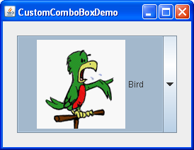
Here is a picture of an application that uses five radio buttons to let you choose which kind of pet is displayed:
Try this:
1. Click the Launch button to run the RadioButton Demo using Java™ Web Start (download JDK 7 or later).
2. Click the Dog button or press Alt-d.
The Dog button becomes selected, which makes the Bird button become unselected. The picture switches from a bird to a dog. This application has one action listener that listens to all the radio buttons. Each time the action listener receives an event, the application displays the picture for the radio button that was just clicked.
Each time the user clicks a radio button (even if it was already selected), the button fires an action event. One or two item events also occur — one from the button that was just selected, and another from the button that lost the selection (if any). Usually, you handle radio button clicks using an action listener.
Below is the code from RadioButtonDemo.java that creates the radio buttons in the previous example and reacts to clicks.
//In initialization code:
//Create the radio buttons.
JRadioButton birdButton = new JRadioButton(birdString);
birdButton.setMnemonic(KeyEvent.VK_B);
birdButton.setActionCommand(birdString);
birdButton.setSelected(true);
JRadioButton catButton = new JRadioButton(catString);
catButton.setMnemonic(KeyEvent.VK_C);
catButton.setActionCommand(catString);
JRadioButton dogButton = new JRadioButton(dogString);
dogButton.setMnemonic(KeyEvent.VK_D);
dogButton.setActionCommand(dogString);
JRadioButton rabbitButton = new JRadioButton(rabbitString);
rabbitButton.setMnemonic(KeyEvent.VK_R);
rabbitButton.setActionCommand(rabbitString);
JRadioButton pigButton = new JRadioButton(pigString);
pigButton.setMnemonic(KeyEvent.VK_P);
pigButton.setActionCommand(pigString);
//Group the radio buttons.
ButtonGroup group = new ButtonGroup();
group.add(birdButton);
group.add(catButton);
group.add(dogButton);
group.add(rabbitButton);
group.add(pigButton);
//Register a listener for the radio buttons.
birdButton.addActionListener(this);
catButton.addActionListener(this);
dogButton.addActionListener(this);
rabbitButton.addActionListener(this);
pigButton.addActionListener(this);
...
public void actionPerformed(ActionEvent e) {
picture.setIcon(new ImageIcon("images/"
+ e.getActionCommand()
+ ".gif"));
}
For each group of radio buttons, you need to create a ButtonGroup instance and add each radio button to it. The ButtonGroup takes care of unselecting the previously selected button when the user selects another button in the group.
You should generally initialize a group of radio buttons so that one is selected. However, the API doesn't enforce this rule — a group of radio buttons can have no initial selection. Once the user has made a selection, exactly one button is selected from then on.
◉ How to Use the ButtonGroup Component
The ButtonGroup component manages the selected/unselected state for a set of buttons. For the group, the ButtonGroup instance guarantees that only one button can be selected at a time.
Initially, all buttons managed by a ButtonGroup instance are unselected.
How to Use ButtonGroup Features
You can use ButtonGroup with any set of objects that inherit from AbstractButton. Typically a button group contains instances of JRadioButton, JRadioButtonMenuItem, or JToggleButton. It would not make sense to put an instance of JButton or JMenuItem in a button group because JButton and JMenuItem do not implement the select/deselect button state.
In general, you will typically follow these steps to write code that uses a ButtonGroup component.
1. Subclass JFrame
2. Call ContextPane together with a layout manager
3. Declare and configure a set of radio buttons or toggle buttons
4. Instantiate a ButtonGroup object
5. Call the add method on that buttongroup object in order to add each button to the group.
The ButtonGroup API
Commonly Used Button Group Constructors/Methods
| Constructor or Method | Purpose |
| ButtonGroup() | Create a ButtonGroup instance. |
| void add(AbstractButton) void remove(AbstractButton) |
Add a button to the group, or remove a button from the group. |
| public ButtonGroup getGroup() (in DefaultButtonModel) |
Get the ButtonGroup, if any, that controls a button. For example: ButtonGroup group = ((DefaultButtonModel)button.getModel()).getGroup(); |
| public ButtonGroup clearSelection() | Clears the state of selected buttons in the ButtonGroup. None of the buttons in the ButtonGroup are selected . |
ButtonGroup Examples
The following demonstration application uses the ButtonGroup component to group radio buttons displaying on a Window.
Example Where Described Notes
RadioButtonDemo How to Use Radio Buttons Uses radio buttons to determine which of five images it should display.
◉ How to Use Color Choosers
Use the JColorChooser class to enable users to choose from a palette of colors. A color chooser is a component that you can place anywhere within your program GUI. The JColorChooser API also makes it easy to bring up a dialog (modal or not) that contains a color chooser.
Here is a picture of an application that uses a color chooser to set the text color in a banner:

The source code for the program is in ColorChooserDemo.java.
The color chooser consists of everything within the box labeled Choose Text Color. This is what a standard color chooser looks like in the Java Look & Feel. It contains two parts, a tabbed pane and a preview panel. The three tabs in the tabbed pane select chooser panels. The preview panel below the tabbed pane displays the currently selected color.
Here is the code from the example that creates a JColorChooser instance and adds it to a container:
public class ColorChooserDemo extends JPanel ... {
public ColorChooserDemo() {
super(new BorderLayout());
banner = new JLabel("Welcome to the Tutorial Zone!",
JLabel.CENTER);
banner.setForeground(Color.yellow);
. . .
tcc = new JColorChooser(banner.getForeground());
. . .
add(tcc, BorderLayout.PAGE_END);
}
The JColorChooser constructor in the previous code snippet takes a Color argument, which specifies the chooser's initially selected color. If you do not specify the initial color, then the color chooser displays Color.white.
A color chooser uses an instance of ColorSelectionModel to contain and manage the current selection. The color selection model fires a change event whenever the user changes the color in the color chooser. The example program registers a change listener with the color selection model so that it can update the banner at the top of the window. The following code registers and implements the change listener:
tcc.getSelectionModel().addChangeListener(this);
. . .
public void stateChanged(ChangeEvent e) {
Color newColor = tcc.getColor();
banner.setForeground(newColor);
}
A basic color chooser, like the one used in the example program, is sufficient for many programs. However, the color chooser API allows you to customize a color chooser by providing it with a preview panel of your own design, by adding your own chooser panels to it, or by removing existing chooser panels from the color chooser. Additionally, the JColorChooser class provides two methods that make it easy to use a color chooser within a dialog.
The rest of this section discusses these topics:
Another Example: ColorChooserDemo2
Now let's turn our attention to ColorChooserDemo2, a modified version of the previous demo program that uses more of the JColorChooser API.
Try this:
Click the Launch button to run the ColorChooser Demo using Java™ Web Start (download the JDK).
Here is a picture of ColorChooserDemo2:
This program customizes the banner text color chooser in these ways:
- Removes the preview panel
- Removes all of the default chooser panels
- Adds a custom chooser panel
Removing or Replacing the Preview Panel covers the first customization. Creating a Custom Chooser Panel discusses the last two.
This program also adds a button that brings up a color chooser in a dialog, which you can use to set the banner background color.
Showing a Color Chooser in a Dialog
The JColorChooser class provides two class methods to make it easy to use a color chooser in a dialog. ColorChooserDemo2 uses one of these methods, showDialog, to display the background color chooser when the user clicks the Show Color Chooser... button. Here is the single line of code from the example that brings up the background color chooser in a dialog:
Color newColor = JColorChooser.showDialog(
ColorChooserDemo2.this,
"Choose Background Color",
banner.getBackground());
The first argument is the parent for the dialog, the second is the dialog title, and the third is the initially selected color.
The dialog disappears under three conditions: the user chooses a color and clicks the OK button, the user cancels the operation with the Cancel button, or the user dismisses the dialog with a frame control. If the user chooses a color, the showDialog method returns the new color. If the user cancels the operation or dismisses the window, the method returns null. Here is the code from the example that updates the banner background color according to the value returned by showDialog:
if (newColor != null) {
banner.setBackground(newColor);
}
The dialog created by showDialog is modal. If you want a non-modal dialog, you can use JColorChooser's createDialog method to create the dialog. This method also lets you specify action listeners for the OK and Cancel buttons in the dialog window. Use JDialog's show method to display the dialog created by this method.
Removing or Replacing the Preview Panel
By default, the color chooser displays a preview panel. ColorChooserDemo2 removes the text color chooser's preview panel with this line of code:
tcc.setPreviewPanel(new JPanel());
This effectively removes the preview panel because a plain JPanel has no size and no default view. To set the preview panel back to the default, use null as the argument to setPreviewPanel.
To provide a custom preview panel, you also use setPreviewPanel. The component you pass into the method should inherit from JComponent, specify a reasonable size, and provide a customized view of the current color. To get notified when the user changes the color in the color chooser, the preview panel must register as a change listener on the color chooser's color selection model as described previously.
Creating a Custom Chooser Panel
The default color chooser provides five chooser panels:
- Swatches — for choosing a color from a collection of swatches.
- HSV — for choosing a color using the Hue-Saturation-Value color representation. Prior to JDK 7, this was called HSB, for Hue-Saturation-Brightness.
- HSL — for choosing a color using the Hue-Saturation-Lightness color representation. This is new in JDK 7.
- RGB — for choosing a color using the Red-Green-Blue color model.
- CMYK — for choosing a color using the process color or four color model. This is new in JDK 7.
You can extend the default color chooser by adding chooser panels of your own design with addChooserPanel, or you can limit it by removing chooser panels with removeChooserPanel.
If you want to remove all of the default chooser panels and add one or more of your own, you can do this with a single call to setChooserPanels. ColorChooserDemo2 uses this method to replace the default chooser panels with an instance of CrayonPanel, a custom chooser panel. Here is the call to setChooserPanels from that example:
//Override the chooser panels with our own.
AbstractColorChooserPanel panels[] = { new CrayonPanel() };
tcc.setChooserPanels(panels);
The code is straighforward: it creates an array containing the CrayonPanel. Next the code calls setChooserPanels to set the contents of the array as the color chooser's chooser panels.
CrayonPanel is a subclass of AbstractColorChooserPanel and overrides the five abstract methods defined in its superclass:
void buildChooser()
Creates the GUI that comprises the chooser panel. The example creates four toggle buttons — one for each crayon — and adds them to the chooser panel.
void updateChooser()
This method is called whenever the chooser panel is displayed. The implementation of this method selects the toggle button that represents the currently selected color.
public void updateChooser() {
Color color = getColorFromModel();
if (Color.red.equals(color)) {
redCrayon.setSelected(true);
} else if (Color.yellow.equals(color)) {
yellowCrayon.setSelected(true);
} else if (Color.green.equals(color)) {
greenCrayon.setSelected(true);
} else if (Color.blue.equals(color)) {
blueCrayon.setSelected(true);
}
}
String getDisplayName()
Returns the display name of the chooser panel. The name is used on the tab for the chooser panel. Here is the example getDisplayName method:
public String getDisplayName() {
return "Crayons";
}
Icon getSmallDisplayIcon()
Returns a small icon to represent this chooser panel. This is currently unused. Future versions of the color chooser might use this icon or the large one to represent this chooser panel in the display. The example implementation of this method returns null.
Icon getLargeDisplayIcon()
Returns a large icon to represent this chooser panel. This is currently unused. Future versions of the color chooser might use this icon or the small one to represent this chooser panel in the display. The example implementation of this method returns null.
The Color Chooser API
The following tables list the commonly used JColorChooser constructors and methods. Other methods you might call are listed in the API tables in The JComponent Class. The API for using color choosers falls into these categories:
- Creating and Displaying the Color Chooser
- Customizing the Color Chooser GUI
- Setting or Getting the Current Color
Creating and Displaying the Color Chooser
| Method or Constructor | Purpose |
| JColorChooser() JColorChooser(Color) JColorChooser(ColorSelectionModel) |
Create a color chooser. The default constructor creates a color chooser with an initial color of Color.white. Use the second constructor to specify a different initial color. The ColorSelectionModel argument, when present, provides the color chooser with a color selection model. |
| Color showDialog(Component, String, Color) | Create and show a color chooser in a modal dialog. The Component argument is the parent of the dialog, the String argument specifies the dialog title, and the Color argument specifies the chooser's initial color. |
| JDialog createDialog(Component, String, boolean, JColorChooser, ActionListener, ActionListener) |
Create a dialog for the specified color chooser. As with showDialog, the Component argument is the parent of the dialog and the String argument specifies the dialog title. The other arguments are as follows: the boolean specifies whether the dialog is modal, the JColorChooser is the color chooser to display in the dialog, the first ActionListener is for the OK button, and the second is for the Cancel button. |
Customizing the Color Chooser's GUI
| Method | Purpose |
| void setPreviewPanel(JComponent) JComponent getPreviewPanel() |
Set or get the component used to preview the color selection. To remove the preview panel, use new JPanel() as an argument. To specify the default preview panel, use null. |
| void setChooserPanels(AbstractColorChooserPanel[]) AbstractColorChooserPanel[] getChooserPanels() |
Set or get the chooser panels in the color chooser. |
| void addChooserPanel(AbstractColorChooserPanel) AbstractColorChooserPanel removeChooserPanel(AbstractColorChooserPanel) |
Add a chooser panel to the color chooser or remove a chooser panel from it. |
| void setDragEnabled(boolean) boolean getDragEnabled() |
Set or get the dragEnabled property, which must be true to enable drag handling on this component. The default value is false. |
Setting or Getting the Current Color
| Method | Purpose |
| void setColor(Color) void setColor(int, int, int) void setColor(int) Color getColor() |
Set or get the currently selected color. The three integer version of the setColor method interprets the three integers together as an RGB color. The single integer version of the setColor method divides the integer into four 8-bit bytes and interprets the integer as an RGB color as follows: R G B |
| void setSelectionModel(ColorSelectionModel) ColorSelectionModel getSelectionModel() |
Set or get the selection model for the color chooser. This object contains the current selection and fires change events to registered listeners whenever the selection changes. |
Examples that Use Color Choosers
This table shows the examples that use JColorChooser and where those examples are described.
| Example | Where Described | Notes |
| ColorChooserDemo | This section | Uses a standard color chooser. |
| ColorChooserDemo2 | This section | Uses one customized color chooser and one standard color chooser in a dialog created with showDialog. |
| TableDialogEditDemo | How to Use Tables | Shows how to use a color chooser as a custom cell editor in a table. The color chooser used by this example is created with createDialog. |
| BasicDnD | Introduction to DnD | Uses a color chooser that is not in a dialog; demonstrates default drag-and-drop capabilities of Swing components, including color choosers. |
◉ How to Use Combo Boxes
A JComboBox, which lets the user choose one of several choices, can have two very different forms. The default form is the uneditable combo box, which features a button and a drop-down list of values. The second form, called the editable combo box, features a text field with a small button abutting it. The user can type a value in the text field or click the button to display a drop-down list. Here's what the two forms of combo boxes look like in the Java look and feel:
Uneditable combo box, before (top) and after the button is clicked
Editable combo box, before and after the arrow button is clicked
Combo boxes require little screen space, and their editable (text field) form is useful for letting the user quickly choose a value without limiting the user to the displayed values. Other components that can display one-of-many choices are groups of radio buttons and lists. Groups of radio buttons are generally the easiest for users to understand, but combo boxes can be more appropriate when space is limited or more than a few choices are available. Lists are not terribly attractive, but they're more appropriate than combo boxes when the number of items is large (say, over 20) or when selecting multiple items might be valid.
Using an Uneditable Combo Box
The application shown here uses an uneditable combo box for choosing a pet picture:
Try this:
1. Click the Launch button to run the ComboBox Demo using Java™ Web Start (download JDK 7 or later).
2. Choose an animal name from the combo box to view its picture.
3. Compare the operation and GUI of this program to one that uses radio buttons: run RadioButtonDemo (it requires release 6). You might want to compare the source code as well: ComboBoxDemo.java vs. RadioButtonDemo.java.
The following code, taken from ComboBoxDemo.java, creates an uneditable combo box and sets it up:
String[] petStrings = { "Bird", "Cat", "Dog", "Rabbit", "Pig" };
//Create the combo box, select item at index 4.
//Indices start at 0, so 4 specifies the pig.
JComboBox petList = new JComboBox(petStrings);
petList.setSelectedIndex(4);
petList.addActionListener(this);
This combo box contains an array of strings, but you could just as easily use icons instead. To put anything else into a combo box or to customize how the items in a combo box look, you need to write a custom renderer. An editable combo box would also need a custom editor.
The preceding code registers an action listener on the combo box. To see the action listener implementation and learn about other types of listeners supported by combo box, refer to Handling Events on a Combo Box.
No matter which constructor you use, a combo box uses a combo box model to contain and manage the items in its menu. When you initialize a combo box with an array or a vector, the combo box creates a default model object for you. As with other Swing components, you can customize a combo box in part by implementing a custom model — an object that implements the ComboBoxModel interface.
Note:
Be careful when implementing a custom model for a combo box. The JComboBox methods that change the items in the combo box's menu, such as insertItemAt, work only if the data model implements the MutableComboBoxModel interface (a subinterface of ComboBoxModel). Refer to the API tables to see which methods are affected.
Something else to watch out for — even for uneditable combo boxes — is ensuring that your custom model fires list data events when the combo box's data or state changes. Even immutable combo box models, whose data never changes, must fire a list data event (a CONTENTS_CHANGED event) when the selection changes. One way to get the list data event firing code for free is to make your combo box model a subclass of AbstractListModel.
Handling Events on a Combo Box
Here's the code from ComboBoxDemo.java that registers and implements an action listener on the combo box:
public class ComboBoxDemo ... implements ActionListener {
. . .
petList.addActionListener(this) {
. . .
public void actionPerformed(ActionEvent e) {
JComboBox cb = (JComboBox)e.getSource();
String petName = (String)cb.getSelectedItem();
updateLabel(petName);
}
. . .
}
This action listener gets the newly selected item from the combo box, uses it to compute the name of an image file, and updates a label to display the image. The combo box fires an action event when the user selects an item from the combo box's menu.
Combo boxes also generate item events, which are fired when any of the items' selection state changes. Only one item at a time can be selected in a combo box, so when the user makes a new selection the previously selected item becomes unselected. Thus two item events are fired each time the user selects a different item from the menu. If the user chooses the same item, no item events are fired. Use addItemListener to register an item listener on a combo box.
Although JComboBox inherits methods to register listeners for low-level events — focus, key, and mouse events, for example — we recommend that you don't listen for low-level events on a combo box. Here's why: A combo box is a compound component — it is comprised of two or more other components. The combo box itself fires high-level events such as action events. Its subcomponents fire low-level events such as mouse, key, and focus events. The low-level events and the subcomponent that fires them are look-and-feel-dependent. To avoid writing look-and-feel-dependent code, you should listen only for high-level events on a compound component such as a combo box.
Using an Editable Combo Box
Here's a picture of a demo application that uses an editable combo box to enter a pattern with which to format dates.
Try this:
1. Click the Launch button to run the ComboBox2 Demo using Java™ Web Start (download JDK 7 or later).
2. Enter a new pattern by choosing one from the combo box's menu. The program reformats the current date and time.
3. Enter a new pattern by typing one in and pressing Enter. Again the program reformats the current date and time.
The following code, taken from ComboBoxDemo2.java, creates and sets up the combo box:
String[] patternExamples = {
"dd MMMMM yyyy",
"dd.MM.yy",
"MM/dd/yy",
"yyyy.MM.dd G 'at' hh:mm:ss z",
"EEE, MMM d, ''yy",
"h:mm a",
"H:mm:ss:SSS",
"K:mm a,z",
"yyyy.MMMMM.dd GGG hh:mm aaa"
};
. . .
JComboBox patternList = new JComboBox(patternExamples);
patternList.setEditable(true);
patternList.addActionListener(this);
This code is very similar to the previous example, but warrants a few words of explanation. The bold line of code explicitly turns on editing to allow the user to type values in. This is necessary because, by default, a combo box is not editable. This particular example allows editing on the combo box because its menu does not provide all possible date formatting patterns, just shortcuts to frequently used patterns.
An editable combo box fires an action event when the user chooses an item from the menu and when the user types Enter. Note that the menu remains unchanged when the user enters a value into the combo box. If you want, you can easily write an action listener that adds a new item to the combo box's menu each time the user types in a unique value.
Providing a Custom Renderer
A combo box uses a renderer to display each item in its menu. If the combo box is uneditable, it also uses the renderer to display the currently selected item. An editable combo box, on the other hand, uses an editor to display the selected item. A renderer for a combo box must implement the ListCellRenderer interface. A combo box's editor must implement ComboBoxEditor. This section shows how to provide a custom renderer for an uneditable combo box.
The default renderer knows how to render strings and icons. If you put other objects in a combo box, the default renderer calls the toString method to provide a string to display. You can customize the way a combo box renders itself and its items by implementing your own ListCellRenderer.
Here's a picture of an application that uses a combo box with a custom renderer:
The following statements from the example create an instance of ComboBoxRenderer (a custom class) and set up the instance as the combo box's renderer:
JComboBox petList = new JComboBox(intArray);
. . .
ComboBoxRenderer renderer = new ComboBoxRenderer();
renderer.setPreferredSize(new Dimension(200, 130));
petList.setRenderer(renderer);
petList.setMaximumRowCount(3);
The last line sets the combo box's maximum row count, which determines the number of items visible when the menu is displayed. If the number of items in the combo box is larger than its maximum row count, the menu has a scroll bar. The icons are pretty big for a menu, so our code limits the number of rows to 3. Here's the implementation of ComboBoxRenderer, a renderer that puts an icon and text side-by-side:
class ComboBoxRenderer extends JLabel
implements ListCellRenderer {
. . .
public ComboBoxRenderer() {
setOpaque(true);
setHorizontalAlignment(CENTER);
setVerticalAlignment(CENTER);
}
/*
* This method finds the image and text corresponding
* to the selected value and returns the label, set up
* to display the text and image.
*/
public Component getListCellRendererComponent(
JList list,
Object value,
int index,
boolean isSelected,
boolean cellHasFocus) {
//Get the selected index. (The index param isn't
//always valid, so just use the value.)
int selectedIndex = ((Integer)value).intValue();
if (isSelected) {
setBackground(list.getSelectionBackground());
setForeground(list.getSelectionForeground());
} else {
setBackground(list.getBackground());
setForeground(list.getForeground());
}
//Set the icon and text. If icon was null, say so.
ImageIcon icon = images[selectedIndex];
String pet = petStrings[selectedIndex];
setIcon(icon);
if (icon != null) {
setText(pet);
setFont(list.getFont());
} else {
setUhOhText(pet + " (no image available)",
list.getFont());
}
return this;
}
. . .
}
As a ListCellRenderer, ComboBoxRenderer implements a method called getListCellRendererComponent, which returns a component whose paintComponent method is used to display the combo box and each of its items. The easiest way to display an image and an icon is to use a label. So ComboBoxRenderer is a subclass of label and returns itself. The implementation of getListCellRendererComponent configures the renderer to display the currently selected icon and its description.
These arguments are passed to getListCellRendererComponent:
- JList list — a list object used behind the scenes to display the items. The example uses this object's colors to set up foreground and background colors.
- Object value — the object to render. An Integer in this example.
- int index — the index of the object to render.
- boolean isSelected — indicates whether the object to render is selected. Used by the example to determine which colors to use.
- boolean cellHasFocus — indicates whether the object to render has the focus.
Note that combo boxes and lists use the same type of renderer — ListCellRenderer. You can save yourself some time by sharing renderers between combo boxes and lists, if it makes sense for your program.
The Combo Box API
The following tables list the commonly used JComboBox constructors and methods. Other methods you are most likely to invoke on a JComboBox object are those it inherits from its superclasses, such as setPreferredSize.
The API for using combo boxes falls into two categories:
- Setting or Getting the Items in the Combo Box's Menu
- Customizing the Combo Box's Operation
Setting or Getting the Items in the Combo Boxes's Menu
| Method | Purpose |
| JComboBox() JComboBox(ComboBoxModel) JComboBox(Object[]) JComboBox(Vector) |
Create a combo box with the specified items in its menu. A combo box created with the default constructor has no items in the menu initially. Each of the other constructors initializes the menu from its argument: a model object, an array of objects, or a Vector of objects. |
| void addItem(Object) void insertItemAt(Object, int) |
Add or insert the specified object into the combo box's menu. The insert method places the specified object at the specified index, thus inserting it before the object currently at that index. These methods require that the combo box's data model be an instance of MutableComboBoxModel. |
| Object getItemAt(int) Object getSelectedItem() |
Get an item from the combo box's menu. |
| void removeAllItems() void removeItemAt(int) void removeItem(Object) |
Remove one or more items from the combo box's menu. These methods require that the combo box's data model be an instance of MutableComboBoxModel. |
| int getItemCount() | Get the number of items in the combo box's menu. |
| void setModel(ComboBoxModel) ComboBoxModel getModel() |
Set or get the data model that provides the items in the combo box's menu. |
| void setAction(Action) Action getAction() |
Set or get the Action associated with the combo box. For further information, see How to Use Actions. |
Customizing the Combo Box's Operation
| Method | Purpose |
| void addActionListener(ActionListener) | Add an action listener to the combo box. The listener's actionPerformed method is called when the user selects an item from the combo box's menu or, in an editable combo box, when the user presses Enter. |
| void addItemListener(ItemListener) | Add an item listener to the combo box. The listener's itemStateChanged method is called when the selection state of any of the combo box's items change. |
| void setEditable(boolean) boolean isEditable() |
Set or get whether the user can type in the combo box. |
| void setRenderer(ListCellRenderer) ListCellRenderer getRenderer() |
Set or get the object responsible for painting the selected item in the combo box. The renderer is used only when the combo box is uneditable. If the combo box is editable, the editor is used to paint the selected item instead. |
| void setEditor(ComboBoxEditor) ComboBoxEditor getEditor() |
Set or get the object responsible for painting and editing the selected item in the combo box. The editor is used only when the combo box is editable. If the combo box is uneditable, the renderer is used to paint the selected item instead. |
Examples that Use Combo Boxes
This table shows the examples that use JComboBox and where those examples are described.
This table shows the examples that use JComboBox and where those examples are described.
| Example | Where Described | Notes |
| ComboBoxDemo | This section | Uses an uneditable combo box. |
| ComboBoxDemo2 | This section | Uses an editable combo box. |
| CustomComboBoxDemo | This section | Provides a custom renderer for a combo box. |
| TableRenderDemo | How to Use Tables | Shows how to use a combo box as a table cell editor. |
◉ How to Make Dialogs
A Dialog window is an independent subwindow meant to carry temporary notice apart from the main Swing Application Window. Most Dialogs present an error message or warning to a user, but Dialogs can present images, directory trees, or just about anything compatible with the main Swing Application that manages them.
For convenience, several Swing component classes can directly instantiate and display dialogs. To create simple, standard dialogs, you use the JOptionPane class. The ProgressMonitor class can put up a dialog that shows the progress of an operation. Two other classes, JColorChooser and JFileChooser, also supply standard dialogs. To bring up a print dialog, you can use the Printing API. To create a custom dialog, use the JDialog class directly.
The code for simple dialogs can be minimal. For example, here is an informational dialog:
Here is the code that creates and shows it:
JOptionPane.showMessageDialog(frame, "Eggs are not supposed to be green.");
An Overview of Dialogs
Every dialog is dependent on a Frame component. When that Frame is destroyed, so are its dependent Dialogs. When the frame is iconified, its dependent Dialogs also disappear from the screen. When the frame is deiconified, its dependent Dialogs return to the screen. A swing JDialog class inherits this behavior from the AWT Dialog class.
A Dialog can be modal. When a modal Dialog is visible, it blocks user input to all other windows in the program. JOptionPane creates JDialogs that are modal. To create a non-modal Dialog, you must use the JDialog class directly.
Starting with JDK 7, you can modify dialog window modality behavior using the new Modality API.
The JDialog class is a subclass of the AWT java.awt.Dialog class. It adds a root pane container and support for a default close operation to the Dialog object . These are the same features that JFrame has, and using JDialog directly is very similar to using JFrame. If you're going to use JDialog directly, then you should understand the material in Using Top-Level Containers and How to Make Frames, especially Responding to Window-Closing Events.
Even when you use JOptionPane to implement a dialog, you're still using a JDialog behind the scenes. The reason is that JOptionPane is simply a container that can automatically create a JDialog and add itself to the JDialog's content pane.
The DialogDemo Example
Here is a picture of an application that displays dialogs.

Try this:
1. Click the Launch button to run the Dialog Demo using Java™ Web Start (download JDK 7 or later). Alternatively, to compile and run the example yourself, consult the example index.Launches the DialogDemo example
2. Click the Show it! button.
A modal dialog will appear. Until you close it, the application will be unresponsive, although it will repaint itself if necessary. You can close the dialog either by clicking a button in the dialog or explicitly, such as by using the dialog window decorations.
3. In the More Dialogs pane, click the bottom radio button and then the Show it! button.
A non-modal dialog will appear. Note that the DialogDemo window remains fully functional while the non-modal dialog is up.
4. While the non-modal dialog is showing, iconify the DialogDemo window.
The dialog will disappear from the screen until you deiconify the DialogDemo window.
JOptionPane Features
Using JOptionPane, you can quickly create and customize several different kinds of dialogs. JOptionPane provides support for laying out standard dialogs, providing icons, specifying the dialog title and text, and customizing the button text. Other features allow you to customize the components the dialog displays and specify where the dialog should appear onscreen. You can even specify that an option pane put itself into an internal frame (JInternalFrame) instead of a JDialog.
When you create a JOptionPane, look-and-feel-specific code adds components to the JOptionPane and determines the layout of those components.
JOptionPane's icon support lets you easily specify which icon the dialog displays. You can use a custom icon, no icon at all, or any one of four standard JOptionPane icons (question, information, warning, and error). Each look and feel has its own versions of the four standard icons. The following figure shows the icons used in the Java (and Windows) look and feel.
Icons used by JOptionPane
| Icon description | Icon description | Windows look and feel |
| question |  |
 |
| information |  |
 |
| warning |  |
 |
| error |  |
 |
Creating and Showing Simple Dialogs
For most simple modal dialogs, you create and show the dialog using one of JOptionPane's showXxxDialog methods. If your dialog should be an internal frame, then add Internal after show — for example, showMessageDialog changes to showInternalMessageDialog. If you need to control the dialog window-closing behavior or if you do not want the dialog to be modal, then you should directly instantiate JOptionPane and add it to a JDialog instance. Then invoke setVisible(true) on the JDialog to make it appear.
The two most useful showXxxDialog methods are showMessageDialog and showOptionDialog. The showMessageDialog method displays a simple, one-button dialog. The showOptionDialog method displays a customized dialog — it can display a variety of buttons with customized button text, and can contain a standard text message or a collection of components.
The other two showXxxDialog methods are used less often. The showConfirmDialog method asks the user to confirm something, but presents standard button text (Yes/No or the localized equivalent, for example) rather than button text customized to the user situation (Start/Cancel, for example). A fourth method, showInputDialog, is designed to display a modal dialog that gets a string from the user, using either a text field, an uneditable combo box or a list.
Here are some examples, taken from DialogDemo.java, of using showMessageDialog, showOptionDialog, and the JOptionPane constructor. For more example code, see DialogDemo.java and the other programs listed in Examples that Use Dialogs.
showMessageDialog
Displays a modal dialog with one button, which is labeled "OK" (or the localized equivalent). You can easily specify the message, icon, and title that the dialog displays. Here are some examples of using showMessageDialog:


//default title and icon
JOptionPane.showMessageDialog(frame,
"Eggs are not supposed to be green.");
//custom title, warning icon
JOptionPane.showMessageDialog(frame,
"Eggs are not supposed to be green.",
"Inane warning",
JOptionPane.WARNING_MESSAGE);
//custom title, error icon
JOptionPane.showMessageDialog(frame,
"Eggs are not supposed to be green.",
"Inane error",
JOptionPane.ERROR_MESSAGE);
//custom title, no icon
JOptionPane.showMessageDialog(frame,
"Eggs are not supposed to be green.",
"A plain message",
JOptionPane.PLAIN_MESSAGE);
//custom title, custom icon
JOptionPane.showMessageDialog(frame,
"Eggs are not supposed to be green.",
"Inane custom dialog",
JOptionPane.INFORMATION_MESSAGE,
icon);
showOptionDialog
Displays a modal dialog with the specified buttons, icons, message, title, and so on. With this method, you can change the text that appears on the buttons of standard dialogs. You can also perform many other kinds of customization.
//Custom button text
Object[] options = {"Yes, please",
"No, thanks",
"No eggs, no ham!"};
int n = JOptionPane.showOptionDialog(frame,
"Would you like some green eggs to go "
+ "with that ham?",
"A Silly Question",
JOptionPane.YES_NO_CANCEL_OPTION,
JOptionPane.QUESTION_MESSAGE,
null,
options,
options[2]);
JOptionPane (constructor)
Creates a JOptionPane with the specified buttons, icons, message, title, and so on. You must then add the option pane to a JDialog, register a property-change listener on the option pane, and show the dialog.
final JOptionPane optionPane = new JOptionPane(
"The only way to close this dialog is by\n"
+ "pressing one of the following buttons.\n"
+ "Do you understand?",
JOptionPane.QUESTION_MESSAGE,
JOptionPane.YES_NO_OPTION);
The arguments to all of the showXxxDialog methods and JOptionPane constructors are standardized, though the number of arguments for each method and constructor varies. The following list describes each argument.
Component parentComponent
The first argument to each showXxxDialog method is always the parent component, which must be a Frame, a component inside a Frame, or null. If you specify a Frame or Dialog, then the Dialog will appear over the center of the Frame and follow the focus behavior of that Frame. If you specify a component inside a Frame, then the Dialog will appear over the center of that component and will follow the focus behavior of that component's Frame. If you specify null, then the look and feel will pick an appropriate position for the dialog — generally the center of the screen — and the Dialog will not necessarily follow the focus behavior of any visible Frame or Dialog.
The JOptionPane constructors do not include this argument. Instead, you specify the parent frame when you create the JDialog that contains the JOptionPane, and you use the JDialog setLocationRelativeTo method to set the dialog position.
Object message
This required argument specifies what the dialog should display in its main area. Generally, you specify a string, which results in the dialog displaying a label with the specified text. You can split the message over several lines by putting newline (\n) characters inside the message string. For example:
"Complete the sentence:\n \"Green eggs and...\""
String title
The title of the dialog.
int optionType
Specifies the set of buttons that appear at the bottom of the dialog. Choose from one of the following standard sets: DEFAULT_OPTION, YES_NO_OPTION, YES_NO_CANCEL_OPTION, OK_CANCEL_OPTION.
int messageType
This argument determines the icon displayed in the dialog. Choose from one of the following values: PLAIN_MESSAGE (no icon), ERROR_MESSAGE, INFORMATION_MESSAGE, WARNING_MESSAGE, QUESTION_MESSAGE.
Icon icon
The icon to display in the dialog.
Object[] options
Generally used to specify the string displayed by each button at the bottom of the dialog. See Customizing Button Text in a Standard Dialog for more information. Can also be used to specify icons to be displayed by the buttons or non-button components to be added to the button row.
Object initialValue
Specifies the default value to be selected.
You can either let the option pane display its default icon or specify the icon using the message type or icon argument. By default, an option pane created with showMessageDialog displays the information icon, one created with showConfirmDialog or showInputDialog displays the question icon, and one created with a JOptionPane constructor displays no icon. To specify that the dialog display a standard icon or no icon, specify the message type corresponding to the icon you desire. To specify a custom icon, use the icon argument. The icon argument takes precedence over the message type; as long as the icon argument has a non-null value, the dialog displays the specified icon.
Customizing Button Text
When you use JOptionPane to create a dialog, you can either use the standard button text (which might vary by look and feel and locale) or specify different text. By default, the option pane type determines how many buttons appear. For example, YES_NO_OPTION dialogs have two buttons, and YES_NO_CANCEL_OPTION dialogs have three buttons.
The following code, taken from DialogDemo.java, creates two Yes/No dialogs. The first dialog is implemented with showConfirmDialog, which uses the look-and-feel wording for the two buttons. The second dialog uses showOptionDialog so it can customize the wording. With the exception of wording changes, the dialogs are identical.
//default icon, custom title
int n = JOptionPane.showConfirmDialog(
frame,
"Would you like green eggs and ham?",
"An Inane Question",
JOptionPane.YES_NO_OPTION);
Object[] options = {"Yes, please",
"No way!"};
int n = JOptionPane.showOptionDialog(frame,
"Would you like green eggs and ham?",
"A Silly Question",
JOptionPane.YES_NO_OPTION,
JOptionPane.QUESTION_MESSAGE,
null, //do not use a custom Icon
options, //the titles of buttons
options[0]); //default button title
As the previous code snippets showed, the showMessageDialog, showConfirmDialog, and showOptionDialog methods return an integer indicating the user's choice. The values for this integer are YES_OPTION, NO_OPTION, CANCEL_OPTION, OK_OPTION, and CLOSED_OPTION. Except for CLOSED_OPTION, each option corresponds to the button the user pressed. When CLOSED_OPTION is returned, it indicates that the user closed the dialog window explicitly, rather than by choosing a button inside the option pane.
Even if you change the strings that the standard dialog buttons display, the return value is still one of the pre-defined integers. For example, a YES_NO_OPTION dialog always returns one of the following values: YES_OPTION, NO_OPTION, or CLOSED_OPTION.
Getting the User's Input from a Dialog
The only form of showXxxDialog that does not return an integer is showInputDialog, which returns an Object instead. This Object is generally a String reflecting the user's choice. Here is an example of using showInputDialog to create a dialog that lets the user choose one of three strings:
Object[] possibilities = {"ham", "spam", "yam"};
String s = (String)JOptionPane.showInputDialog(
frame,
"Complete the sentence:\n"
+ "\"Green eggs and...\"",
"Customized Dialog",
JOptionPane.PLAIN_MESSAGE,
icon,
possibilities,
"ham");
//If a string was returned, say so.
if ((s != null) && (s.length() > 0)) {
setLabel("Green eggs and... " + s + "!");
return;
}
//If you're here, the return value was null/empty.
setLabel("Come on, finish the sentence!");
If you do not care to limit the user's choices, you can either use a form of the showInputDialog method that takes fewer arguments or specify null for the array of objects. In the Java look and feel, substituting null for possibilities results in a dialog that has a text field and looks like this:
Because the user can type anything into the text field, you might want to check the returned value and ask the user to try again if it is invalid. Another approach is to create a custom dialog that validates the user-entered data before it returns.
If you're designing a custom dialog, you need to design your dialog's API so that you can query the dialog about what the user chose. For example, CustomDialog has a getValidatedText method that returns the text the user entered.
Stopping Automatic Dialog Closing
By default, when the user clicks a JOptionPane-created button, the dialog closes. But what if you want to check the user's answer before closing the dialog? In this case, you must implement your own property change listener so that when the user clicks a button, the dialog does not automatically close.
DialogDemo contains two dialogs that implement a property change listener. One of these dialogs is a custom modal dialog, implemented in CustomDialog, that uses JOptionPane both to get the standard icon and to get layout assistance. The other dialog, whose code is below, uses a standard Yes/No JOptionPane. Though this dialog is rather useless as written, its code is simple enough that you can use it as a template for more complex dialogs.
Besides setting the property change listener, the following code also calls the JDialog's setDefaultCloseOperation method and implements a window listener that handles the window close attempt properly. If you do not care to be notified when the user closes the window explicitly, then ignore the bold code.
final JOptionPane optionPane = new JOptionPane(
"The only way to close this dialog is by\n"
+ "pressing one of the following buttons.\n"
+ "Do you understand?",
JOptionPane.QUESTION_MESSAGE,
JOptionPane.YES_NO_OPTION);
final JDialog dialog = new JDialog(frame,
"Click a button",
true);
dialog.setContentPane(optionPane);
dialog.setDefaultCloseOperation(
JDialog.DO_NOTHING_ON_CLOSE);
dialog.addWindowListener(new WindowAdapter() {
public void windowClosing(WindowEvent we) {
setLabel("Thwarted user attempt to close window.");
}
});
optionPane.addPropertyChangeListener(
new PropertyChangeListener() {
public void propertyChange(PropertyChangeEvent e) {
String prop = e.getPropertyName();
if (dialog.isVisible()
&& (e.getSource() == optionPane)
&& (prop.equals(JOptionPane.VALUE_PROPERTY))) {
//If you were going to check something
//before closing the window, you'd do
//it here.
dialog.setVisible(false);
}
}
});
dialog.pack();
dialog.setVisible(true);
int value = ((Integer)optionPane.getValue()).intValue();
if (value == JOptionPane.YES_OPTION) {
setLabel("Good.");
} else if (value == JOptionPane.NO_OPTION) {
setLabel("Try using the window decorations "
+ "to close the non-auto-closing dialog. "
+ "You can't!");
}
The Dialog API
The following tables list the commonly used JOptionPane and JDialog constructors and methods. Other methods you're likely to call are defined by the Dialog, Window and Component classes and include pack, setSize, and setVisible.
The API is listed as follows:
◉ Showing Standard Modal Dialogs (using JOptionPane Class Methods)
◉ Methods for Using JOptionPanes Directly
◉ Frequently Used JDialog Constructors and Methods
Showing Standard Modal Dialogs (Using JOptionPane Class Methods)
| Method | Purpose |
| static void showMessageDialog(Component, Object) static void showMessageDialog(Component, Object, String, int) static void showMessageDialog(Component, Object, String, int, Icon) |
Show a one-button, modal dialog that gives the user some information. The arguments specify (in order) the parent component, message, title, message type, and icon for the dialog. |
| static int showOptionDialog(Component, Object, String, int, int, Icon, Object[], Object) | Show a customized modal dialog. The arguments specify (in order) the parent component, message, title, option type, message type, icon, options, and initial value for the dialog. |
| static int showConfirmDialog(Component, Object) static int showConfirmDialog(Component, Object, String, int) static int showConfirmDialog(Component, Object, String, int, int) static int showConfirmDialog(Component, Object, String, int, int, Icon) |
Show a modal dialog that asks the user a question. The arguments specify (in order) the parent component, message, title, option type, message type, and icon for the dialog. |
| static String showInputDialog(Object) static String showInputDialog(Component, Object) static String showInputDialog(Component, Object, String, int) static String showInputDialog(Component, Object, String, int, Icon, Object[], Object) |
Show a modal dialog that prompts the user for input. The single-argument version specifies just the message, with the parent component assumed to be null. The arguments for the other versions specify (in order) the parent component, message, title, message type, icon, options, and initial value for the dialog. |
| static void showInternalMessageDialog(...) static void showInternalOptionDialog(...) static void showInternalConfirmDialog(...) static String showInternalInputDialog(...) |
Implement a standard dialog as an internal frame. |
Methods for Using JOptionPanes Directly
| Method or Constructor | Purpose |
| JOptionPane() JOptionPane(Object) JOptionPane(Object, int) JOptionPane(Object, int, int) JOptionPane(Object, int, int, Icon) JOptionPane(Object, int, int, Icon, Object[]) JOptionPane(Object, int, int, Icon, Object[], Object) |
Creates a JOptionPane instance. |
| static Frame getFrameForComponent(Component) static JDesktopPane getDesktopPaneForComponent(Component) |
static Frame getFrameForComponent(Component) static JDesktopPane getDesktopPaneForComponent(Component) |
| int getMaxCharactersPerLineCount() | Determines where line breaks will be automatically inserted in the option pane text. (The default is Integer.MAX_VALUE.) To use this method, you must create a JOptionPane subclass. For example, the following code results in an option pane with one word per line, due to the fact that each word in the string is 5 characters or less: JOptionPane op = new JOptionPane("This is the text.") { public int getMaxCharactersPerLineCount() { return 5; } }; |
Frequently Used JDialog Constructors and Methods
| Method or Constructor | Purpose |
| JDialog() JDialog(Dialog) JDialog(Dialog, boolean) JDialog(Dialog, String) JDialog(Dialog, String, boolean) JDialog(Dialog, String, boolean, GraphicsConfiguration) JDialog(Frame) JDialog(Frame, boolean) JDialog(Frame, String) JDialog(Frame, String, boolean) JDialog(Frame, String, boolean, GraphicsConfiguration) JDialog(Window owner) JDialog(Window owner, Dialog.ModalityType modalityType) JDialog(Window owner, String title) JDialog(Window owner, String title, Dialog.ModalityType modalityType) JDialog(Window owner, String title, Dialog.ModalityType modalityType, GraphicsConfiguration gc) |
Creates a JDialog instance. The Frame argument, if any, is the frame (usually a JFrame object) that the dialog depends on. Make the boolean argument true to specify a modal dialog, false or absent to specify a non-modal dialog. You can also specify the title of the dialog, using a string argument. |
| void setContentPane(Container) Container getContentPane() |
Get and set the content pane, which is usually the container of all the dialog's components |
| void setDefaultCloseOperation(int) int getDefaultCloseOperation() |
Get and set what happens when the user tries to close the dialog. Possible values: DISPOSE_ON_CLOSE, DO_NOTHING_ON_CLOSE, HIDE_ON_CLOSE (the default). |
| void setLocationRelativeTo(Component) | Centers the dialog over the specified component. |
| static void setDefaultLookAndFeelDecorated(boolean) static boolean isDefaultLookAndFeelDecorated() |
Set or get a hint as to whether the dialog's window decorations (such as borders, or widgets to close the window) should be provided by the current look and feel. Otherwise the dialog's decorations will be provided by the current window manager. |
Examples that Use Dialogs
This table lists examples that use JOptionPane or JDialog.
| Example | Where Described | Notes |
| DialogDemo, CustomDialog |
This section | Creates many kinds of dialogs, using JOptionPane and JDialog. |
| Framework | - | Brings up a confirmation dialog when the user selects the Quit menu item. |
| ListDialog | How to Use BoxLayout | Implements a modal dialog containing a scrolling list and two buttons. Does not use JOptionPane, except for the utility method getFrameForComponent. |
◉ How to Use Editor Panes and Text Panes
Two Swing classes support styled text: JEditorPane and its subclass JTextPane. The JEditorPane class is the foundation for Swing's styled text components and provides a mechanism through which you can add support for custom text formats. If you want unstyled text, use a text area instead.
You can see an editor pane and a text pane in use by running TextSamplerDemo. Here is a picture of the TextSamplerDemo example.
Click the Launch button to run TextSamplerDemo using Java™ Web Start (download JDK 7 or later).
The TextSamplerDemo example barely begins to demonstrate the capabilities of editor panes and text panes. However, the top right editor pane illustrates a handy, easy-to-use feature: it displays uneditable help information loaded from a URL. The text pane at the lower right demonstrates that you can easily embed images and even components directly into text panes.
Note: If you need a fully-fledged help system, take a look at the javahelp project.
The Swing text API is powerful and immense, and we could devote an entire book just to using editor panes and text panes. This section introduces their capabilities, offers hints on which one you might want to use, and points to other sources of information.
◉ Using an Editor Pane to Display Text From a URL
◉ Editor Panes vs. Text Panes
◉ An Example of Using a Text Pane
◉ The Editor Pane and Text Pane API
◉ Examples That Use Editor Panes and Text Panes
Using an Editor Pane to Display Text From a URL
One task that you can accomplish without knowing anything about the Swing text system is displaying text from a URL. Here is the code from TextSamplerDemo.java that creates an uneditable editor pane that displays text formatted with HTML tags.
JEditorPane editorPane = new JEditorPane();
editorPane.setEditable(false);
java.net.URL helpURL = TextSamplerDemo.class.getResource(
"TextSamplerDemoHelp.html");
if (helpURL != null) {
try {
editorPane.setPage(helpURL);
} catch (IOException e) {
System.err.println("Attempted to read a bad URL: " + helpURL);
}
} else {
System.err.println("Couldn't find file: TextSamplerDemoHelp.html");
}
//Put the editor pane in a scroll pane.
JScrollPane editorScrollPane = new JScrollPane(editorPane);
editorScrollPane.setVerticalScrollBarPolicy(
JScrollPane.VERTICAL_SCROLLBAR_ALWAYS);
editorScrollPane.setPreferredSize(new Dimension(250, 145));
editorScrollPane.setMinimumSize(new Dimension(10, 10));
The code uses the default constructor to create the editor pane, then calls setEditable(false) so the user cannot edit the text. Next, the code creates the URL object, and calls the setPage method with it.
The setPage method opens the resource pointed to by the URL and figures out the format of the text (which is HTML in the example). If the text format is known, the editor pane initializes itself with the text found at the URL. A standard editor pane can understand plain text, HTML, and RTF. Note that the page might be loaded asynchronously, which keeps the GUI responsive but means that you should not count on the data being completely loaded after the call to setPage returns.
Editor Panes vs. Text Panes
In order to use editor panes and text panes, you need to understand the text system, which is described in Text Component Features. Several facts about editor panes and text panes are scattered throughout that section. Here we list the facts again and provide a bit more detail. The information here should help you understand the differences between editor panes and text panes, and when to use which.
◉ An editor pane or a text pane can easily be loaded with text from a URL using the setPage method. The JEditorPane class also provides constructors that let you initialize an editor pane from a URL. The JTextPane class has no such constructors.
Be aware that the document and editor kit might change when using the setPage method. For example, if an editor pane contains plain text (the default), and you load it with HTML, the document will change to an HTMLDocument instance and the editor kit will change to an HTMLEditorKit instance. If your program uses the setPage method, make sure you adjust your code for possible changes to the pane's document and editor kit instances (re-register document listeners on the new document, and so on).
◉ Editor panes, by default, know how to read, write, and edit plain, HTML, and RTF text. Text panes inherit this capability but impose certain limitations. A text pane insists that its document implement the StyledDocument interface. HTMLDocument and RTFDocument are both StyledDocuments so HTML and RTF work as expected within a text pane. If you load a text pane with plain text though, the text pane's document is not a PlainDocument as you might expect, but a DefaultStyledDocument.
◉ To support a custom text format, implement an editor kit that can read, write, and edit text of that format. Then call the registerEditorKitForContentType method to register your kit with the JEditorPane class. By registering an editor kit in this way, all editor panes and text panes in your program will be able to read, write, and edit the new format. However, if the new editor kit is not a StyledEditorKit, text panes will not support the new format.
◉ As mentioned previously, a text pane requires its document to implement the StyledDocument interface. The Swing text package provides a default implementation of this interface, DefaultStyledDocument, which is the document that text panes use by default. A text pane also requires that its editor kit be an instance of a StyledEditorKit (or a subclass). Be aware that the read and write methods for StyleEditorKit work with plain text.
◉ Through their styled document and styled editor kit, text panes provide support for named styles and logical styles. The JTextPane class itself contains many methods for working with styles that simply call methods in its document or editor kit.
◉ Through the API provided in the JTextPane class, you can embed images and components in a text pane. You can embed images in an editor pane, too, but only by including the images in an HTML or RTF file.
An Example of Using a Text Pane
Here is the code from the TextSamplerDemo example that creates and initializes a text pane.
String[] initString =
{ /* ... fill array with initial text ... */ };
String[] initStyles =
{ /* ... fill array with names of styles ... */ };
JTextPane textPane = new JTextPane();
StyledDocument doc = textPane.getStyledDocument();
addStylesToDocument(doc);
//Load the text pane with styled text.
try {
for (int i=0; i < initString.length; i++) {
doc.insertString(doc.getLength(), initString[i],
doc.getStyle(initStyles[i]));
}
} catch (BadLocationException ble) {
System.err.println("Couldn't insert initial text into text pane.");
}
Briefly, this code hard-codes the initial text into an array and creates and hard-codes several styles — objects that represent different paragraph and character formats — into another array. Next, the code loops over the arrays, inserts the text into the text pane, and specifies the style to use for the inserted text.
Although this is an interesting example that concisely demonstrates several features of JTextPane, "real-world" programs aren't likely to initialize a text pane this way. Instead, a program would use an editor pane to save a document which would then be used to initialize the text pane.
The Editor Pane and Text Pane API
This section lists some of the API related to text and editor panes. Many of the most useful methods for JEditorPane and its subclass JTextPane are inherited from the JTextComponent class. You can find the API tables for JTextComponent in The Text Component API.
JEditorPane API for Displaying Text from a URL
| Method or Constructor | Description |
| JEditorPane(URL) JEditorPane(String) |
Creates an editor pane loaded with the text at the specified URL. |
| setPage(URL) setPage(String) |
Loads an editor pane (or text pane) with the text at the specified URL. |
| URL getPage() | Gets the URL for the editor pane's (or text pane's) current page. |
JTextPane API
| Method or Constructor | Description |
| JTextPane() JTextPane(StyledDocument) |
Creates a text pane. The optional argument specifies the text pane's model. |
| StyledDocument getStyledDocument setStyledDocument(StyledDocument) |
Gets or sets the text pane's model. |
Examples That Use Text Panes and Editor Panes
To begin using text, you might want to run these programs and examine their code to find something similar to what you want to do.
| Example | Where Described | Notes |
| TextSamplerDemo | Using Text Components | Uses each Swing text component. |
| TextComponentDemo | Text Component Features | Provides a customized text pane. Illustrates many text component features, such as undo and redo, document filters, document listeners, caret change listeners, and how to associate editing actions with menus and key strokes. |
| TreeDemo | How to Use Trees | Uses an editor pane to display help loaded from an HTML file. |
◉ How to Use File Choosers
File choosers provide a GUI for navigating the file system, and then either choosing a file or directory from a list, or entering the name of a file or directory. To display a file chooser, you usually use the JFileChooser API to show a modal dialog containing the file chooser. Another way to present a file chooser is to add an instance of JFileChooser to a container.
Note: If you intend to distribute your program as a sandbox Java Web Start application, then instead of using the JFileChooser API you should use the file services provided by the JNLP API. These services — FileOpenService and FileSaveService — not only provide support for choosing files in a restricted environment, but also take care of actually opening and saving them.
When working with the JWSFileChooserDemo example, be careful not to lose files that you need. Whenever you click the save button and select an existing file, this demo brings up the File Exists dialog box with a request to replace the file. Accepting the request overwrites the file.
The rest of this section discusses how to use the JFileChooser API. A JFileChooser object only presents the GUI for choosing files. Your program is responsible for doing something with the chosen file, such as opening or saving it.
The JFileChooser API makes it easy to bring up open and save dialogs. The type of look and feel determines what these standard dialogs look like and how they differ. In the Java look and feel, the save dialog looks the same as the open dialog, except for the title on the dialog's window and the text on the button that approves the operation. Here is a picture of a standard open dialog in the Java look and feel:
Here is a picture of an application called FileChooserDemo that brings up an open dialog and a save dialog.
Try this:
1. Compile and run the example, consult the example index.
2. Click the Open a File button. Navigate around the file chooser, choose a file, and click the dialog's Open button.
3. Use the Save a File button to bring up a save dialog. Try to use all of the controls on the file chooser.
4. In the source file FileChooserDemo.java, change the file selection mode to directories-only mode. (Search for DIRECTORIES_ONLY and uncomment the line that contains it.) Then compile and run the example again. You will only be able to see and select directories, not ordinary files.
Bringing up a standard open dialog requires only two lines of code:
//Create a file chooser
final JFileChooser fc = new JFileChooser();
...
//In response to a button click:
int returnVal = fc.showOpenDialog(aComponent);
The argument to the showOpenDialog method specifies the parent component for the dialog. The parent component affects the position of the dialog and the frame that the dialog depends on. For example, the Java look and feel places the dialog directly over the parent component. If the parent component is in a frame, then the dialog is dependent on that frame. This dialog disappears when the frame is minimized and reappears when the frame is maximized.
By default, a file chooser that has not been shown before displays all files in the user's home directory. You can specify the file chooser's initial directory by using one of JFileChooser's other constructors, or you can set the directory with the setCurrentDirectory method.
The call to showOpenDialog appears in the actionPerformed method of the Open a File button's action listener:
public void actionPerformed(ActionEvent e) {
//Handle open button action.
if (e.getSource() == openButton) {
int returnVal = fc.showOpenDialog(FileChooserDemo.this);
if (returnVal == JFileChooser.APPROVE_OPTION) {
File file = fc.getSelectedFile();
//This is where a real application would open the file.
log.append("Opening: " + file.getName() + "." + newline);
} else {
log.append("Open command cancelled by user." + newline);
}
} ...
}
The showXxxDialog methods return an integer that indicates whether the user selected a file. Depending on how you use a file chooser, it is often sufficient to check whether the return value is APPROVE_OPTION and then not to change any other value. To get the chosen file (or directory, if you set up the file chooser to allow directory selections), call the getSelectedFile method on the file chooser. This method returns an instance of File.
The example obtains the name of the file and uses it in the log message. You can call other methods on the File object, such as getPath, isDirectory, or exists to obtain information about the file. You can also call other methods such as delete and rename to change the file in some way. Of course, you might also want to open or save the file by using one of the reader or writer classes provided by the Java platform. See Basic I/O for information about using readers and writers to read and write data to the file system.
The example program uses the same instance of the JFileChooser class to display a standard save dialog. This time the program calls showSaveDialog:
int returnVal = fc.showSaveDialog(FileChooserDemo.this);
By using the same file chooser instance to display its open and save dialogs, the program reaps the following benefits:
◉ The chooser remembers the current directory between uses, so the open and save versions automatically share the same current directory.
◉ You have to customize only one file chooser, and the customizations apply to both the open and save versions.
Finally, the example program has commented-out lines of code that let you change the file selection mode. For example, the following line of code makes the file chooser able to select only directories, and not files:
fc.setFileSelectionMode(JFileChooser.DIRECTORIES_ONLY);
Another possible selection mode is FILES_AND_DIRECTORIES. The default is FILES_ONLY. The following picture shows an open dialog with the file selection mode set to DIRECTORIES_ONLY. Note that, in the Java look and feel at least, only directories are visible — not files.
If you want to create a file chooser for a task other than opening or saving, or if you want to customize the file chooser, keep reading. We will discuss the following topics:
Another Example: FileChooserDemo2
Let us look at FileChooserDemo2 example, a modified version of the previous demo program that uses more of the JFileChooser API. This example uses a file chooser that has been customized in several ways. Like the original example, the user invokes a file chooser with the push of a button. Here is a picture of the file chooser:
As the figure shows, this file chooser has been customized for a special task (Attach), provides a user-choosable file filter (Just Images), uses a special file view for image files, and has an accessory component that displays a thumbnail sketch of the currently selected image file.
The remainder of this section shows you the code that creates and customizes this file chooser. See the example index for links to all the files required by this example.
Using a File Chooser for a Custom Task
As you have seen, the JFileChooser class provides the showOpenDialog method for displaying an open dialog and the showSaveDialog method for displaying a save dialog.
The class has another method, showDialog, for displaying a file chooser for a custom task in a dialog. In the Java look and feel, the only difference between this dialog and the other file chooser dialogs is the title on the dialog window and the label on the approve button. Here is the code from FileChooserDemo2 that brings up the file chooser dialog for the Attach task:
JFileChooser fc = new JFileChooser();
int returnVal = fc.showDialog(FileChooserDemo2.this, "Attach");
The first argument to the showDialog method is the parent component for the dialog. The second argument is a String object that provides both the title for the dialog window and the label for the approve button.
Once again, the file chooser doesn't do anything with the selected file. The program is responsible for implementing the custom task for which the file chooser was created.
Filtering the List of Files
By default, a file chooser displays all of the files and directories that it detects, except for hidden files. A program can apply one or more file filters to a file chooser so that the chooser shows only some files. The file chooser calls the filter's accept method for each file to determine whether it should be displayed. A file filter accepts or rejects a file based on criteria such as file type, size, ownership, and so on. Filters affect the list of files displayed by the file chooser. The user can enter the name of any file even if it is not displayed.
JFileChooser supports three different kinds of filtering. The filters are checked in the order listed here. For example, an application-controlled filter sees only those files accepted by the built-in filtering.
Built-in filtering
Filtering is set up through specific method calls on a file chooser. Currently the only built-in filter available is for hidden files, such as those whose names begin with period (.) on UNIX systems. By default, hidden files are not shown. Call setFileHidingEnabled(false) to show hidden files.
Application-controlled filtering
The application determines which files are shown. Create a custom subclass of FileFilter, instantiate it, and use the instance as an argument to the setFileFilter method. The installed filter is displayed on the list of user-choosable filters. The file chooser shows only those files that the filter accepts.
User-choosable filtering
The file chooser GUI provides a list of filters that the user can choose from. When the user chooses a filter, the file chooser shows only those files accepted by that filter. FileChooserDemo2 adds a custom file filter to the list of user-choosable filters:
fc.addChoosableFileFilter(new ImageFilter());
By default, the list of user-choosable filters includes the Accept All filter, which enables the user to see all non-hidden files. This example uses the following code to disable the Accept All filter:
fc.setAcceptAllFileFilterUsed(false);
Our custom file filter is implemented in ImageFilter.java and is a subclass of FileFilter. The ImageFilter class implements the getDescription method to return "Just Images" — a string to put in the list of user-choosable filters. ImageFilter also implements the accept method so that it accepts all directories and any file that has a .png, .jpg, .jpeg, .gif, .tif, or .tiff filename extension.
public boolean accept(File f) {
if (f.isDirectory()) {
return true;
}
String extension = Utils.getExtension(f);
if (extension != null) {
if (extension.equals(Utils.tiff) ||
extension.equals(Utils.tif) ||
extension.equals(Utils.gif) ||
extension.equals(Utils.jpeg) ||
extension.equals(Utils.jpg) ||
extension.equals(Utils.png)) {
return true;
} else {
return false;
}
}
return false;
}
By accepting all directories, this filter allows the user to navigate around the file system. If the bold lines were omitted from this method, the user would be limited to the directory with which the chooser was initialized.
The preceding code sample uses the getExtension method and several string constants from Utils.java, shown here:
public class Utils {
public final static String jpeg = "jpeg";
public final static String jpg = "jpg";
public final static String gif = "gif";
public final static String tiff = "tiff";
public final static String tif = "tif";
public final static String png = "png";
/*
* Get the extension of a file.
*/
public static String getExtension(File f) {
String ext = null;
String s = f.getName();
int i = s.lastIndexOf('.');
if (i > 0 && i < s.length() - 1) {
ext = s.substring(i+1).toLowerCase();
}
return ext;
}
}
Customizing the File View
In the Java look and feel, the chooser's list shows each file's name and displays a small icon that represents whether the file is a true file or a directory. You can customize this file view by creating a custom subclass of FileView and using an instance of the class as an argument to the setFileView method. The example uses an instance of a custom class, implemented in ImageFileView.java, as the file chooser's file view.
fc.setFileView(new ImageFileView());
The ImageFileView class shows a different icon for each type of image accepted by the image filter described previously.
The ImageFileView class overrides the five abstract methods defined in the FileView as follows.
String getTypeDescription(File f)
Returns a description of the file type. Here is ImageFileView's implementation of this method:
public String getTypeDescription(File f) {
String extension = Utils.getExtension(f);
String type = null;
if (extension != null) {
if (extension.equals(Utils.jpeg) ||
extension.equals(Utils.jpg)) {
type = "JPEG Image";
} else if (extension.equals(Utils.gif)){
type = "GIF Image";
} else if (extension.equals(Utils.tiff) ||
extension.equals(Utils.tif)) {
type = "TIFF Image";
} else if (extension.equals(Utils.png)){
type = "PNG Image";
}
}
return type;
}
Icon getIcon(File f)
Returns an icon representing the file or its type. Here is ImageFileView's implementation of this method:
public Icon getIcon(File f) {
String extension = Utils.getExtension(f);
Icon icon = null;
if (extension != null) {
if (extension.equals(Utils.jpeg) ||
extension.equals(Utils.jpg)) {
icon = jpgIcon;
} else if (extension.equals(Utils.gif)) {
icon = gifIcon;
} else if (extension.equals(Utils.tiff) ||
extension.equals(Utils.tif)) {
icon = tiffIcon;
} else if (extension.equals(Utils.png)) {
icon = pngIcon;
}
}
return icon;
}
String getName(File f)
Returns the name of the file. Most implementations of this method should return null to indicate that the look and feel should figure it out. Another common implementation returns f.getName().
String getDescription(File f)
Returns a description of the file. The intent is to describe individual files more specifically. A common implementation of this method returns null to indicate that the look and feel should figure it out.
Boolean isTraversable(File f)
Returns whether a directory is traversable. Most implementations of this method should return null to indicate that the look and feel should figure it out. Some applications might want to prevent users from descending into a certain type of directory because it represents a compound document. The isTraversable method should never return true for a non-directory.
Providing an Accessory Component
The customized file chooser in FileChooserDemo2 has an accessory component. If the currently selected item is a PNG, JPEG, TIFF, or GIF image, the accessory component displays a thumbnail sketch of the image. Otherwise, the accessory component is empty. Aside from a previewer, probably the most common use for the accessory component is a panel with more controls on it such as checkboxes that toggle between features.
The example calls the setAccessory method to establish an instance of the ImagePreview class, implemented in ImagePreview.java, as the chooser's accessory component:
fc.setAccessory(new ImagePreview(fc));
Any object that inherits from the JComponent class can be an accessory component. The component should have a preferred size that looks good in the file chooser.
The file chooser fires a property change event when the user selects an item in the list. A program with an accessory component must register to receive these events to update the accessory component whenever the selection changes. In the example, the ImagePreview object itself registers for these events. This keeps all the code related to the accessory component together in one class.
Here is the example's implementation of the propertyChange method, which is the method called when a property change event is fired:
//where member variables are declared
File file = null;
...
public void propertyChange(PropertyChangeEvent e) {
boolean update = false;
String prop = e.getPropertyName();
//If the directory changed, don't show an image.
if (JFileChooser.DIRECTORY_CHANGED_PROPERTY.equals(prop)) {
file = null;
update = true;
//If a file became selected, find out which one.
} else if (JFileChooser.SELECTED_FILE_CHANGED_PROPERTY.equals(prop)) {
file = (File) e.getNewValue();
update = true;
}
//Update the preview accordingly.
if (update) {
thumbnail = null;
if (isShowing()) {
loadImage();
repaint();
}
}
}
If SELECTED_FILE_CHANGED_PROPERTY is the property that changed, this method obtains a File object from the file chooser. The loadImage and repaint methods use the File object to load the image and repaint the accessory component.
The File Chooser API
The API for using file choosers falls into these categories:
Creating and Showing the File Chooser
| Method or Constructor | Purpose |
| JFileChooser() JFileChooser(File) JFileChooser(String) |
Creates a file chooser instance. The File and String arguments, when present, provide the initial directory. |
| int showOpenDialog(Component) int showSaveDialog(Component) int showDialog(Component, String) |
Shows a modal dialog containing the file chooser. These methods return APPROVE_OPTION if the user approved the operation and CANCEL_OPTION if the user cancelled it. Another possible return value is ERROR_OPTION, which means an unanticipated error occurred. |
Selecting Files and Directories
| Method | Purpose |
| void setSelectedFile(File) File getSelectedFile() |
Sets or obtains the currently selected file or (if directory selection has been enabled) directory. |
| void setSelectedFiles(File[]) File[] getSelectedFiles() |
Sets or obtains the currently selected files if the file chooser is set to allow multiple selection. |
| void setFileSelectionMode(int) void getFileSelectionMode() boolean isDirectorySelectionEnabled() boolean isFileSelectionEnabled() |
Sets or obtains the file selection mode. Acceptable values are FILES_ONLY (the default), DIRECTORIES_ONLY, and FILES_AND_DIRECTORIES. Interprets whether directories or files are selectable according to the current selection mode. |
| void setMultiSelectionEnabled(boolean) boolean isMultiSelectionEnabled() |
Sets or interprets whether multiple files can be selected at once. By default, a user can choose only one file. |
| void setAcceptAllFileFilterUsed(boolean) boolean isAcceptAllFileFilterUsed() |
Sets or obtains whether the AcceptAll file filter is used as an allowable choice in the choosable filter list; the default value is true. |
| Dialog createDialog(Component) | Given a parent component, creates and returns a new dialog that contains this file chooser, is dependent on the parent's frame, and is centered over the parent. |
Navigating the File Chooser's List
| Method | Purpose |
| void ensureFileIsVisible(File) | Scrolls the file chooser's list such that the indicated file is visible. |
| void setCurrentDirectory(File) File getCurrentDirectory() |
Sets or obtains the directory whose files are displayed in the file chooser's list. |
| void changeToParentDirectory() | Changes the list to display the current directory's parent. |
| void rescanCurrentDirectory() | Checks the file system and updates the chooser's list. |
| void setDragEnabled(boolean) boolean getDragEnabled() |
Sets or obtains the property that determines whether automatic drag handling is enabled |
Customizing the File Chooser
| Method | Purpose |
| void setAccessory(javax.swing.JComponent) JComponent getAccessory() |
Sets or obtains the file chooser's accessory component. |
| void setFileFilter(FileFilter) FileFilter getFileFilter() |
Sets or obtains the file chooser's primary file filter. |
| void setFileView(FileView) FileView getFileView() |
Sets or obtains the chooser's file view. |
| FileFilter[] getChoosableFileFilters() void addChoosableFileFilter(FileFilter) boolean removeChoosableFileFilter(FileFilter) void resetChoosableFileFilters() FileFilter getAcceptAllFileFilter() |
Sets, obtains, or modifies the list of user-choosable file filters. |
| void setFileHidingEnabled(boolean) boolean isFileHidingEnabled() |
Sets or obtains whether hidden files are displayed. |
| void setControlButtonsAreShown(boolean) boolean getControlButtonsAreShown() |
Sets or obtains the property that indicates whether the Approve and Cancel buttons are shown in the file chooser. This property is true by default. |
Examples That Use File Choosers
This table shows the examples that use file choosers and points to where those examples are described.
| Example | Where Described | Notes |
| FileChooserDemo | This section | Displays an open dialog and a save dialog. |
| FileChooserDemo2 | This section | Uses a file chooser with custom filtering, a custom file view, and an accessory component. |
| JWSFileChooserDemo | This section | Uses the JNLP API to open and save files. |
◉ How to Use Formatted Text Fields
Formatted text fields provide a way for developers to specify the valid set of characters that can be typed in a text field. Specifically, the JFormattedTextField class adds a formatter and an object value to the features inherited from the JTextField class. The formatter translates the field's value into the text it displays, and the text into the field's value.
Using the formatters that Swing provides, you can set up formatted text fields to type dates and numbers in localized formats. Another kind of formatter enables you to use a character mask to specify the set of characters that can be typed at each position in the field. For example, you can specify a mask for typing phone numbers in a particular format, such as (XX) X-XX-XX-XX-XX.
If the possible values of a formatted text field have an obvious order, use a spinner instead. A spinner uses a formatted text field by default, but adds two buttons that enable the user to choose a value in a sequence.
Another alternative or adjunct to using a formatted text field is installing an input verifier on the field. A component's input verifier is called when the component nearly loses the keyboard focus. The input verifier enables you to check whether the value of the component is valid and optionally change it or stop the focus from being transferred.
This GUI uses formatted text fields to display numbers in four different formats.
Try this:
1. Click the Launch button to run FormattedTextFieldDemo using Java™ Web Start. Alternatively, to compile and run the example yourself, consult the example index.
2. Experiment with different loan amounts, annual percentage rates (APRs), and loan lengths.
Note that as long as the text you type is valid, the Month Payment field is updated when you press Enter or move the focus out of the field that you are editing.
3. Type invalid text such as "abcd" in the Loan Amount field and then press Enter.
The Month Payment field remains the same. When you move the focus from the Loan Amount field, the text reverts to the field's last valid value.
4. Type marginally valid text such as "2000abcd" in the Loan Amount field and press Enter.
The Monthly Payment field is updated, though the Loan Amount field still displays 2000abcd. When you move the focus from the Loan Amount field, the text it displays is updated to a neatly formatted version of its value, for example, "2,000".
You can find the entire code for this program in FormattedTextFieldDemo.java. This code creates the first field.
amountField = new JFormattedTextField(amountFormat);
amountField.setValue(new Double(amount));
amountField.setColumns(10);
amountField.addPropertyChangeListener("value", this);
...
amountFormat = NumberFormat.getNumberInstance();
The constructor used to create the amountField object takes a java.text.Format argument. The Format object is used by the field's formatter to translate the field's value to text and the text to the field's value.
The remaining code sets up the amountField object. The setValue method sets the field's value property to a floating-point number represented as a Double object. The setColumns method, inherited from the JTextField class, hints about the preferred size of the field. The call to the addPropertyChangeListener method registers a listener for the value property of the field, so the program can update the Monthly Payment field whenever the user changes the loan amount.
This section does not explain the API inherited from the JTextField class. That API is described in How to Use Text Fields.
Creating and Initializing Formatted Text Fields
The following code creates and initializes the remaining three fields in the FormattedTextFieldDemo example.
rateField = new JFormattedTextField(percentFormat);
rateField.setValue(new Double(rate));
rateField.setColumns(10);
rateField.addPropertyChangeListener("value", this);
numPeriodsField = new JFormattedTextField();
numPeriodsField.setValue(new Integer(numPeriods));
numPeriodsField.setColumns(10);
numPeriodsField.addPropertyChangeListener("value", this);
paymentField = new JFormattedTextField(paymentFormat);
paymentField.setValue(new Double(payment));
paymentField.setColumns(10);
paymentField.setEditable(false);
paymentField.setForeground(Color.red);
...
percentFormat = NumberFormat.getNumberInstance();
percentFormat.setMinimumFractionDigits(2);
paymentFormat = NumberFormat.getCurrencyInstance();
The code for setting up the rateField object is almost identical to the code listed previously for other fields. The only difference is that the format is slightly different, thanks to the code percentFormat.setMinimumFractionDigits(2).
The code that creates the numPeriodsField object does not explicitly set a format or formatter. Instead, it sets the value to an Integer and enables the field to use the default formatter for Integer objects. The code did not do this in the previous two fields because the default formatter is not being used for Double objects. The result was not what was needed. How to specify formats and formatters is covered later in this section.
The payment field is different from the other fields because it is uneditable, uses a different color for its text, and does not have a property change listener. Otherwise, it is identical to the other fields. We could have chosen to use a text field or label instead. Whatever the component, we could still use the paymentFormat method to parse the payment amount into the text to be displayed.
Setting and Getting the Field's Value
Keep the following in mind when using a formatted text field:
A formatted text field's text and its value are two different properties, and the value often lags behind the text.
The text property is defined by the JTextField class. This property always reflects what the field displays. The value property, defined by the JFormattedTextField class, might not reflect the latest text displayed in the field. While the user is typing, the text property changes, but the value property does not change until the changes are committed.
To be more precise, the value of a formatted text field can be set by using either the setValue method or the commitEdit method. The setValue method sets the value to the specified argument. The argument can technically be any Object, but the formatter needs to be able to convert it into a string. Otherwise, the text field does not display any substantive information.
The commitEdit method sets the value to whatever object the formatter determines is represented by the field's text. The commitEdit method is automatically called when either of the following happens:
◉ When the user presses Enter while the field has the focus.
◉ By default, when the field loses the focus, for example, when the user presses the Tab key to change the focus to another component. You can use the setFocusLostBehavior method to specify a different outcome when the field loses the focus.
Note:
Some formatters might update the value constantly, rendering the loss of focus meaningless, as the value is always the same as what the text specifies.
When you set the value of a formatted text field, the field's text is updated to reflect the value. Exactly how the value is represented as text depends on the field's formatter.
Note that although the JFormattedTextField class inherits the setText method from the JTextField class, you do not usually call the setText method on a formatted text field. If you do, the field's display changes accordingly but the value is not updated (unless the field's formatter updates it constantly).
To obtain a formatted text field's current value, use the getValue method. If necessary, you can ensure that the value reflects the text by calling the commitEdit method before getValue. Because the getValue method returns an Object, you need to cast it to the type used for your field's value. For example:
Date enteredDate = (Date)dateField.getValue();
To detect changes in a formatted text field's value, you can register a property change listener on the formatted text field to listen for changes to the "value" property. The property change listener is taken from the FormattedTextFieldDemo example:
//The property change listener is registered on each
//field using code like this:
// someField.addPropertyChangeListener("value", this);
/** Called when a field's "value" property changes. */
public void propertyChange(PropertyChangeEvent e) {
Object source = e.getSource();
if (source == amountField) {
amount = ((Number)amountField.getValue()).doubleValue();
} else if (source == rateField) {
rate = ((Number)rateField.getValue()).doubleValue();
} else if (source == numPeriodsField) {
numPeriods = ((Number)numPeriodsField.getValue()).intValue();
}
double payment = computePayment(amount, rate, numPeriods);
paymentField.setValue(new Double(payment));
}
Specifying Formats
The Format class provides a way to format locale-sensitive information such as dates and numbers. Formatters that descend from the InternationalFormatter class, such as the DateFormatter and NumberFormatter classes, use Format objects to translate between the field's text and value. You can obtain a Format object by calling one of the factory methods in the DateFormat or NumberFormat classes, or by using one of the SimpleDateFormat constructors.
Note:
A third commonly used formatter class, MaskFormatter, does not descend from the InternationalFormatter class and does not use formats.
You can customize certain format aspects when you create the Format object, and others through a format-specific API. For example, DecimalFormat objects, which inherit from NumberFormat and are often returned by its factory methods, can be customized by using the setMaximumFractionDigits and setNegativePrefix methods. For information about using Format objects, see the Formatting lesson of the Internationalization trail.
The easiest way to associate a customized format with a formatted text field is to create the field by using the JFormattedTextField constructor that takes a Format as an argument. You can see this association in the previous code examples that create amountField and rateField objects.
Using MaskFormatter
The MaskFormatter class implements a formatter that specifies exactly which characters are valid in each position of the field's text. For example, the following code creates a MaskFormatter that lets the user to type a five-digit zip code:
zipField = new JFormattedTextField(
createFormatter("#####"));
...
protected MaskFormatter createFormatter(String s) {
MaskFormatter formatter = null;
try {
formatter = new MaskFormatter(s);
} catch (java.text.ParseException exc) {
System.err.println("formatter is bad: " + exc.getMessage());
System.exit(-1);
}
return formatter;
}
The program's GUI is displayed.

The following table shows the characters that you can use in the formatting mask:
| Character | Description |
| # | Any valid number (Character.isDigit). |
| ' (single quote) | Escape character used to escape any of the special formatting characters. |
| U | Any character (Character.isLetter). All lowercase letters are mapped to uppercase. |
| L | Any character (Character.isLetter). All uppercase letters are mapped to lowercase. |
| A | Any character or number (Character.isLetter or Character.isDigit). |
| ? | Any character (Character.isLetter). |
| * | Anything. |
| H | Any hex character (0-9, a-f or A-F). |
Specifying Formatters and Using Formatter Factories
When specifying formatters, keep in mind that each formatter object can be used by at most one formatted text field at a time. Each field should have at least one formatter associated with it, of which exactly one is used at any time.
You can specify the formatters to be used by a formatted text field in several ways:
◉ Use the JFormattedTextField constructor that takes a Format argument.
A formatter for the field is automatically created that uses the specified format.
◉ Use the JFormattedTextField constructor that takes a JFormattedTextField.AbstractFormatter argument.
The specified formatter is used for the field.
◉ Set the value of a formatted text field that has no format, formatter, or formatter factory specified.
A formatter is assigned to the field by the default formatter factory, using the type of the field's value as a guide. If the value is a Date, the formatter is a DateFormatter. If the value is a Number, the formatter is a NumberFormatter. Other types result in an instance of DefaultFormatter.
◉ Make the formatted text field use a formatter factory that returns customized formatter objects.
This is the most flexible approach. It is useful when you want to associate more than one formatter with a field or add a new kind of formatter to be used for multiple fields. An example of the former use is a field that interprets the user typing in a certain way but displays the value (when the user is not typing) in another way. An example of the latter use is several fields with custom class values, for example, PhoneNumber. You can set up the fields to use a formatter factory that returns specialized formatters for phone numbers.
You can set a field's formatter factory either by creating the field using a constructor that takes a formatter factory argument, or by calling the setFormatterFactory method on the field. To create a formatter factory, you can often use an instance of DefaultFormatterFactory class. A DefaultFormatterFactory object enables you to specify the formatters returned when a value is being edited, is not being edited, or has a null value.
The following figures show an application based on the FormattedTextFieldDemo example that uses formatter factories to set multiple editors for the Loan Amount and APR fields. While the user is editing the Loan Amount, the $ character is not used so that the user is not forced to type it. Similarly, while the user is editing the APR field, the % character is not required.
The following code that creates the formatters and sets them up by using instances of the DefaultFormatterFactory class:
private double rate = .075; //7.5 %
...
amountField = new JFormattedTextField(
new DefaultFormatterFactory(
new NumberFormatter(amountDisplayFormat),
new NumberFormatter(amountDisplayFormat),
new NumberFormatter(amountEditFormat)));
...
NumberFormatter percentEditFormatter =
new NumberFormatter(percentEditFormat) {
public String valueToString(Object o)
throws ParseException {
Number number = (Number)o;
if (number != null) {
double d = number.doubleValue() * 100.0;
number = new Double(d);
}
return super.valueToString(number);
}
public Object stringToValue(String s)
throws ParseException {
Number number = (Number)super.stringToValue(s);
if (number != null) {
double d = number.doubleValue() / 100.0;
number = new Double(d);
}
return number;
}
};
rateField = new JFormattedTextField(
new DefaultFormatterFactory(
new NumberFormatter(percentDisplayFormat),
new NumberFormatter(percentDisplayFormat),
percentEditFormatter));
...
amountDisplayFormat = NumberFormat.getCurrencyInstance();
amountDisplayFormat.setMinimumFractionDigits(0);
amountEditFormat = NumberFormat.getNumberInstance();
percentDisplayFormat = NumberFormat.getPercentInstance();
percentDisplayFormat.setMinimumFractionDigits(2);
percentEditFormat = NumberFormat.getNumberInstance();
percentEditFormat.setMinimumFractionDigits(2);
The boldface code highlights the calls to DefaultFormatterFactory constructors. The first argument to the constructor specifies the default formatter to use for the formatted text field. The second argument specifies the display formatter, which is used when the field does not have the focus. The third argument specifies the edit formatter, which is used when the field has the focus. The code does not use a fourth argument, but if it did, the fourth argument would specify the null formatter, which is used when the field's value is null. Because no null formatter is specified, the default formatter is used when the value is null.
The code customizes the formatter that uses percentEditFormat by creating a subclass of the NumberFormatter class. This subclass overrides the valueToString and stringToValue methods of NumberFormatter so that they convert the displayed number to the value actually used in calculations, and convert the value to a number. Specifically, the displayed number is 100 times the actual value. The reason is that the percent format used by the display formatter automatically displays the text as 100 times the value, so the corresponding editor formatter must display the text at the same value. The FormattedTextFieldDemo example does not need to take care of this conversion because this demo uses only one format for both display and editing.
Formatted Text Field API
The following tables list some of the commonly used APIs for using formatted text fields.
◉ Classes Related to Formatted Text Fields
◉ JFormattedTextField Methods
◉ DefaultFormatter Options
Classes Related to Formatted Text Fields
| Class or Interface | Purpose |
| JFormattedTextField | Subclass of JTextField that supports formatting arbitrary values. |
| JFormattedTextField.AbstractFormatter | The superclass of all formatters for JFormattedTextField. A formatter enforces editing policies and navigation policies, handles string-to-object conversions, and manipulates the JFormattedTextField as necessary to enforce the desired policy. |
| JFormattedTextField.AbstractFormatterFactory | The superclass of all formatter factories. Each JFormattedTextField uses a formatter factory to obtain the formatter that best corresponds to the text field's state. |
| DefaultFormatterFactory | The formatter factory normally used. Provides formatters based on details such as the passed-in parameters and focus state. |
| DefaultFormatter | Subclass of JFormattedTextField.AbstractFormatter that formats arbitrary objects by using the toString method. |
| MaskFormatter | Subclass of DefaultFormatter that formats and edits strings using a specified character mask. (For example, seven-digit phone numbers can be specified by using "###-####".) |
| InternationalFormatter | Subclass of DefaultFormatter that uses an instance of java.text.Format to handle conversion to and from a String. |
| NumberFormatter | Subclass of InternationalFormatter that supports number formats by using an instance of NumberFormat. |
| DateFormatter | Subclass of InternationalFormatter that supports date formats by using an instance of DateFormat. |
JFormattedTextField Methods
| Class or Interface | Purpose |
| JFormattedTextField() JFormattedTextField(Object) JFormattedTextField(Format) JFormattedTextField(AbstractFormatter) JFormattedTextField(AbstractFormatterFactory) JFormattedTextField(AbstractFormatterFactory, Object) |
Creates a new formatted text field. The Object argument, if present, specifies the initial value of the field and causes an appropriate formatter factory to be created. The Format or AbstractFormatter argument specifies the format or formatter to be used for the field, and causes an appropriate formatter factory to be created. The AbstractFormatterFactory argument specifies the formatter factory to be used, which determines which formatters are used for the field. |
| void setValue(Object) Object getValue() |
Sets or obtains the value of the formatted text field. You must cast the return type based on how the JFormattedTextField has been configured. If the formatter has not been set yet, calling setValue sets the formatter to one returned by the field's formatter factory. |
| void setFormatterFactory(AbstractFormatterFactory) | Sets the object that determines the formatters used for the formatted text field. The object is often an instance of the DefaultFormatterFactory class. |
| AbstractFormatter getFormatter() | Obtains the formatter of the formatted text field. The formatter is often an instance of the DefaultFormatter class. |
| void setFocusLostBehavior(int) | Specifies the outcome of a field losing the focus. Possible values are defined in JFormattedTextField as COMMIT_OR_REVERT (the default), COMMIT (commit if valid, otherwise leave everything the same), PERSIST (do nothing), and REVERT (change the text to reflect the value). |
| void commitEdit() | Sets the value to the object represented by the field's text, as determined by the field's formatter. If the text is invalid, the value remains the same and a ParseException is thrown. |
| boolean isEditValid() | Returns true if the formatter considers the current text to be valid, as determined by the field's formatter. |
DefaultFormatter Options
| Method | Purpose |
| void setCommitsOnValidEdit(boolean) boolean getCommitsOnValidEdit() |
Sets or obtains values when edits are pushed back to the JFormattedTextField. If true, commitEdit is called after every valid edit. This property is false by default. |
| void setOverwriteMode(boolean) boolean getOverwriteMode() |
Sets or obtains the behavior when inserting characters. If true, new characters overwrite existing characters in the model as they are inserted. The default value of this property is true in DefaultFormatter (and thus in MaskFormatter) and false in InternationalFormatter (and thus in DateFormatter and NumberFormatter). |
| void setAllowsInvalid(boolean) boolean getAllowsInvalid() |
Sets or interprets whether the value being edited is allowed to be invalid for a length of time. It is often convenient to enable the user to type invalid values until the commitEdit method is attempted. DefaultFormatter initializes this property to true. Of the standard Swing formatters, only MaskFormatter sets this property to false. |
Examples That Use Formatted Text Fields
This table lists examples that use formatted text fields and points to where those examples are described.
| Example | Where Described | Notes |
| FormattedTextFieldDemo | This section | Uses four formatted text fields. |
| SpinnerDemo | How to Use Spinners | Customizes the appearance of the formatted text fields used by two spinners. |
| Converter | Using Models | Each ConversionPanel pairs a formatted text field with a slider. |
| TextInputDemo | This section | Shows how to use text fields, spinners, and formatted text fields together, and demonstrates how to use MaskFormatter. Includes code for selecting the text of the field that has just received the focus. |
| FormatterFactoryDemo | This section | A variation on FormattedTextFieldDemo that uses formatter factories to specify multiple formatters for two formatted text fields. |
◉ How to Make Frames (Main Windows)
A Frame is a top-level window with a title and a border. The size of the frame includes any area designated for the border. The dimensions of the border area may be obtained using the getInsets method. Since the border area is included in the overall size of the frame, the border effectively obscures a portion of the frame, constraining the area available for rendering and/or displaying subcomponents to the rectangle which has an upper-left corner location of (insets.left, insets.top), and has a size of width - (insets.left + insets.right) by height - (insets.top + insets.bottom).
A frame, implemented as an instance of the JFrame class, is a window that has decorations such as a border, a title, and supports button components that close or iconify the window. Applications with a GUI usually include at least one frame. Applets sometimes use frames, as well.
To make a window that is dependent on another window — disappearing when the other window is iconified, for example — use a dialog instead of frame.. To make a window that appears within another window, use an internal frame.
Creating and Showing Frames
Here is a picture of the extremely plain window created by the FrameDemo demonstration application.

The following FrameDemo code shows how to create and set up a frame.
//1. Create the frame.
JFrame frame = new JFrame("FrameDemo");
//2. Optional: What happens when the frame closes?
frame.setDefaultCloseOperation(JFrame.EXIT_ON_CLOSE);
//3. Create components and put them in the frame.
//...create emptyLabel...
frame.getContentPane().add(emptyLabel, BorderLayout.CENTER);
//4. Size the frame.
frame.pack();
//5. Show it.
frame.setVisible(true);
Here are some details about the code:
1. The first line of code creates a frame using a constructor that lets you set the frame title. The other frequently used JFrame constructor is the no-argument constructor.
2. Next the code specifies what happens when your user closes the frame. The EXIT_ON_CLOSE operation exits the program when your user closes the frame. This behavior is appropriate for this program because the program has only one frame, and closing the frame makes the program useless.
3. The next bit of code adds a blank label to the frame content pane
4. The pack method sizes the frame so that all its contents are at or above their preferred sizes. An alternative to pack is to establish a frame size explicitly by calling setSize or setBounds (which also sets the frame location). In general, using pack is preferable to calling setSize, since pack leaves the frame layout manager in charge of the frame size, and layout managers are good at adjusting to platform dependencies and other factors that affect component size.
This example does not set the frame location, but it is easy to do so using either the setLocationRelativeTo or setLocation method. For example, the following code centers a frame onscreen:
frame.setLocationRelativeTo(null);
5. Calling setVisible(true) makes the frame appear onscreen. Sometimes you might see the show method used instead. The two usages are equivalent, but we use setVisible(true) for consistency's sake.
Specifying Window Decorations
By default, window decorations are supplied by the native window system. However, you can request that the look-and-feel provide the decorations for a frame. You can also specify that the frame have no window decorations at all, a feature that can be used on its own, or to provide your own decorations, or with full-screen exclusive mode.
Besides specifying who provides the window decorations, you can also specify which icon is used to represent the window. Exactly how this icon is used depends on the window system or look and feel that provides the window decorations. If the window system supports minimization, then the icon is used to represent the minimized window. Most window systems or look and feels also display the icon in the window decorations. A typical icon size is 16x16 pixels, but some window systems use other sizes.
The following snapshots show three frames that are identical except for their window decorations. As you can tell by the appearance of the button in each frame, all three use the Java look and feel. The first uses decorations provided by the window system, which happen to be Microsoft Windows, but could as easily be any other system running the Java platform.The second and third use window decorations provided by the Java look and feel. The third frame uses Java look and feel window decorations, but has a custom icon.


Window decorations provided by the look and feel Window decorations provided by the window system Custom icon; window decorations provided by the look and feel
Here is an example of creating a frame with a custom icon and with window decorations provided by the look and feel:
//Ask for window decorations provided by the look and feel.
JFrame.setDefaultLookAndFeelDecorated(true);
//Create the frame.
JFrame frame = new JFrame("A window");
//Set the frame icon to an image loaded from a file.
frame.setIconImage(new ImageIcon(imgURL).getImage());
As the preceding code snippet implies, you must invoke the setDefaultLookAndFeelDecorated method before creating the frame whose decorations you wish to affect. The value you set with setDefaultLookAndFeelDecorated is used for all subsequently created JFrames. You can switch back to using window system decorations by invoking JFrame.setDefaultLookAndFeelDecorated(false). Some look and feels might not support window decorations; in this case, the window system decorations are used.
The full source code for the application that creates the frames pictured above is in FrameDemo2.java. Besides showing how to choose window decorations, FrameDemo2 also shows how to disable all window decorations and gives an example of positioning windows. It includes two methods that create the Image objects used as icons — one is loaded from a file, and the other is painted from scratch.
Responding to Window-Closing Events
By default, when the user closes a frame onscreen, the frame is hidden. Although invisible, the frame still exists and the program can make it visible again. If you want different behavior, then you need to either register a window listener that handles window-closing events, or you need to specify default close behavior using the setDefaultCloseOperation method. You can even do both.
The argument to setDefaultCloseOperation must be one of the following values, the first three of which are defined in the WindowConstants interface (implemented by JFrame, JInternalPane, and JDialog):
DO_NOTHING_ON_CLOSE
Do not do anything when the user requests that the window close. Instead, the program should probably use a window listener that performs some other action in its windowClosing method.
HIDE_ON_CLOSE (the default for JDialog and JFrame)
Hide the window when the user closes it. This removes the window from the screen but leaves it displayable.
DISPOSE_ON_CLOSE (the default for JInternalFrame)
Hide and dispose of the window when the user closes it. This removes the window from the screen and frees up any resources used by it.
EXIT_ON_CLOSE (defined in the JFrame class)
Exit the application, using System.exit(0). This is recommended for applications only. If used within an applet, a SecurityException may be thrown.
Note:
DISPOSE_ON_CLOSE can have results similar to EXIT_ON_CLOSE if only one window is onscreen. More precisely, when the last displayable window within the Java virtual machine (VM) is disposed of, the VM may terminate.
The default close operation is executed after any window listeners handle the window-closing event. So, for example, assume that you specify that the default close operation is to dispose of a frame. You also implement a window listener that tests whether the frame is the last one visible and, if so, saves some data and exits the application. Under these conditions, when the user closes a frame, the window listener will be called first. If it does not exit the application, then the default close operation — disposing of the frame — will then be performed.
The Frame API
The following tables list the commonly used JFrame constructors and methods. Other methods you might want to call are defined by the java.awt.Frame, java.awt.Window, and java.awt.Component classes, from which JFrame descends.
Because each JFrame object has a root pane, frames have support for interposing input and painting behavior in front of the frame children, placing children on different "layers", and for Swing menu bars.
The API for using frames falls into these categories:
Creating and Setting Up a Frame
| Method or Constructor | Purpose |
| JFrame() JFrame(String) |
Create a frame that is initially invisible. The String argument provides a title for the frame. To make the frame visible, invoke setVisible(true) on it. |
| void setDefaultCloseOperation(int) int getDefaultCloseOperation() |
Set or get the operation that occurs when the user pushes the close button on this frame. Possible choices are: DO_NOTHING_ON_CLOSE HIDE_ON_CLOSE DISPOSE_ON_CLOSE EXIT_ON_CLOSE The first three constants are defined in the WindowConstants interface, which JFrame implements. The EXIT_ON_CLOSE constant is defined in the JFrame class. |
| void setIconImage(Image) Image getIconImage() (in Frame) |
Set or get the icon that represents the frame. Note that the argument is a java.awt.Image object, not a javax.swing.ImageIcon (or any other javax.swing.Icon implementation). |
| void setTitle(String) String getTitle() (in Frame) |
Set or get the frame title. |
| void setUndecorated(boolean) boolean isUndecorated() (in Frame) |
Set or get whether this frame should be decorated. Works only if the frame is not yet displayable (has not been packed or shown). Typically used with full-screen exclusive mode or to enable custom window decorations. |
| static void setDefaultLookAndFeelDecorated(boolean) static boolean isDefaultLookAndFeelDecorated() |
Determine whether subsequently created JFrames should have their Window decorations (such as borders, and widgets for closing the window) provided by the current look-and-feel. Note that this is only a hint, as some look and feels may not support this feature. |
Setting the Window Size and Location
| Method | Purpose |
| void pack() (in Window) |
Size the window so that all its contents are at or above their preferred sizes. |
| void setSize(int, int) void setSize(Dimension) Dimension getSize() (in Component) |
Set or get the total size of the window. The integer arguments to setSize specify the width and height, respectively. |
| void setBounds(int, int, int, int) void setBounds(Rectangle) Rectangle getBounds() (in Component) |
Set or get the size and position of the window. For the integer version of setBounds, the window upper left corner is at the x, y location specified by the first two arguments, and has the width and height specified by the last two arguments. |
| void setLocation(int, int) Point getLocation() (in Component) |
Set or get the location of the upper left corner of the window. The parameters are the x and y values, respectively. |
| void setLocationRelativeTo(Component) (in Window) |
Position the window so that it is centered over the specified component. If the argument is null, the window is centered onscreen. To properly center the window, you should invoke this method after the window size has been set. |
Methods Related to the Root Pane
| Method | Purpose |
| void setContentPane(Container) Container getContentPane() |
Set or get the frame content pane. The content pane contains the visible GUI components within the frame. |
| JRootPane createRootPane() void setRootPane(JRootPane) JRootPane getRootPane() |
Create, set, or get the frame root pane. The root pane manages the interior of the frame including the content pane, the glass pane, and so on. |
| void setJMenuBar(JMenuBar) JMenuBar getJMenuBar() |
Set or get the frame menu bar to manage a set of menus for the frame. |
| void setGlassPane(Component) Component getGlassPane() |
Set or get the frame glass pane. You can use the glass pane to intercept mouse events or paint on top of your program GUI. |
| void setLayeredPane(JLayeredPane) JLayeredPane getLayeredPane() |
Set or get the frame layered pane. You can use the frame layered pane to put components on top of or behind other components. |
Examples that Use Frames
All of the standalone applications in this trail use JFrame. The following table lists a few and tells you where each is discussed.
| Example | Where Described | Notes |
| FrameDemo | The Example Explained | Displays a basic frame with one component. |
| FrameDemo2 | Specifying Window Decorations | Lets you create frames with various window decorations. |
| Framework | - | A study in creating and destroying windows, in implementing a menu bar, and in exiting an application. |
| LayeredPaneDemo | How to Use Layered Panes | Illustrates how to use a layered pane (but not the frame layered pane). |
| GlassPaneDemo | The Glass Pane | Illustrates the use of a frame glass pane. |
| MenuDemo | How to Use Menus | Shows how to put a JMenuBar in a JFrame. |
◉ How to Use Internal Frames
With the JInternalFrame class you can display a JFrame-like window within another window. Usually, you add internal frames to a desktop pane. The desktop pane, in turn, might be used as the content pane of a JFrame. The desktop pane is an instance of JDesktopPane, which is a subclass of JLayeredPane that has added API for managing multiple overlapping internal frames.
You should consider carefully whether to base your program's GUI around frames or internal frames. Switching from internal frames to frames or vice versa is not necessarily a simple task. By experimenting with both frames and internal frames, you can get an idea of the tradeoffs involved in choosing one over the other.
Here is a picture of an application that has two internal frames (one of which is iconified) inside a regular frame:

The following code, taken from InternalFrameDemo.java, creates the desktop and internal frames in the previous example.
...//In the constructor of InternalFrameDemo, a JFrame subclass:
desktop = new JDesktopPane();
createFrame(); //Create first window
setContentPane(desktop);
...
//Make dragging a little faster but perhaps uglier.
desktop.setDragMode(JDesktopPane.OUTLINE_DRAG_MODE);
...
protected void createFrame() {
MyInternalFrame frame = new MyInternalFrame();
frame.setVisible(true);
desktop.add(frame);
try {
frame.setSelected(true);
} catch (java.beans.PropertyVetoException e) {}
}
...//In the constructor of MyInternalFrame, a JInternalFrame subclass:
static int openFrameCount = 0;
static final int xOffset = 30, yOffset = 30;
public MyInternalFrame() {
super("Document #" + (++openFrameCount),
true, //resizable
true, //closable
true, //maximizable
true);//iconifiable
//...Create the GUI and put it in the window...
//...Then set the window size or call pack...
...
//Set the window's location.
setLocation(xOffset*openFrameCount, yOffset*openFrameCount);
}
Internal Frames vs. Regular Frames
The code for using internal frames is similar in many ways to the code for using regular Swing frames. Because internal frames have root panes, setting up the GUI for a JInternalFrame is very similar to setting up the GUI for a JFrame. JInternalFrame also provides other API, such as pack, that makes it similar to JFrame.
Note:
Just as for a regular frame, you must invoke setVisible(true) or show() on an internal frame to display it. The internal frame does not appear until you explicitly make it visible.
Internal frames are not windows or top-level containers, however, which makes them different from frames. For example, you must add an internal frame to a container (usually a JDesktopPane); an internal frame cannot be the root of a containment hierarchy. Also, internal frames do not generate window events. Instead, the user actions that would cause a frame to fire window events cause an internal frame to fire internal frame events.
Because internal frames are implemented with platform-independent code, they add some features that frames cannot give you. One such feature is that internal frames give you more control over their state and capabilities than frames do. You can programatically iconify or maximize an internal frame. You can also specify what icon goes in the internal frame's title bar. You can even specify whether the internal frame has the window decorations to support resizing, iconifying, closing, and maximizing.
Another feature is that internal frames are designed to work within desktop panes. The JInternalFrame API contains methods such as moveToFront that work only if the internal frame's container is a layered pane such as a JDesktopPane.
Rules of Using Internal Frames
If you have built any programs using JFrame and the other Swing components, then you already know a lot about how to use internal frames. The following list summarizes the rules for using internal frames.
You must set the size of the internal frame.
If you do not set the size of the internal frame, it will have zero size and thus never be visible. You can set the size using one of the following methods: setSize, pack, or setBounds.
As a rule, you should set the location of the internal frame.
If you do not set the location of the internal frame, it will come up at 0,0 (the upper left of its container). You can use the setLocation or setBounds method to specify the upper left point of the internal frame, relative to its container.
To add components to an internal frame, you add them to the internal frame's content pane.
This is exactly like the JFrame situation.
Dialogs that are internal frames should be implemented using JOptionPane or JInternalFrame, not JDialog.
To create a simple dialog, you can use the JOptionPane showInternalXxxDialog methods.
You must add an internal frame to a container.
If you do not add the internal frame to a container (usually a JDesktopPane), the internal frame will not appear.
You need to call show or setVisible on internal frames.
Internal frames are invisible by default. You must invoke setVisible(true) or show() to make them visible.
Internal frames fire internal frame events, not window events.
Handling internal frame events is almost identical to handling window events.
Performance tip: When a desktop has many internal frames, the user might notice that moving them seems slow. Outline dragging is one way to avoid this problem. With outline dragging, only the outline of the internal frame is painted at the current mouse position while the internal frame's being dragged. The internal frame's innards are not repainted at a new position until dragging stops. The default behavior (called live dragging) is to reposition and repaint some or all of internal frame continuously while it is being moved; this can be slow if the desktop has many internal frames.
Use the JDesktopPane method setDragMode* to specify outline dragging. For example:
desktop.setDragMode(JDesktopPane.OUTLINE_DRAG_MODE);
The Internal Frame API
The following tables list the commonly used JInternalFrame constructors and methods, as well as a few methods that JDesktopPane provides. Besides the API listed in this section, JInternalFrame inherits useful API from its superclasses, JComponent, Component, and Container.
Like JInternalFrame, JDesktopPane descends from JComponent, and thus provides the methods described in The JComponent Class. Because JDesktopPane extends JLayeredPane, it also supports the methods described in The Layered Pane API.
The API for using internal frames falls into these categories:
Creating the Internal Frame
| Constructor or Method | Purpose |
| JInternalFrame() JInternalFrame(String) JInternalFrame(String, boolean) JInternalFrame(String, boolean, boolean) JInternalFrame(String, boolean, boolean, boolean) JInternalFrame(String, boolean, boolean, boolean, boolean) |
Create a JInternalFrame instance. The first argument specifies the title (if any) to be displayed by the internal frame. The rest of the arguments specify whether the internal frame should contain decorations allowing the user to resize, close, maximize, and iconify the internal frame (specified in that order). The default value for each boolean argument is false, which means that the operation is not allowed. |
| static int showInternalConfirmDialog(Component, Object) static String showInternalInputDialog(Component, Object) static Object showInternalMessageDialog(Component, Object) static int showInternalOptionDialog(Component, Object, String, int, int, Icon, Object[], Object) |
Create a JInternalFrame that simulates a dialog. |
Adding Components to the Internal Frame
| Method | Purpose |
| void setContentPane(Container) Container getContentPane() |
Set or get the internal frame's content pane, which generally contains all of the internal frame's GUI, with the exception of the menu bar and window decorations. |
| void setJMenuBar(JMenuBar) JMenuBar getJMenuBar() |
Set or get the internal frame's menu bar. |
| void setLayeredPane(JLayeredPane) JLayeredPane getLayeredPane() |
Set or get the internal frame's layered pane. |
Specifying the Internal Frame's Visibility, Size, and Location
| Method | Purpose |
| void setVisible(boolean) | Make the internal frame visible (if true) or invisible (if false). You should invoke setVisible(true) on each JInternalFrame before adding it to its container. (Inherited from Component). |
| void pack() | Size the internal frame so that its components are at their preferred sizes. |
| void setLocation(Point) void setLocation(int, int) |
Set the position of the internal frame. (Inherited from Component). |
| void setBounds(Rectangle) void setBounds(int, int, int, int) |
Explicitly set the size and location of the internal frame. (Inherited from Component). |
| void setSize(Dimension) void setSize(int, int) |
Explicitly set the size of the internal frame. (Inherited from Component). |
Performing Window Operations on the Internal Frame
| Method | Purpose |
| void setDefaultCloseOperation(int) int getDefaultCloseOperation() |
Set or get what the internal frame does when the user attempts to "close" the internal frame. |
| void addInternalFrameListener(InternalFrameListener) void removeInternalFrameListener(InternalFrameListener) |
Add or remove an internal frame listener (JInternalFrame's equivalent of a window listener). |
| void moveToFront() void moveToBack() |
If the internal frame's parent is a layered pane such as a desktop pane, moves the internal frame to the front or back (respectively) of its layer. |
| void setClosed(boolean) boolean isClosed() |
Set or get whether the internal frame is currently closed. The argument to setClosed must be true. When reopening a closed internal frame, you make it visible and add it to a container (usually the desktop pane you originally added it to). |
| void setIcon(boolean) boolean isIcon() |
Iconify or deiconify the internal frame, or determine whether it is currently iconified. |
| void setMaximum(boolean) boolean isMaximum() |
Maximize or restore the internal frame, or determine whether it is maximized. |
| void setSelected(boolean) boolean isSelected() |
Set or get whether the internal frame is the currently "selected" (activated) internal frame. |
Controlling Window Decorations and Capabilities
| Method | Purpose |
| void setFrameIcon(Icon) Icon getFrameIcon() |
Set or get the icon displayed in the title bar of the internal frame (usually in the top-left corner). |
| void setClosable(boolean) boolean isClosable() |
Set or get whether the user can close the internal frame. |
| void setIconifiable(boolean) boolean isIconifiable() |
Set or get whether the internal frame can be iconified. |
| void setMaximizable(boolean) boolean isMaximizable() |
Set or get whether the user can maximize this internal frame. |
| void setResizable(boolean) boolean isResizable() |
Set or get whether the internal frame can be resized. |
| void setTitle(String) String getTitle() |
Set or get the window title. |
Using the JDesktopPane API
| Constructor or Method | Purpose |
| JDesktopPane() | Creates a new instance of JDesktopPane. |
| JInternalFrame[] getAllFrames() | Returns all JInternalFrame objects that the desktop contains. |
| JInternalFrame[] getAllFramesInLayer(int) | Returns all JInternalFrame objects that the desktop contains that are in the specified layer. See How to Use Layered Panes for information about layers. |
| void setDragMode(int) int getDragMode() |
Set or get the drag mode used for internal frames in this desktop. The integer can be either JDesktopPane.LIVE_DRAG_MODE or JDesktopPane.OUTLINE_DRAG_MODE. The default for the Java look and feel is live-drag mode. |
Examples that Use Internal Frames
The following examples use internal frames. Because internal frames are similar to regular frames, you should also look at Examples that Use Frames.
| Example | Where Described | Notes |
| MyInternalFrame | This page. | Implements an internal frame that appears at an offset to the previously created internal frame. |
| InternalFrameDemo | This page. | Lets you create internal frames (instances of MyInternalFrame) that go into the application's JDesktopPane. |
| InternalFrameEventDemo | How to Write an Internal Frame Listener | Demonstrates listening for internal frame events. Also demonstrates positioning internal frames within a desktop pane. |
◉ How to Use Labels
With the JLabel class, you can display unselectable text and images. If you need to create a component that displays a string, an image, or both, you can do so by using or extending JLabel. If the component is interactive and has a certain state, use a button instead of a label.
By specifying HTML code in a label's text, you can give the label various characteristics such as multiple lines, multiple fonts or multiple colors. If the label uses just a single color or font, you can avoid the overhead of HTML processing by using the setForeground or setFont method instead.
Note that labels are not opaque by default. If you need to paint the label's background, it is recommended that you turn its opacity property to "true". The following code snippet shows how to do this.
label.setOpaque(true);
The following picture introduces an application that displays three labels. The window is divided into three rows of equal height; the label in each row is as wide as possible.

Below is the code from LabelDemo.java that creates the labels in the previous example.
ImageIcon icon = createImageIcon("images/middle.gif");
. . .
label1 = new JLabel("Image and Text",
icon,
JLabel.CENTER);
//Set the position of the text, relative to the icon:
label1.setVerticalTextPosition(JLabel.BOTTOM);
label1.setHorizontalTextPosition(JLabel.CENTER);
label2 = new JLabel("Text-Only Label");
label3 = new JLabel(icon);
The code for the createImageIcon method is similar to that used throughout this tutorial. You can find it in How to Use Icons.
Often, a label describes another component. When this occurs, you can improve your program's accessibility by using the setLabelFor method to identify the component that the label describes. For example:
amountLabel.setLabelFor(amountField);
The preceding code, taken from the FormattedTextFieldDemo example discussed in How to Use Formatted Text Fields, lets assistive technologies know that the label (amountLabel) provides information about the formatted text field (amountField).
The Label API
The following tables list the commonly used JLabel constructors and methods. Other methods you are likely to call are defined by the Component and JComponent classes. They include setFont, setForeground, setBorder, setOpaque, and setBackground. See The JComponent Class for details. The API for using labels falls into three categories:
- Setting or Getting the Label's Contents
- Fine Tuning the Label's Appearance
- Supporting Accessibility
Note:
In the following API, do not confuse label alignment with X and Y alignment. X and Y alignment are used by layout managers and can affect the way any component — not just a label — is sized or positioned. Label alignment, on the other hand, has no effect on a label's size or position. Label alignment simply determines where, inside the label's painting area, the label's contents are positioned. Typically, the label's painting area is exactly the size needed to paint on the label and thus label alignment is irrelevant.
Setting or Getting the Label's Contents
| Method or Constructor | Purpose |
| JLabel(Icon) JLabel(Icon, int) JLabel(String) JLabel(String, Icon, int) JLabel(String, int) JLabel() | Creates a JLabel instance, initializing it to have the specified text/image/alignment. The int argument specifies the horizontal alignment of the label's contents within its drawing area. The horizontal alignment must be one of the following constants defined in the SwingConstants interface (which JLabel implements): LEFT, CENTER, RIGHT, LEADING, or TRAILING. For ease of localization, we strongly recommend using LEADING and TRAILING, rather than LEFT and RIGHT. |
| void setText(String) String getText() | Sets or gets the text displayed by the label. |
| void setIcon(Icon) Icon getIcon() | Sets or gets the image displayed by the label. |
| void setDisplayedMnemonic(char) char getDisplayedMnemonic() | Sets or gets the letter that should look like a keyboard alternative. This is helpful when a label describes a component (such as a text field) that has a keyboard alternative but cannot display it. If the labelFor property is also set (using setLabelFor), then when the user activates the mnemonic, the keyboard focus is transferred to the component specified by the labelFor property. |
| void setDisplayedMnemonicIndex(int) int getDisplayedMnemonicIndex() | Sets or gets a hint as to which character in the text should be decorated to represent the mnemonic. This is useful when you have two instances of the same character and wish to decorate the second instance. For example, setDisplayedMnemonicIndex(5) decorates the character that is at position 5 (that is, the 6th character in the text). Not all types of look and feel may support this feature. |
| void setDisabledIcon(Icon) Icon getDisabledIcon() | Sets or gets the image displayed by the label when it is disabled. If you do not specify a disabled image, then the look and feel creates one by manipulating the default image. |
Fine Tuning the Label's Appearance
| Method | Purpose |
| void setHorizontalAlignment(int) void setVerticalAlignment(int) int getHorizontalAlignment() int getVerticalAlignment() |
Sets or gets the area on the label where its contents should be placed. The SwingConstants interface defines five possible values for horizontal alignment: LEFT, CENTER (the default for image-only labels), RIGHT, LEADING (the default for text-only labels), TRAILING. For vertical alignment: TOP, CENTER (the default), and BOTTOM. |
| void setHorizontalTextPosition(int) void setVerticalTextPosition(int) int getHorizontalTextPosition() int getVerticalTextPosition() |
Sets or gets the location where the label's text will be placed, relative to the label's image. The SwingConstants interface defines five possible values for horizontal position: LEADING, LEFT, CENTER, RIGHT, and TRAILING (the default). For vertical position: TOP, CENTER (the default), and BOTTOM. |
| void setIconTextGap(int) int getIconTextGap() |
Sets or gets the number of pixels between the label's text and its image. |
Supporting Accessibility
| Method | Purpose |
| void setLabelFor(Component) Component getLabelFor() |
Sets or gets which component the label describes. |
Examples That Use Labels
The following table lists some of the many examples that use labels.
| Method | Purpose | Notes |
| LabelDemo | This section | Shows how to specify horizontal and vertical alignment as well as how to align a label's text and image. |
| HtmlDemo | Using HTML in Swing Components | Lets you experiment with specifying HTML text for a label. |
| BoxAlignmentDemo | Fixing Alignment Problems | Demonstrates possible alignment problems when using a label in a vertical box layout. Shows how to solve the problem. |
| DialogDemo | How to Use Dialogs | Uses a changeable label to display instructions and provide feedback. |
| SplitPaneDemo | How to Use Split Panes and How to Use Lists | Displays an image using a label inside of a scroll pane. |
| SliderDemo2 | How to Use Sliders | Uses JLabel to provide labels for a slider. |
| TableDialogEditDemo | How to Use Tables | Implements a label subclass, ColorRenderer, to display colors in table cells. |
| FormattedTextFieldDemo | How to Use Formatted Text Fields | Has four rows, each containing a label and the formatted text field it describes. |
| TextComponentDemo | Text Component Features | TextComponentDemo has an inner class (CaretListenerLabel) that extends JLabel to provide a label that listens for events, updating itself based on the events. |
| ColorChooserDemo | How to Use Color Choosers | Uses an opaque label to display the currently chosen color against a fixed-color background. |
◉ How to Use Layered Panes
A layered pane is a Swing container that provides a third dimension for positioning components: depth, also known as Z order. When adding a component to a layered pane, you specify its depth as an integer. The higher the number, closer the component is to the "top" position within the container. If components overlap, the "closer" components are drawn on top of components at a lower depth. The relationship between components at the same depth is determined by their positions within the depth.
Note: The AWT Container has an API that allows you to manipulate component Z order.
Every Swing container that has a root pane — such as JFrame, JApplet, JDialog, or JInternalFrame — automatically has a layered pane. Most programs do not explicitly use the root pane's layered pane, so this section will not discuss it. You can find information about it in The Root Pane, which provides an overview, and The Layered Pane, which has further details. This section tells you how to create your own layered pane and use it anywhere you can use a regular Swing container.
Swing provides two layered pane classes. The first, JLayeredPane, is the class that root panes use and is the class used by the example in this section. The second, JDesktopPane, is a JLayeredPane subclass that is specialized for the task of holding internal frames.
Here is a picture of an application that creates a layered pane and places overlapping, colored labels at different depths:

Here is the code from LayeredPaneDemo.java that creates the layered pane:
layeredPane = new JLayeredPane();
layeredPane.setPreferredSize(new Dimension(300, 310));
layeredPane.setBorder(BorderFactory.createTitledBorder(
"Move the Mouse to Move Duke"));
layeredPane.addMouseMotionListener(new MouseMotionAdapter() {
...
});
The code uses JLayeredPane's only constructor — the no-argument constructor — to create the layered pane. The rest of the code uses methods inherited from superclasses to give the layered pane a preferred size and a border, and add a mouse-motion listener to it. The mouse-motion listener just moves the Duke image around in response to mouse movement. Although we do not show the code here, the example adds the layered pane to the frame's content pane.
As we will show you a bit later, you add components to a layered pane using an add method. When adding a component to a layered pane, you specify the component depth, and optionally, its position within its depth. The layered pane in the demo program contains six labels — the five colored labels and a sixth one that displays the Duke image. As the program demonstrates, both the depth of a component and its position within that depth can change dynamically.
The rest of this section covers these topics:
◉ Adding Components and Setting Component Depth
◉ Setting a Component Position Within Its Depth
◉ Laying Out Components in a Layered Pane
◉ The Layered Pane API
◉ Examples that Use Layered Panes
Adding Components and Setting Component Depth
Here is the code from the sample program that adds the colored labels to the layered pane:
for (int i = 0; i < ...number of labels...; i++) {
JLabel label = createColoredLabel(...);
layeredPane.add(label, new Integer(i));
...
}
You can find the implementation of the createColoredLabel method in the source code for the program. It just creates an opaque JLabel initialized with a background color, a border, some text, and a size.
The example program uses a two-argument version of the add method. The first argument is the component to add, the second is an Integer object, specifying the depth. This program uses the for loop iteration variable to specify depths. The actual values do not matter much. What matters is the relative value of the depths and that you are consistent within your program in how you use each depth.
Note:
If you use the root pane's layered pane, be sure to use its depth conventions. Refer to The Layered Pane for details. That section shows you how to modify LayeredPaneDemo to use the root pane's layered pane. With the modifications, you can see how the dragging Duke image relates to the combo box in the control panel.
As you can see from the example program, if components overlap, components at a higher depth are on top of components at a lower depth. To change a component depth dynamically, use the setLayer method. In the example, the user can change Duke's layer by making a selection from the combo box. Here is the actionPerformed method of the action listener registered on the combo box:
public void actionPerformed(ActionEvent e) {
int position = onTop.isSelected() ? 0 : 1;
layeredPane.setLayer(dukeLabel,
layerList.getSelectedIndex(),
position);
}
The setLayer method used here takes three arguments: the component whose depth is to be set, the new depth, and the position within the depth. JLayeredPane has a two-argument version of setLayer that takes only the component and the new depth. That method puts the component at the bottom position in its depth.
A note of caution:
When adding a component to a layered pane you specify the layer with an Integer. When using setLayer to change a component's layer, you use an int. You might think that if you use an int instead of an Integer with the add method, the compiler would complain or your program would throw an illegal argument exception. But the compiler says nothing, which results in a common layered pane problem. You can use the API tables at the end of this section to check the types of the arguments and return values for methods that deal with layers.
Setting a Component's Position Within Its Depth
The following code creates the label that displays Duke's image, and then adds the label to the layered pane.
final ImageIcon icon = createImageIcon("images/dukeWaveRed.gif");
...
dukeLabel = new JLabel(icon);
...
dukeLabel.setBounds(15, 225,
icon.getIconWidth(),
icon.getIconHeight());
...
layeredPane.add(dukeLabel, new Integer(2), 0);
This code uses the three-argument version of the add method. The third argument specifies the Duke label position within its depth, which determines the component's relationship with other components at the same depth.
Positions are specified with an int between -1 and (n - 1), where n is the number of components at the depth. Unlike layer numbers, the smaller the position number, the higher the component within its depth. Using -1 is the same as using n - 1; it indicates the bottom-most position. Using 0 specifies that the component should be in the top-most position within its depth. As the following figure shows, with the exception of -1, a lower position number indicates a higher position within a depth.

A component's position within its layer can change dynamically. In the example, you can use the check box to determine whether Duke label is in the top position at its depth. Here's the actionPerformed method for the action listener registered on the check box:
public void actionPerformed(ActionEvent e) {
if (onTop.isSelected())
layeredPane.moveToFront(dukeLabel);
else
layeredPane.moveToBack(dukeLabel);
}
When the user selects the check box, the moveToFront method moves Duke to the front (position 0). And when the user deselects check box, Duke gets moved to the back with the moveToBack method. You can also use the setPosition method or the three-argument version of setLayer to change a component's position.
Laying Out Components in a Layered Pane
By default a layered pane has no layout manager. This means that you typically have to write the code that positions and sizes the components you put in a layered pane.
The example uses the setBounds method to set the size and position of each of the labels:
dukeLabel.setBounds(15, 225,
icon.getIconWidth(),
icon.getIconHeight());
...
label.setBounds(origin.x, origin.y, 140, 140);
When the user moves the mouse around, the program calls setPosition to change Duke's position:
dukeLabel.setLocation(e.getX()-XFUDGE, e.getY()-YFUDGE);
Although a layered pane has no layout manager by default, you can still assign a layout manager to the layered pane. All of the layout managers provided by the Java platform arrange the components as if they were all on one layer. Here is a version of the previous demo that sets the layered pane's layout manager to an instance of GridLayout, using that layout manager to lay out six colored labels.

Many programs use intermediate containers (such as panels) and their layout managers to lay out components on the same layer, but use absolute positioning to lay out components on different layers.
The Layered Pane API
The following tables list the commonly used JLayeredPane constructors and methods. Other methods you are most likely to invoke on a JLayeredPane object are those it inherits from its superclasses, such as setBorder, setPreferredSize, and so on.
The API for using layered pane falls into these categories:
◉ Creating or Getting a Layered Pane
◉ Layering Components
◉ Setting Component's Intra-Layer Positions
Creating or Getting a Layered Pane
| Method or Constructor | Purpose |
| JLayeredPane() | Create a layered pane. |
| JLayeredPane getLayeredPane() (in JApplet, JDialog, JFrame, and JInternalFrame) |
Get the automatic layered pane in an applet, dialog, frame, or internal frame. |
Layering Components
| Method | Purpose |
| void add(Component) void add(Component, Object) void add(Component, Object, int) |
Add the specified component to the layered pane. The second argument, when present, is an Integer that indicates the layer. The third argument, when present, indicates the component's position within its layer. If you use the one-argument version of this method, the component is added to layer 0. If you use the one- or two-argument version of this method, the component is placed underneath all other components currently in the same layer. |
| void setLayer(Component, int) void setLayer(Component, int, int) |
Change the component's layer. The second argument indicates the layer. The third argument, when present, indicates the component's position within its layer. |
| int getLayer(Component) int getLayer(JComponent) |
Get the layer for the specified component. |
| int getComponentCountInLayer(int) | Get the number of components in the specified layer. The value returned by this method can be useful for computing position values. |
| Component[] getComponentsInLayer(int) | Get an array of all the components in the specified layer. |
| int highestLayer() int lowestLayer() |
Compute the highest or lowest layer currently in use. |
Setting Components' Intra-Layer Positions
| Method | Purpose |
| void setPosition(Component, int) int getPosition(Component) |
Set or get the position for the specified component within its layer |
| void moveToFront(Component) void moveToBack(Component) |
Move the specified component to the front or back of its layer. |
Examples that Use Layered Panes
This table shows the examples that use JLayeredPane and where those examples are described.
| Example | Where Described | Notes |
| LayeredPaneDemo | This section | Illustrates layers and intra-layer positions of a JLayeredPane. |
| LayeredPaneDemo2 | This section | Uses a layout manager to help lay out the components in a layered pane. |
| RootLayeredPaneDemo | The Layered Pane | A version of LayeredPaneDemo modified to use the root pane's layered pane. |
| InternalFrameDemo | How to Use Internal Frames | Uses a JDesktopFrame to manage internal frames. |
◉ How to Use Lists
A JList presents the user with a group of items, displayed in one or more columns, to choose from. Lists can have many items, so they are often put in scroll panes.
In addition to lists, the following Swing components present multiple selectable items to the user: combo boxes, menus, tables, and groups of check boxes or radio buttons. To display hierarchical data, use a tree.
The following figures shows two applications that use lists. This section uses these examples as a basis for the discussions that follow.


This rest of this section discusses the following topics:
Creating a Model
There are three ways to create a list model:
- DefaultListModel — everything is pretty much taken care of for you. The examples in this page use DefaultListModel.
- AbstractListModel — you manage the data and invoke the "fire" methods. For this approach, you must subclass AbstractListModel and implement the getSize and getElementAt methods inherited from the ListModel interface.
- ListModel — you manage everything.
Initializing a List
Here is the code from ListDialog.java that creates and sets up its list:
list = new JList(data); //data has type Object[]
list.setSelectionMode(ListSelectionModel.SINGLE_INTERVAL_SELECTION);
list.setLayoutOrientation(JList.HORIZONTAL_WRAP);
list.setVisibleRowCount(-1);
...
JScrollPane listScroller = new JScrollPane(list);
listScroller.setPreferredSize(new Dimension(250, 80));
The code passes an array to the list's constructor. The array is filled with strings that were passed in from another object. In our example, the strings happen to be boys' names.
Other JList constructors let you initialize a list from a Vector or from an object that adheres to the ListModel interface. If you initialize a list with an array or vector, the constructor implicitly creates a default list model. The default list model is immutable — you cannot add, remove, or replace items in the list. To create a list whose items can be changed individually, set the list's model to an instance of a mutable list model class, such as an instance of DefaultListModel. You can set a list's model when you create the list or by calling the setModel method.
The call to setSelectionMode specifies how many items the user can select, and whether they must be contiguous; the next section tells you more about selection modes.
The call to setLayoutOrientation lets the list display its data in multiple columns. The value JList.HORIZONTAL_WRAP specifies that the list should display its items from left to right before wrapping to a new row. Another possible value is JList.VERTICAL_WRAP, which specifies that the data be displayed from top to bottom (as usual) before wrapping to a new column. The following figures show these two wrapping possibilities, together with the default, JList.VERTICAL.

HORIZONTAL_WRAP

VERTICAL_WRAP

VERTICAL
In combination with the call to setLayoutOrientation, invoking setVisibleRowCount(-1) makes the list display the maximum number of items possible in the available space onscreen. Another common use of setVisibleRowCount is to specify to the lists's scroll pane how many rows the list prefers to display.
Selecting Items in a List
A list uses an instance of ListSelectionModel to manage its selection. By default, a list selection model allows any combination of items to be selected at a time. You can specify a different selection mode by calling the setSelectionMode method on the list. For example, both ListDialog and ListDemo set the selection mode to SINGLE_SELECTION (a constant defined by ListSelectionModel) so that only one item in the list can be selected. The following table describes the three list selection modes:
| Mode | Description |
SINGLE_SELECTION |
Only one item can be selected at a time. When the user selects an item, any previously selected item is deselected first. |
SINGLE_INTERVAL_SELECTION |
Multiple, contiguous items can be selected. When the user begins a new selection range, any previously selected items are deselected first. |
MULTIPLE_INTERVAL_SELECTION |
The default. Any combination of items can be selected. The user must explicitly deselect items. |
No matter which selection mode your list uses, the list fires list selection events whenever the selection changes. You can process these events by adding a list selection listener to the list with the addListSelectionListener method. A list selection listener must implement one method: valueChanged. Here is the valueChanged method for the listener in ListDemo:
public void valueChanged(ListSelectionEvent e) {
if (e.getValueIsAdjusting() == false) {
if (list.getSelectedIndex() == -1) {
//No selection, disable fire button.
fireButton.setEnabled(false);
} else {
//Selection, enable the fire button.
fireButton.setEnabled(true);
}
}
}
Many list selection events can be generated from a single user action such as a mouse click. The getValueIsAdjusting method returns true if the user is still manipulating the selection. This particular program is interested only in the final result of the user's action, so the valueChanged method does something only if getValueIsAdjusting returns false.
Because the list is in single-selection mode, this code can use getSelectedIndex to get the index of the just-selected item. JList provides other methods for setting or getting the selection when the selection mode allows more than one item to be selected. If you want, you can listen for events on the list's list selection model rather than on the list itself. ListSelectionDemo is an example that shows how to listen for list selection events on the list selection model and lets you change the selection mode of a list dynamically.
Adding Items to and Removing Items from a List
The ListDemo example that we showed previously features a list whose contents can change. You can find the source code for ListDemo in ListDemo.java. Here is the ListDemo code that creates a mutable list model object, puts the initial items in it, and uses the list model to create a list:
listModel = new DefaultListModel();
listModel.addElement("Jane Doe");
listModel.addElement("John Smith");
listModel.addElement("Kathy Green");
list = new JList(listModel);
This particular program uses an instance of DefaultListModel, a class provided by Swing. In spite of the class name, a list does not have a DefaultListModel unless your program explicitly makes it so. If DefaultListModel does not suit your needs, you can write a custom list model, which must adhere to the ListModel interface.
The following code snippet shows the actionPerformed method for the action listener registered on the Fire button. The bold line of code removes the selected item in the list. The remaining lines in the method disable the fire button if the list is now empty, and make another selection if it is not.
public void actionPerformed(ActionEvent e) {
int index = list.getSelectedIndex();
listModel.remove(index);
int size = listModel.getSize();
if (size == 0) { //Nobody's left, disable firing.
fireButton.setEnabled(false);
} else { //Select an index.
if (index == listModel.getSize()) {
//removed item in last position
index--;
}
list.setSelectedIndex(index);
list.ensureIndexIsVisible(index);
}
}
Here is the actionPerformed method for the action listener shared by the Hire button and the text field:
public void actionPerformed(ActionEvent e) {
String name = employeeName.getText();
//User did not type in a unique name...
if (name.equals("") || alreadyInList(name)) {
Toolkit.getDefaultToolkit().beep();
employeeName.requestFocusInWindow();
employeeName.selectAll();
return;
}
int index = list.getSelectedIndex(); //get selected index
if (index == -1) { //no selection, so insert at beginning
index = 0;
} else { //add after the selected item
index++;
}
listModel.insertElementAt(employeeName.getText(), index);
//Reset the text field.
employeeName.requestFocusInWindow();
employeeName.setText("");
//Select the new item and make it visible.
list.setSelectedIndex(index);
list.ensureIndexIsVisible(index);
}
This code uses the list model's insertElementAt method to insert the new name after the current selection or, if no selection exists, at the beginning of the list. If you just wish to add to the end of the list, you can use DefaultListModel's addElement method instead.
Whenever items are added to, removed from, or modified in a list, the list model fires list data events. Refer to How to Write a List Data Listener for information about listening for these events. That section contains an example that is similar to ListDemo, but adds buttons that move items up or down in the list.
Writing a Custom Cell Renderer
A list uses an object called a cell renderer to display each of its items. The default cell renderer knows how to display strings and icons and it displays Objects by invoking toString. If you want to change the way the default renderer display icons or strings, or if you want behavior different than what is provided by toString, you can implement a custom cell renderer. Take these steps to provide a custom cell renderer for a list:
◉ Write a class that implements the ListCellRenderer interface.
◉ Create an instance of your class and call the list's setCellRenderer using the instance as an argument.
We do not provide an example of a list with a custom cell renderer, but we do have an example of a combo box with a custom renderer — and combo boxes use the same type of renderer as lists.
The List API
The following tables list the commonly used JList constructors and methods. Other methods you are most likely to invoke on a JList object are those such as setPreferredSize that its superclasses provide.
Much of the operation of a list is managed by other objects. The items in the list are managed by a list model object, the selection is managed by a list selection model object, and most programs put a list in a scroll pane to handle scrolling. For the most part, you do not need to worry about the models because JList creates them as necessary and you interact with them implicitly with JList's convenience methods.
That said, the API for using lists falls into these categories:
Initializing List Data
| Method or Constructor | Purpose |
| JList(ListModel) JList(Object[]) JList(Vector) JList() |
Create a list with the initial list items specified. The second and third constructors implicitly create an immutable ListModel; you should not subsequently modify the passed-in array or Vector. |
| void setModel(ListModel) ListModel getModel() |
Set or get the model that contains the contents of the list. |
| void setListData(Object[]) void setListData(Vector) |
Set the items in the list. These methods implicitly create an immutable ListModel. |
Displaying the List
| Method | Purpose |
| void setVisibleRowCount(int) int getVisibleRowCount() |
Set or get the visibleRowCount property. For a VERTICAL layout orientation, this sets or gets the preferred number of rows to display without requiring scrolling. For the HORIZONTAL_WRAP or VERTICAL_WRAP layout orientations, it defines how the cells wrap. See the setLayoutOrientation(int) for more information. The default value of this property is VERTICAL. |
| void setLayoutOrientation(int) int getLayoutOrientation() |
Set or get the way list cells are laid out. The possible layout formats are specified by the JList-defined values VERTICAL (a single column of cells; the default), HORIZONTAL_WRAP ("newspaper" style with the content flowing horizontally then vertically), and VERTICAL_WRAP ("newspaper" style with the content flowing vertically then horizontally). |
| int getFirstVisibleIndex() int getLastVisibleIndex() |
Get the index of the first or last visible item. |
| void ensureIndexIsVisible(int) | Scroll so that the specified index is visible within the viewport that this list is in. |
Managing the List's Selection
| Method | Purpose |
| void addListSelectionListener(ListSelectionListener) | Register to receive notification of selection changes. |
| void setSelectedIndex(int) void setSelectedIndices(int[]) void setSelectedValue(Object, boolean) void setSelectionInterval(int, int) |
Set the current selection as indicated. Use setSelectionMode to set what ranges of selections are acceptable. The boolean argument specifies whether the list should attempt to scroll itself so that the selected item is visible. |
| int getAnchorSelectionIndex() int getLeadSelectionIndex() int getSelectedIndex() int getMinSelectionIndex() int getMaxSelectionIndex() int[] getSelectedIndices() Object getSelectedValue() Object[] getSelectedValues() |
Get information about the current selection as indicated. |
| void setSelectionMode(int) int getSelectionMode() |
Set or get the selection mode. Acceptable values are: SINGLE_SELECTION, SINGLE_INTERVAL_SELECTION, or MULTIPLE_INTERVAL_SELECTION (the default), which are defined in ListSelectionModel. |
| void clearSelection() boolean isSelectionEmpty() |
Set or get whether any items are selected. |
| boolean isSelectedIndex(int) | Determine whether the specified index is selected. |
Managing List Data
| Class or Method | Purpose |
| int getNextMatch(String, int, javax.swing.text.Position.Bias) | Given the starting index, search through the list for an item that starts with the specified string and return that index (or -1 if the string is not found). The third argument, which specifies the search direction, can be either Position.Bias.Forward or Position.Bias.Backward. For example, if you have a 6-item list, getNextMatch("Matisse", 5, javax.swing.text.Position.Bias.Forward) searches for the string "Matisse" in the item at index 5, then (if necessary) at index 0, index 1, and so on. |
| void setDragEnabled(boolean) boolean getDragEnabled() |
Set or get the property that determines whether automatic drag handling is enabled. |
Examples that Use Lists
This table shows the examples that use JList and where those examples are described.
| Example | Where Described | Notes |
| SplitPaneDemo | How to Use Split Panes | Contains a single-selection, immutable list. |
| ListDemo | This section | Demonstrates how to add and remove items from a list at runtime. |
| ListDialog | This section, How to Use BoxLayout | Implements a modal dialog with a single-selection list. |
| ListDataEventDemo | How to Write a List Data Listener | Demonstrates listening for list data events on a list model. |
| ListSelectionDemo | How to Write a List Selection Listener | Contains a list and a table that share the same selection model. You can dynamically choose the selection mode. |
| SharedModelDemo | Using Models | Modifies ListSelectionDemo so that the list and table share the same data model. |
| CustomComboBoxDemo | Providing a Custom Renderer | Shows how to provide a custom renderer for a combo box. Because lists and combo boxes use the same type of renderer, you can use what you learn there an apply it to lists. In fact, a list and a combo box can share a renderer. |
◉ How to Use Menus
A menu provides a space-saving way to let the user choose one of several options. Other components with which the user can make a one-of-many choice include combo boxes, lists, radio buttons, spinners, and tool bars.
Menus are unique in that, by convention, they aren't placed with the other components in the UI. Instead, a menu usually appears either in a menu bar or as a popup menu. A menu bar contains one or more menus and has a customary, platform-dependent location — usually along the top of a window. A popup menu is a menu that is invisible until the user makes a platform-specific mouse action, such as pressing the right mouse button, over a popup-enabled component. The popup menu then appears under the cursor.
The following figure shows many menu-related components: a menu bar, menus, menu items, radio button menu items, check box menu items, and separators. As you can see, a menu item can have either an image or text, or both. You can also specify other properties, such as font and color.

The Menu Component Hierarchy
Here is a picture of the inheritance hierarchy for the menu-related classes:

As the figure shows, menu items (including menus) are simply buttons. You might be wondering how a menu, if it's only a button, shows its menu items. The answer is that when a menu is activated, it automatically brings up a popup menu that displays the menu items.
Creating Menus
The following code creates the menus shown near the beginning of this menu section. The bold lines of code create and connect the menu objects; the other code sets up or customizes the menu objects. You can find the entire program in MenuLookDemo.java. Other required files are listed in the example index.
Because this code has no event handling, the menus do nothing useful except to look as they should. If you run the example, you'll notice that despite the lack of custom event handling, menus and submenus appear when they should, and the check boxes and radio buttons respond appropriately when the user chooses them.
//Where the GUI is created:
JMenuBar menuBar;
JMenu menu, submenu;
JMenuItem menuItem;
JRadioButtonMenuItem rbMenuItem;
JCheckBoxMenuItem cbMenuItem;
//Create the menu bar.
menuBar = new JMenuBar();
//Build the first menu.
menu = new JMenu("A Menu");
menu.setMnemonic(KeyEvent.VK_A);
menu.getAccessibleContext().setAccessibleDescription(
"The only menu in this program that has menu items");
menuBar.add(menu);
//a group of JMenuItems
menuItem = new JMenuItem("A text-only menu item",
KeyEvent.VK_T);
menuItem.setAccelerator(KeyStroke.getKeyStroke(
KeyEvent.VK_1, ActionEvent.ALT_MASK));
menuItem.getAccessibleContext().setAccessibleDescription(
"This doesn't really do anything");
menu.add(menuItem);
menuItem = new JMenuItem("Both text and icon",
new ImageIcon("images/middle.gif"));
menuItem.setMnemonic(KeyEvent.VK_B);
menu.add(menuItem);
menuItem = new JMenuItem(new ImageIcon("images/middle.gif"));
menuItem.setMnemonic(KeyEvent.VK_D);
menu.add(menuItem);
//a group of radio button menu items
menu.addSeparator();
ButtonGroup group = new ButtonGroup();
rbMenuItem = new JRadioButtonMenuItem("A radio button menu item");
rbMenuItem.setSelected(true);
rbMenuItem.setMnemonic(KeyEvent.VK_R);
group.add(rbMenuItem);
menu.add(rbMenuItem);
rbMenuItem = new JRadioButtonMenuItem("Another one");
rbMenuItem.setMnemonic(KeyEvent.VK_O);
group.add(rbMenuItem);
menu.add(rbMenuItem);
//a group of check box menu items
menu.addSeparator();
cbMenuItem = new JCheckBoxMenuItem("A check box menu item");
cbMenuItem.setMnemonic(KeyEvent.VK_C);
menu.add(cbMenuItem);
cbMenuItem = new JCheckBoxMenuItem("Another one");
cbMenuItem.setMnemonic(KeyEvent.VK_H);
menu.add(cbMenuItem);
//a submenu
menu.addSeparator();
submenu = new JMenu("A submenu");
submenu.setMnemonic(KeyEvent.VK_S);
menuItem = new JMenuItem("An item in the submenu");
menuItem.setAccelerator(KeyStroke.getKeyStroke(
KeyEvent.VK_2, ActionEvent.ALT_MASK));
submenu.add(menuItem);
menuItem = new JMenuItem("Another item");
submenu.add(menuItem);
menu.add(submenu);
//Build second menu in the menu bar.
menu = new JMenu("Another Menu");
menu.setMnemonic(KeyEvent.VK_N);
menu.getAccessibleContext().setAccessibleDescription(
"This menu does nothing");
menuBar.add(menu);
...
frame.setJMenuBar(theJMenuBar);
As the code shows, to set the menu bar for a JFrame, you use the setJMenuBar method. To add a JMenu to a JMenuBar, you use the add(JMenu) method. To add menu items and submenus to a JMenu, you use the add(JMenuItem) method.
Note:
Menu items, like other components, can be in at most one container. If you try to add a menu item to a second menu, the menu item will be removed from the first menu before being added to the second.
Handling Events from Menu Items
To detect when the user chooses a JMenuItem, you can listen for action events (just as you would for a JButton).

Here is the code that implements the event handling:
public class MenuDemo ... implements ActionListener,
ItemListener {
...
public MenuDemo() {
//...for each JMenuItem instance:
menuItem.addActionListener(this);
...
//for each JRadioButtonMenuItem:
rbMenuItem.addActionListener(this);
...
//for each JCheckBoxMenuItem:
cbMenuItem.addItemListener(this);
...
}
public void actionPerformed(ActionEvent e) {
//...Get information from the action event...
//...Display it in the text area...
}
public void itemStateChanged(ItemEvent e) {
//...Get information from the item event...
//...Display it in the text area...
}
Enabling Keyboard Operation
Menus support two kinds of keyboard alternatives: mnemonics and accelerators. Mnemonics offer a way to use the keyboard to navigate the menu hierarchy, increasing the accessibility of programs. Accelerators, on the other hand, offer keyboard shortcuts to bypass navigating the menu hierarchy. Mnemonics are for all users; accelerators are for power users.
A mnemonic is a key that makes an already visible menu item be chosen. For example, in MenuDemo the first menu has the mnemonic A, and its second menu item has the mnemonic B. This means that, when you run MenuDemo with the Java look and feel, pressing the Alt and A keys makes the first menu appear. While the first menu is visible, pressing the B key (with or without Alt) makes the second menu item be chosen. A menu item generally displays its mnemonic by underlining the first occurrence of the mnemonic character in the menu item's text, as the following snapshot shows.

An accelerator is a key combination that causes a menu item to be chosen, whether or not it's visible. For example, pressing the Alt and 2 keys in MenuDemo makes the first item in the first menu's submenu be chosen, without bringing up any menus. Only leaf menu items — menus that don't bring up other menus — can have accelerators. The following snapshot shows how the Java look and feel displays a menu item that has an accelerator.

You can specify a mnemonic either when constructing the menu item or with the setMnemonic method. To specify an accelerator, use the setAccelerator method. Here are examples of setting mnemonics and accelerators:
//Setting the mnemonic when constructing a menu item:
menuItem = new JMenuItem("A text-only menu item",
KeyEvent.VK_T);
//Setting the mnemonic after creation time:
menuItem.setMnemonic(KeyEvent.VK_T);
//Setting the accelerator:
menuItem.setAccelerator(KeyStroke.getKeyStroke(
KeyEvent.VK_T, ActionEvent.ALT_MASK));
As you can see, you set a mnemonic by specifying the KeyEvent constant corresponding to the key the user should press. To specify an accelerator you must use a KeyStroke object, which combines a key (specified by a KeyEvent constant) and a modifier-key mask (specified by an ActionEvent constant).
Note: Because popup menus, unlike regular menus, aren't always contained by a component, accelerators in popup menu items don't work unless the popup menu is visible.
Bringing Up a Popup Menu
To bring up a popup menu (JPopupMenu), you must register a mouse listener on each component that the popup menu should be associated with. The mouse listener must detect user requests that the popup menu be brought up.
The exact gesture that should bring up a popup menu varies by look and feel. In Microsoft Windows, the user by convention brings up a popup menu by releasing the right mouse button while the cursor is over a component that is popup-enabled. In the Java look and feel, the customary trigger is either pressing the right mouse button (for a popup that goes away when the button is released) or clicking it (for a popup that stays up).
//...where instance variables are declared:
JPopupMenu popup;
//...where the GUI is constructed:
//Create the popup menu.
popup = new JPopupMenu();
menuItem = new JMenuItem("A popup menu item");
menuItem.addActionListener(this);
popup.add(menuItem);
menuItem = new JMenuItem("Another popup menu item");
menuItem.addActionListener(this);
popup.add(menuItem);
//Add listener to components that can bring up popup menus.
MouseListener popupListener = new PopupListener();
output.addMouseListener(popupListener);
menuBar.addMouseListener(popupListener);
...
class PopupListener extends MouseAdapter {
public void mousePressed(MouseEvent e) {
maybeShowPopup(e);
}
public void mouseReleased(MouseEvent e) {
maybeShowPopup(e);
}
private void maybeShowPopup(MouseEvent e) {
if (e.isPopupTrigger()) {
popup.show(e.getComponent(),
e.getX(), e.getY());
}
}
}
Popup menus have a few interesting implementation details. One is that every menu has an associated popup menu. When the menu is activated, it uses its associated popup menu to show its menu items.
Another detail is that a popup menu itself uses another component to implement the window containing the menu items. Depending on the circumstances under which the popup menu is displayed, the popup menu might implement its "window" using a lightweight component (such as a JPanel), a "mediumweight" component (such as a Panel), or a heavyweight window (something that inherits from Window).
Lightweight popup windows are more efficient than heavyweight windows but, prior to the Java SE Platform 6 Update 12 release, they didn't work well if you had any heavyweight components inside your GUI. Specifically, when the lightweight popup's display area intersects the heavyweight component's display area, the heavyweight component is drawn on top. This is one of the reasons that, prior to the 6u12 release, we recommended against mixing heavyweight and lightweight components. If you are using an older release and absolutely need to use a heavyweight component in your GUI, then you can invoke JPopupMenu.setLightWeightPopupEnabled(false) to disable lightweight popup windows.
Customizing Menu Layout
Because menus are made up of ordinary Swing components, you can easily customize them. For example, you can add any lightweight component to a JMenu or JMenuBar. And because JMenuBar uses BoxLayout, you can customize a menu bar's layout just by adding invisible components to it. Here is an example of adding a glue component to a menu bar, so that the last menu is at the right edge of the menu bar:
//...create and add some menus...
menuBar.add(Box.createHorizontalGlue());
//...create the rightmost menu...
menuBar.add(rightMenu);
Here's the modified menu layout that MenuGlueDemo displays:

Another way of changing the look of menus is to change the layout managers used to control them. For example, you can change a menu bar's layout manager from the default left-to-right BoxLayout to something such as GridLayout.
Here's a picture of the menu layout that MenuLayoutDemo creates:

The Menu API
The following tables list the commonly used menu constructors and methods. The API for using menus falls into these categories
Creating and Setting Up Menu Bars
| Constructor or Method | Purpose |
| JMenuBar() | Creates a menu bar. |
| JMenu add(JMenu) | Adds the menu to the end of the menu bar. |
| void setJMenuBar(JMenuBar) JMenuBar getJMenuBar() (in JApplet, JDialog, JFrame, JInternalFrame, JRootPane) |
Sets or gets the menu bar of an applet, dialog, frame, internal frame, or root pane. |
Creating and Populating Menus
| Constructor or Method | Purpose |
| JMenu() JMenu(String) JMenu(Action) |
Creates a menu. The string specifies the text to display for the menu. The Action specifies the text and other properties of the menu. |
| JMenuItem add(JMenuItem) JMenuItem add(String) |
Adds a menu item to the current end of the menu. If the argument is a string, then the menu automatically creates a JMenuItem object that displays the specified text. |
| void addSeparator() | Adds a separator to the current end of the menu. |
| JMenuItem insert(JMenuItem, int) void insert(String, int) void insertSeparator(int) |
Inserts a menu item or separator into the menu at the specified position. The first menu item is at position 0, the second at position 1, and so on. The JMenuItem and String arguments are treated the same as in the corresponding add methods. |
| void remove(JMenuItem) void remove(int) void removeAll() |
Removes the specified item(s) from the menu. If the argument is an integer, then it specifies the position of the menu item to be removed. |
Creating, Populating, and Controlling Popup Menus
| Constructor or Method | Purpose |
| JPopupMenu() JPopupMenu(String) |
Creates a popup menu. The optional string argument specifies the title that a look and feel might display as part of the popup window. |
| JMenuItem add(JMenuItem) JMenuItem add(String) |
Adds a menu item to the current end of the popup menu. If the argument is a string, then the menu automatically creates a JMenuItem object that displays the specified text. |
| void addSeparator() | Adds a separator to the current end of the popup menu. |
| void insert(Component, int) | Inserts a menu item into the menu at the specified position. The first menu item is at position 0, the second at position 1, and so on. The Component argument specifies the menu item to add. |
| void remove(int) void removeAll() |
Removes the specified item(s) from the menu. If the argument is an integer, then it specifies the position of the menu item to be removed. |
| static void setLightWeightPopupEnabled(boolean) | By default, Swing implements a menu's window using a lightweight component. This can cause problems if you use any heavyweight components in your Swing program, as described in Bringing Up a Popup Menu. (This is one of several reasons to avoid using heavyweight components.) As a workaround, invoke JPopupMenu.setLightWeightPopupEnabled(false). |
| void show(Component, int, int) | Display the popup menu at the specified x,y position (specified in that order by the integer arguments) in the coordinate system of the specified component. |
Implementing Menu Items
| Implementing Menu Items | Purpose |
| JMenuItem() JMenuItem(String) JMenuItem(Icon) JMenuItem(String, Icon) JMenuItem(String, int) JMenuItem(Action) |
Creates an ordinary menu item. The icon argument, if present, specifies the icon that the menu item should display. Similarly, the string argument specifies the text that the menu item should display. The integer argument specifies the keyboard mnemonic to use. You can specify any of the relevant VK constants defined in the KeyEvent class. For example, to specify the A key, use KeyEvent.VK_A. The constructor with the Action parameter sets the menu item's Action, causing the menu item's properties to be initialized from the Action. |
| JCheckBoxMenuItem() JCheckBoxMenuItem(String) JCheckBoxMenuItem(Icon) JCheckBoxMenuItem(String, Icon) JCheckBoxMenuItem(String, boolean) JCheckBoxMenuItem(String, Icon, boolean) |
Creates a menu item that looks and acts like a check box. The string argument, if any, specifies the text that the menu item should display. If you specify true for the boolean argument, then the menu item is initially selected (checked). Otherwise, the menu item is initially unselected. |
| JRadioButtonMenuItem() JRadioButtonMenuItem(String) JRadioButtonMenuItem(Icon) JRadioButtonMenuItem(String, Icon) JRadioButtonMenuItem(String, boolean) JRadioButtonMenuItem(Icon, boolean) JRadioButtonMenuItem(String, Icon, boolean) |
Creates a menu item that looks and acts like a radio button. The string argument, if any, specifies the text that the menu item should display. If you specify true for the boolean argument, then the menu item is initially selected. Otherwise, the menu item is initially unselected. |
| void setState(boolean) boolean getState() (in JCheckBoxMenuItem) |
Set or get the selection state of a check box menu item. |
| void setEnabled(boolean) | If the argument is true, enable the menu item. Otherwise, disable the menu item. |
| void setMnemonic(int) | Set the mnemonic that enables keyboard navigation to the menu or menu item. Use one of the VK constants defined in the KeyEvent class. |
| void setAccelerator(KeyStroke) | Set the accelerator that activates the menu item. |
| void setActionCommand(String) | Set the name of the action performed by the menu item. |
| void addActionListener(ActionListener) void addItemListener(ItemListener) |
Set the Action associated with the menu item. |
| void setAction(Action) | Many of the preceding methods are inherited from AbstractButton. |
◉ How to Use Panels
The JPanel class provides general-purpose containers for lightweight components. By default, panels do not add colors to anything except their own background; however, you can easily add borders to them and otherwise customize their painting.
In many types of look and feel, panels are opaque by default. Opaque panels work well as content panes and can help with painting efficiently, as described in Using Top-Level Containers. You can change a panel's transparency by invoking the setOpaque method. A transparent panel draws no background, so that any components underneath show through.
An Example
The following picture shows a colored version of the Converter application, which is discussed in more detail in Using Models.

The Converter example uses panels in several ways:
- One JPanel instance — colored red in the preceding snapshot — serves as a content pane for the application's frame. This content pane uses a top-to-bottom BoxLayout to lay out its contents, and an empty border to put 5 pixels of space around them.
- Two instances of a custom JPanel subclass named ConversionPanel — colored cyan — are used to contain components and coordinate communication between components. These ConversionPanel panels also have titled borders, which describe their contents and enclose the contents with a line. Each ConversionPanel panel uses a left-to-right BoxLayout object to lay out its contents.
- In each ConversionPanel, a JPanel instance — colored magenta — is used to ensure the proper size and position of the combo box. Each of these JPanel instances uses a top-to-bottom BoxLayout object (helped by an invisible space-filling component) to lay out the combo box.
- In each ConversionPanel, an instance of an unnamed JPanel subclass — colored blue — groups two components (a text field and a slider) and restricts their size. Each of these JPanel instances uses a top-to-bottom BoxLayout object to lay out its contents.
Here is what the Converter application normally looks like.

As the Converter example demonstrates, panels are useful for grouping components, simplifying component layout, and putting borders around groups of components. The rest of this section gives hints on grouping and laying out components.
Setting the Layout Manager
Like other containers, a panel uses a layout manager to position and size its components. By default, a panel's layout manager is an instance of FlowLayout, which places the panel's contents in a row. You can easily make a panel use any other layout manager by invoking the setLayout method or by specifying a layout manager when creating the panel. The latter approach is preferable for performance reasons, since it avoids the unnecessary creation of a FlowLayout object.
Here is an example of how to set the layout manager when creating the panel.
JPanel p = new JPanel(new BorderLayout()); //PREFERRED!
This approach does not work with BoxLayout, since the BoxLayout constructor requires a pre-existing container. Here is an example that uses BoxLayout.
JPanel p = new JPanel();
p.setLayout(new BoxLayout(p, BoxLayout.PAGE_AXIS));
Adding Components
When you add components to a panel, you use the add method. Exactly which arguments you specify to the add method depend on which layout manager the panel uses. When the layout manager is FlowLayout, BoxLayout, GridLayout, or SpringLayout, you will typically use the one-argument add method, like this:
aFlowPanel.add(aComponent);
aFlowPanel.add(anotherComponent);
When the layout manager is BorderLayout, you need to provide an argument specifying the added component's position within the panel. For example:
aBorderPanel.add(aComponent, BorderLayout.CENTER);
aBorderPanel.add(anotherComponent, BorderLayout.PAGE_END);
With GridBagLayout you can use either add method, but you must somehow specify grid bag constraints for each component.
The Panel API
The API in the JPanel class itself is minimal. The methods you are most likely to invoke on a JPanel object are those it inherits from its superclasses — JComponent, Container, and Component. The following tables list the API you are most likely to use, with the exception of methods related to borders and layout hints.
Creating a JPanel
| Constructor | Purpose |
| JPanel() JPanel(LayoutManager) |
Creates a panel. The LayoutManager parameter provides a layout manager for the new panel. By default, a panel uses a FlowLayout to lay out its components. |
Managing a Container's Components
| Method | Purpose |
| void add(Component) void add(Component, int) void add(Component, Object) void add(Component, Object, int) void add(String, Component) |
Adds the specified component to the panel. When present, the int parameter is the index of the component within the container. By default, the first component added is at index 0, the second is at index 1, and so on. The Object parameter is layout manager dependent and typically provides information to the layout manager regarding positioning and other layout constraints for the added component. The String parameter is similar to the Object parameter. |
| int getComponentCount() | Gets the number of components in this panel. |
| Component getComponent(int) Component getComponentAt(int, int) Component getComponentAt(Point) Component[] getComponents() |
Gets the specified component or components. You can get a component based on its index or x, y position. |
| void remove(Component) void remove(int) void removeAll() |
Removes the specified component(s). |
Setting or Getting the Layout Manager
| Method | Purpose |
| void setLayout(LayoutManager) LayoutManager getLayout() |
Sets or gets the layout manager for this panel. The layout manager is responsible for positioning the panel's components within the panel's bounds according to some philosophy. |
◉ How to Use Password Fields
The JPasswordField class, a subclass of JTextField, provides specialized text fields for password entry. For security reasons, a password field does not show the characters that the user types. Instead, the field displays a character different from the one typed, such as an asterisk '*'. As another security precaution, a password field stores its value as an array of characters, rather than as a string. Like an ordinary text field, a password field fires an action event when the user indicates that text entry is complete, for example by pressing the Enter button
Here is a picture of a demo that opens a small window and prompts the user to type in a password.

◉ How to Use Progress Bars
◉ How to Use Root Panes
◉ How to Use Scroll Panes
◉ How to Use Separators
◉ How to Use Sliders
◉ How to Use Spinners
◉ How to Use Split Panes
◉ How to Use Tabbed Panes
◉ How to Use Tables
◉ How to Use Text Areas
◉ How to Use Text Fields
◉ How to Use Tool Bars
◉ How to Use Tool Tips
◉ How to Use Trees
6. Using Models
7. Using Borders
8. Using Icons
9. Solving Common Component Problems
 Posts
Posts


0 comments:
Post a Comment